Monday 29 October 2012

French Romance At Make My Monday

The challenge today at Make My Monday continues in France and the theme is Romance. For my final Guest DT piece I chose a beautiful vintage image from the internet and used TAP to put it onto some fabric for that aged and textural look which I love so much.

It has been a pleasure to work with the ladies at Make My Monday and a number of them have visited me for the last four weeks and offered their encouragement - thank you so much ladies!

Here's my card and I hope you like it:

The completed card with an aged, somewhat vintage feel (I hope!).
The frame was die cut from grunge board (covered with Crafty Individuals paper) as a label and an aperture was cut to take the image. The frame was embossed in a Tim folder, inked and gold paste was applied to the edges. 
For the flower, card was coloured with distress ink and sprayed with shimmer spray (you can't see this  in the picture). After die cutting, more ink was applied before shaping and layering the flower.
The image came from the internet and was printed onto TAP paper, cut to size and transferred to fabric. A light dusting of distress ink was applied.
The sentiment was computer generated using a font called French Script which I thought was rather apt! The words were printed in brown with a light shadow to achieve a vintage feel. After cutting to size, distress ink was added to complete the look.
Cotton lace was lightly inked then stitched into position before attaching the sentiment.
There are three layers under the frame. The light layer is card which was distressed and inked. The next layer was stamped in plum archival onto card coloured with antique linen with some walnut stain on the edges. The final layer was stamped using coffee archival onto card coloured with antique linen distress ink. To keep to the French theme I used the fleur de lys stamp again.
The edges of all these three layers were stitched before assembly.

Thank you for reading this post and sharing my work with me - if you like it enough to leave a comment, I will most certainly return the favour. Support from others has enabled me to continue to develop my techniques and for that I'm very grateful.


Sunday 28 October 2012

Incorporate Black In Your Project. . . . . .

Time for a new challenge at Anything But A Card today. Each challenge runs for two weeks and you can make anything you like except a card, how easy is that? Five artists are chosen at the end of each challenge by the DT and you can have a badge for your blog if that's how you like to do things. Your work will also be featured on Pinterest by Carla, our illustrious leader.

The theme for the next fortnight is to Incorporate Black into your chosen project. Black paint, stamping, embellishments, trims, fabric - the list could go on and on really.

I tried making something which was primarily black but I just couldn't get the hang of leaving out colour. I decided in the end to have one main image in black, some colour and other black bits and pieces.

I know it's a bit 'samey' but I love making tags and here's the one I've made for the new challenge at Anything But A Card:


The light was a little flat for photos but here's the finished tag. The background was created with dylusion sprays and a piece of powder embossed corrugated card (loving this stuff so much!) was added for extra width.

Still in a bit of a Halloween mood here so decided to use an Andy Skinner bat image. It's really for Valentines day but I thought it doubled up rather well as it has a spooky gothic look which I love.The bat was stamped on the tag and then again onto acetate which was cut out and attached over the first image. The wings have been manipulated to stand away from the tag.
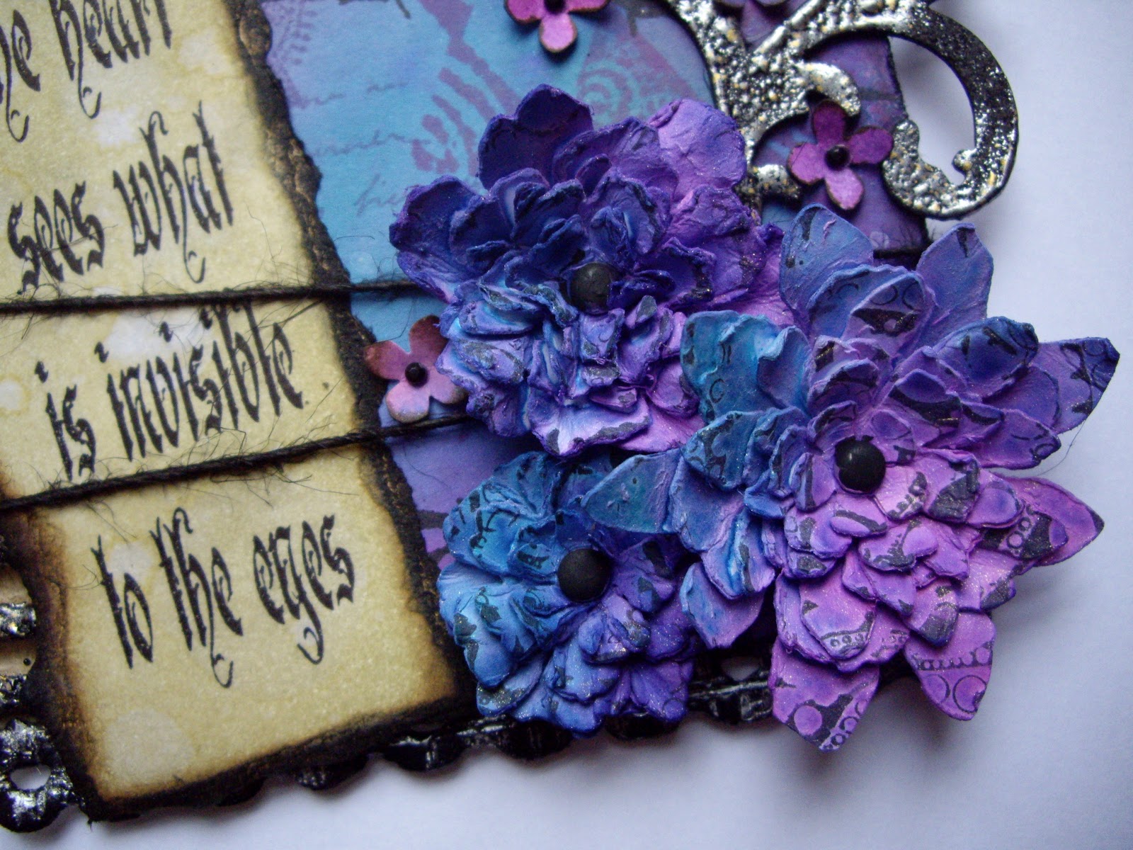
The flowers are die cuts from card coloured with dylusion inks, stamped randomly in archival and fastened with matt black painted fastener. The small flowers were punched from the same card, inked around the edge, shaped and finished with a small black gem. 


The flourish was die cut then inked with black soot distress, followed by embossing with aged silver enamel. I love this enamel because it's chunky and contains not just silver but grains of black and gold too. You can see some of the random background stamping too which was done with various toning shades of distress ink. If you look hard enough you'll see some picket fence marker too which was used on a little dotty stamp just for added interest and depth.

The wonderful sentiment was stamped onto card aged with distress and torn edges. Black jute thread was wrapped around after the sentiment was applied.


The bats were die cut from grunge paper covered with old book pages. The edges were inked with black soot then crackle glaze applied. When dry, black acrylic paint was rubbed into the cracks to highlight them. The stamped barbed wire is very visible here - it lends a little spooky touch to the image.

A little more of the background stamping is visible here. Some black gros grain ribbon and ribbon with silver lurex thread was used through the top of the tag. (see first image for better view).

The corrugated card was inked and then embossed using the silver enamel. At the bottom of the tag you can just see some die cut lace. This was coloured black, embossed with clear powder then whilst still molten, it was stamped with silver brilliance. 

Five different stamps are just visible in this view of the background.

If you go over to Anything But A Card, you can see what the other team members have made for further inspiration. I can't wait to see what you link up with - so  please do have a go, especially if you've never joined us before. We're a friendly bunch and you'll get visits from more than one DT member I can assure you! I make a habit of visiting every entry and I'm always amazed by the number of creative people out there - it's wonderful.

Thanks for hanging on in there and getting down to here. If you like what you see, leave a comment and I'll come and visit you too!


Saturday 27 October 2012

Craft Barn Calendar Challenge # 4 - Doodles

The theme for the Craft Barn Callendar Challenge #4 is 'Doodles' and this filled me with horror!! I doodle when I'm on the phone etc. but not really at any other time. I only have some border dylusion stamps and I felt they wouldn't do so I decided to see what I could create by just playing around.

I sprayed some dylusion ink onto card in various colours and dried it. Some random stamping was added using distress ink. Next some large drops of water were allowed to drop on the ink and were then dried. From this point on, I used a white gel pen and my trusty sewing machine to doodle away and create my calendar page. Do I like it? At first, no. Now I've played with it, photographed it and just lived with it, I think it's grown on me so I decided not to redo it, which was the original plan!

Here's my calendar page - get your sunglasses on people before you view:


The colours are bright and bold and I'm pleased that some areas show a little more yellow than others.


I started by drawing a flower around each water drop mark. They are roughly the same shape but are in a variety of sizes.


Next I bleached out some of the colour from each flower using a waterbrush. A second run with the white gel pen was then needed to make it stand out.
Most of the flowers were then given a 'stem' using an embroidery stitch on my machine. I thought about using various colours of thread but stuck to white in the end to link in with the gel pen.
The little flowers in the centres were punched from some of the background card which had been randomly stamped in white ink. Their edges were inked  and the flowers were given some shape and then attached in the centre of each drawn flower.


My dear husband had sent for a little bag of watch parts for me so I used some of those as the flower centres. They are very tiny but really quite amazing, I can't believe how anyone can put a watch together with such small pieces! The calendar was inked with distress and some Tim tissue tape was applied to the top to hide the stitch holes. It was then machined into position. The edge of the calendar was also machined to define the edge a little more. Have to say it's great to use my machine in my craft work as well as in the more traditional way for sewing fabrics.

I hope you like my page. I know it won't be to everyone's taste but I'm pleased with the outcome,
particularly when I didn't like the theme at all!! Thanks for your support and for visiting me today.

Wednesday 24 October 2012

Fur Or Feathers At Artful Times. . . .

The latest challenge at Artful Times is to include the theme of either fur or feathers in your work. I chose feathers because I have a number of bird stamps which I could choose from but no animal items!

I decided to make a tag with a vaguely autumnal feel to the background and added colour to the birds to make them stand out. No sentiment was added because quite honestly, I feel that they aren't always necessary.

Here's my tag featuring some Crafty Individuals birds:

The background for the tag was created using foliage stamps and distress inks. The white leaves were stamped with brilliance ink.
Die cut lace was inked in the same colours as the tag. Two layers of clear embossing came next, followed by stamping with brilliance ink whilst the embossing powder was still molten.
The birds were layered onto corrugated card from a box I had. The card board was inked lightly with picket fence distress stain followed by walnut stain ink. Aged gold embossing enamel was then applied to various areas of the card.
Each bird image was stamped with archival ink then coloured with distress inks and a water brush. 
Each bird 'tile' was given holes in opposite corners. Jute twine (love this stuff!) was then attached to the tiles and then to the corrugated card. I wanted to use this natural material to keep in line with the nature theme. Some cream cotton lace was used behind the birds and through the hole at the top of the tag.


Close up to show the background. The fern images were stamped vertically - either the right way up or the wrong way! Water was randomly flicked and dried. The white leaves were stamped in some areas only just to lift the background colours a little and to tie in with the picket fence stain on the corrugated card..
Shorter post from me today but lots of pictures as usual! Hope you've enjoyed looking at my tag.


Monday 22 October 2012

Tricoleur At Make My Monday. . . . .

The French theme continues at Make My Monday this week with Tricoleur being their latest challenge. For my guest DT spot I have chosen a fairly modern image and combined it with some inky goodness and a touch of ribbon. I found this challenge quite difficult but I hope you like the card I produced. I'm always amazed at how many images are out there on the internet and for my piece, I chose the red lady image and then printed her out in blue in addition to the red. The tricoleur colours were then achieved by combining a stamped white panel.
Here's what I made:

Not sure why the card looks bent in the photo but here is the completed piece in my usual inky style! Apart from some walnut stain distress ink, the only colours used for this card are the tricoleur colours of blue, white and red. 
The seam binding was coloured with distress inks then three pieces were tied in a knot (much easier than a bow!). I layered the colours in the correct order. The blue image is printed onto card with some inky distressing on the edges. It's a very dreamy image which has more impact when viewed from a distance.
The centre panel was stamped onto white card using distress markers to add colour to the stamp. I tried to match the blue but had to be satisfied with a darker tone. I wanted to ensure that all the tricoleur colours appeared on the centre panel.
The solid red layer was coloured with distress ink and distressed on the edges. The letters are die cuts, colour was added with distress ink. As these are traditional to the tricoleur, I felt it was important to include them. For the accents above certain letters, I used the waste from the letter 'e' to ensure the words were grammatically correct - how fiddly was that little job?!! At one point I considered making the letters glossy but decided that was just a step too far!
The blue inky layer was created with distress ink used to colour first and then stamp appropriate images in the same colour. The edges were heavily distressed to complete the look.

Thanks so much for taking the time to read my post and a big thank you to both established and new followers - your support is most welcome.

Saturday 20 October 2012

Craft Barn Calendar Challenge #3 - White, Yellow and Green. . . .

The calendar challenge at the Craft Barn continues this week with the theme of three colours: white, yellow and green. I found it quite difficult to think of anything that I'd like to do in these three colours to be honest. I don't 'do' white very often as I seem to be programmed to ink everything so there's not huge expanses of white on my finished calendar this week.

I started by playing around with dylusion colours and making a background with green and yellow. Left that for a few days as nothing was working! Carried on then with some floral stamping, some foliage stamping and then thought about how I wanted to display the little calendar piece. I used a die cut in the end and gave it a makeover. Here's my March calendar page which is quite simple but in the end I was rather pleased with the way it had turned out (sorry the pictures are slightly odd, I had to take them in artficial light):


Finished page for March.


The background was created with dylusions, distress ink, water spritzing and some picket fence marker stamping. Some foliage was stamped in mustard seed distress but you have to look quite carefully for it!
For the calendar holder, a die cut was inked, stamped and crackled. The die cut letter M was inked then coated with glossy accents.


A Tim floral stamp was used in each corner with archival. My touch of white was applied with a gel pen to highlight the centres of some flowers.

The calendar was inked and stitched to provide interest and to blend with the background (you may have noticed the mistake I made with the stitching - can't take it out as tell tale holes are left!).

Close up to show foliage stamping.


The top of the calendar piece was wrapped with some Tim tissue tape and inked to dull the white (I can't help doing that!).

This lovely jute braid was used through the die cut and then to hold the calendar (bought at the Craft Barn). The main piece was also stitched around the edge to give a finished look.


I love the crackled effect and the tissue tape - watch out for more of those two!

Thanks for looking at my calendar page. It's relatively simply but I'm very pleased how it turned out in the end - it's a case of if at first you don't succeed, don't throw it away, leave it and go back!!

Monday 15 October 2012

Fleur de Lys At Make My Monday. . . . .

The challenge at Make My Monday this week is to use Fleur de Lys as part of their French celebration. I'm very honoured to be their guest designer again and I would urge you to pop across and see the gorgeous makes from the ladies there as they really are so very talented.

 Luckily, I had a background stamp which fitted this theme perfectly and the tag stamp was a freebie from the wonderful people at Crafty Individuals. I felt that the beautiful tag image needed to be given a slightly retro/vintage look and I've used a green colour scheme with a hint of gold to help achieve this.

I'm going to link my work up at Eclectic Ellapu who have an 'Anything Goes' challenge. This is a new challenge blog and it looks like lots of fun so why not go over and have a look?

Here's the card I made and I hope you like it:

The finished card.

Two layers of plain inked card were used for matting. The pale green layer was achieved by repeat stamping a single fleur de lys image and inking the background. The die cut fleur de lys was inked then embossed with some green enamel. 
The tag was stamped with coffee archival and inked lightly. The face was bleached out with a water brush and a little pencil blusher was applied. The tag is matted onto a piece of inked sheet music (a charity shop buy so I don't feel too bad about cutting it up!).

The die cut letters were inked and applied.
Thanks for stopping by to see my work, I really appreciate it. A big welcome to my new followers too.

Sunday 14 October 2012

Halloween At Anything But A Card. . . .


The challenge at Anything But A Card for the next fortnight covers Halloween, Autumn (Fall) or Earthy Colours.  If you don't like Halloween,  make something to fit one or both of the two alternatives and link up with us over at Anything But A Card

I'm not a Halloween follower but I really love the opportunities that it gives to use something a little different. The images really work for me and in particular I like skulls so I've used one in my project for Anything But A Card this time.

You must go over and see what my fellow designers have come up with too - being 'Anything But A Card', you'll find all kinds of things made by the girls.

I'm also going to link my work up with Simon Says Stamp and Show as their challenge this week is 'Rustification' and I hope my project fits that theme.

I've just spotted the challenge at Sunday Stampers too and I'm linking up there with this piece too - hope Hels won't mind! Her theme this week is 'Metal Gods' - mine isn't real but I've tried hard to make it look real!

I decided to make another journal as they are fun and can be given as gifts or used by me! Here's what I made (lots of pictures I'm afraid!):


Front cover of the journal. The frame was created with stamping, distress inks and two part crackle glaze by Decoart. The red layer was made using an Andy Skinner  paint technique called pitted and chipped. I've used the version which looks like pitted and chipped metal. The nails and the Tando skull were rusted again, courtesy of Andy Skinner. Some washers were coloured with a sharpie pen then sanded to age them. The frame is described later in the photo sequence.
Inside the front cover. The design was created using distress stain, masks, stamps, acrylic paint and white gel pen.
Close up to show stamping, acrylic paint work and gel pen. Some areas were 'bleached' with a water brush to add definition.
Back cover of the journal. The centre panel was inked, stamped and flicked with water. The die cut witch and bats were inked with distress then crackle glazed using the Decoart two step method.
Inside the back cover. Tim paper with added stamping and inked edges.
Close up to show stamping and the paper design peeping through. 

The skull was embossed in a chequer plate folder then rusted. The nails were aged using the same technique. The flowers were added for fun and are die cuts which were assembled, stamped, coloured, scrunched up and shaped then dried. You get a peek at the pitted and chipped painted metal here too.
The frame was made using the method described for the front cover. Some black acrylic paint was gently rubbed into the cracks to finish the look.
If you're still with me then thank you for sticking with it! I loved making this journal and want to try more of Andy's amazing techniques in my work. I'd love to hear what you think of my journal.