Saturday 30 March 2013

Who Are You Inspired By. . . . . ?

The latest challenge at Anything But A Card goes live today. We are asking who inspires you and then to link up with us so we can all share your inspiration. You can be inspired by anyone who does anything, not necessarily in art terms. It could well be a person in the art world, films, literature, history - the list is endless!

I had to think long and hard about this one because I'm inspired by so many people: John William Waterhouse (er. . all Pre-Raphaelite painters!), Gustav Klimt, the Arts and Crafts Movement, the books 'A Thousand Splendid Suns, Jane Eyre and Suite Francaise. . . . . I could go on and on really as these are just a few of my favourites. However, I wanted to pay homage to someone who has been a great influence in what I enjoy doing NOW and that person has to be the incredibly talented Andy Skinner. He is a wonderful teacher and artist. I love how he works things out using paints and various mediums and produces the most incredible art. That he can teach these skills to others is the icing on the cake for me. I'm not sure he'd approve of my rusty floral creation though!

I'm lucky enough to attend a monthly 'club' with Andy along with some very talented people. It's fun and we learn so many wonderful things. How could I not choose him??

I just had to use some Timeworn techniques on my piece. Some I'm starting to get the hang of  and some not but it's fun doing it. This is what I've made - another tag but you can't make too many of these can you?!! - and lots of rust and wire springs. Hope you like it but be warned, there a fair few photos:

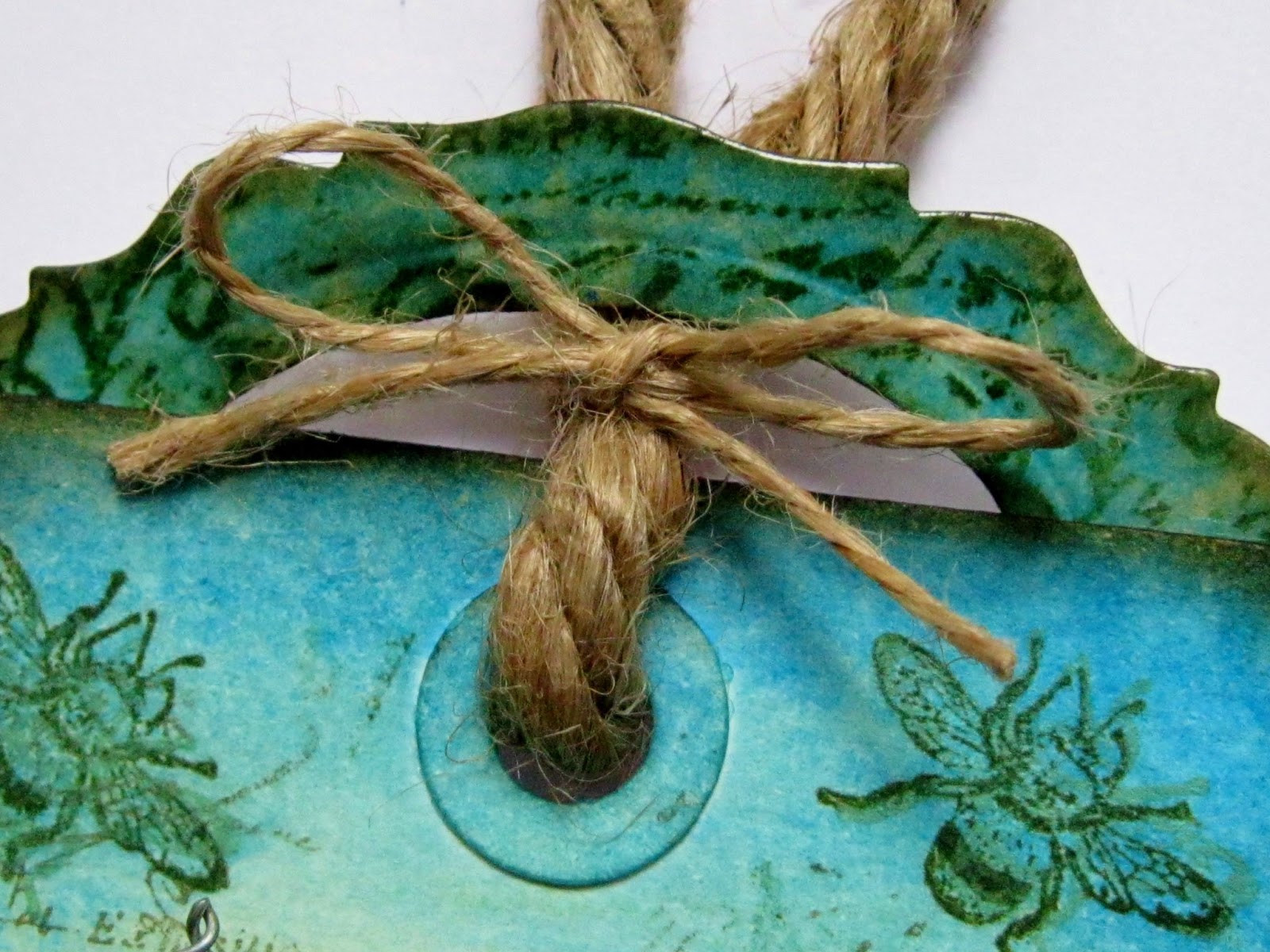
The completed tag with hanging 'sign' at the bottom.
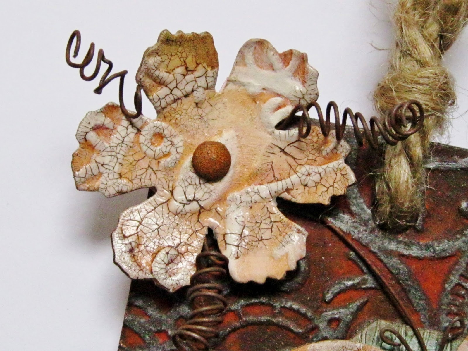
The butterfly and larger flowers are all die cuts. The small flowers are punched shapes. The rusty flower centres are large clear gems which have been rusted.
The tag was cut from some thick card on a used envelope and run through an embossing folder. The card was then treated to one of Andy's rusting techniques. The large tattered floral die cut was also rusted using a different AS (ie. Andy Skinner but quicker to type!) rust method. The wire was bought ready rusted (I draw the line at some things!).
The non rusted flowers and the butterfly were treated to an aged ivory technique with a little crackling as an added extra. I need a little more time with this technique but it's fun trying! 

The blue panel shows a peeling paint technique which was also used on the hanging sign at the bottom.
The rusty bells and wire were  purchased items which I put together as an extra detail.
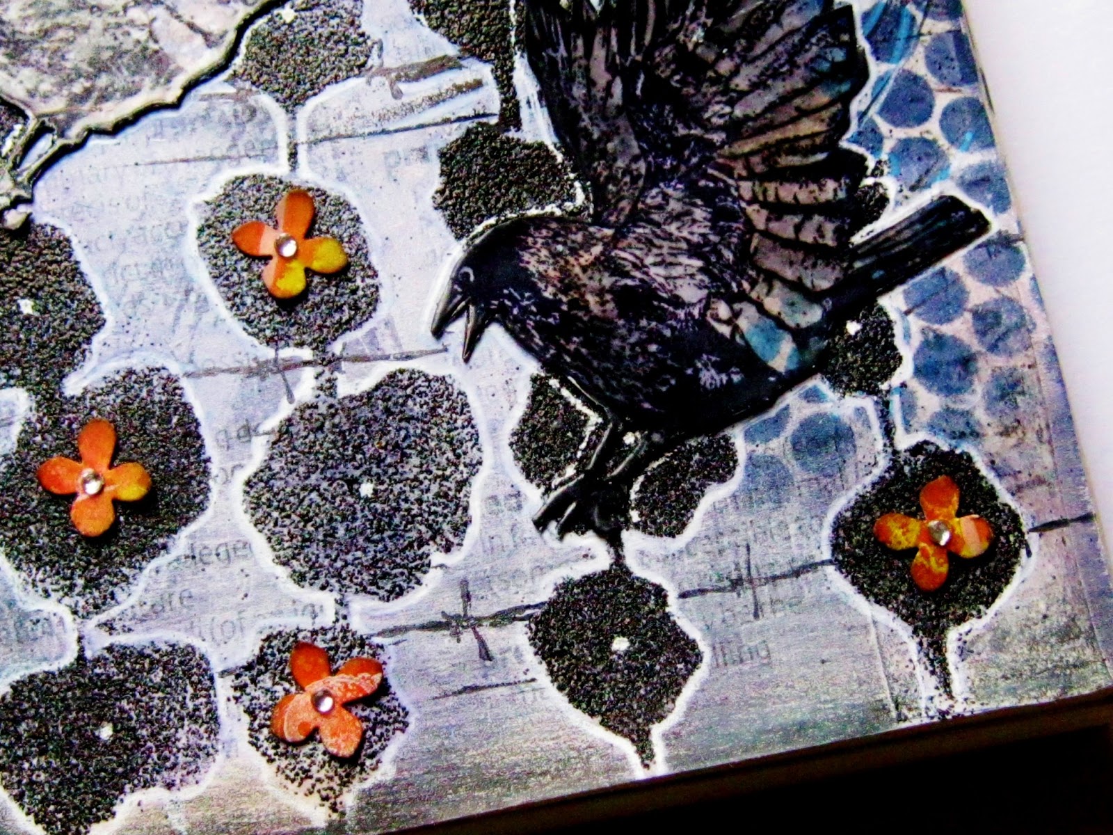
I wanted the word 'Inspire' to appear somewhat weatherworn so I used some distress ink, versamark ink and distress EP on a piece of card with a peeled paint finish. The main part of the sign was burnt around the edges to achieve a more authentic look. (my husband gets worried when I get the little burner from the kitchen and start to apply it to pieces of card!).
If you want to learn how to do these wonderful techniques, why not enrol for one of Andy Skinner's online classes? I think I'm right in saying that he now gives lifetime access too so it's a good deal.

Thank you so much for looking today. We'd love to see what inspires you too so have a think and then link up over at Anything But A Card.

I'd like to welcome my latest followers: 'Gibby' and 'Reusing with Quilling'. I really appreciate your comments and the fact that you've taken time to follow my work.

Thursday 28 March 2013

Alcohol Inks And Corrugated Card In The Garden. . . .

Morning everyone. It's a beautiful sunny day where I am but having already been outside - it's not as warm as it looks and the clouds are trying hard to spoil the Spring sunshine!

I've made a garden based tag with some alcohol ink mosaic pieces mounted on some corrugated card. I even used some twigs I've saved from the gorgeous flowers my daughter sent me for Mother's day!

I'm going to enter my tag at Artful Times for their Alcohol Inks challenge. I love this challenge blog and you really should pop over there if you've not been before. Everyone is so friendly and their challenges are always great fun.

There are two other challenges, one at Eclectic Paperie which is to use Corrugated Card/Cardboard. The other is the Craft-Room challenge who ask that we go 'Into the garden' and make anything but a card. Right up my street then! I've never entered either of these challenges before but have seen some of the inspirational DT work and thought I'd like to have a go.

Here's my tag - hope you like it:


The top layer of the tag is watercolour paper and the first thing  I did was to make a background using various shades of watercolour wax crayons.

Three tiles were made using Tim's Shrink Mosaic technique and alcohol inks. I don't have a melt polt so some scary heating of utee was done in a foil dish! (you can easily find this method in one of Tim's books or on his blog).
Close up to show the colouring on the shrink plastic tile done with acohol inks and the image stamped onto tape at the back.
You will also notice here that a piece of corrugated card has been usded as a backdrop for the tiles. This was treated to some Fresco paints and some distress inks to achieve the look desired. The tiles are then placed onto card which has a piece of chicken wire to stay in line with a 'garden' theme.
The twigs are real but rather delicate - I have no idea what plant they're from though.
(Thanks Rebecca!!)

Some die cut lace (watercolour paper) was coloured with matching shades to the main tag. It was double embossed with clear EP. Whilst the second coat was still liquid, the lace was over stamped to add interest.

Various stamps and different kinds of inks were used in the background to achieve the desired look.

At the top of the tag, a bookplate die cut was used to add interest. This was coloured and stamped using some matching inks and images to the main tag. Finally, two layers of clear EP were added.
Some chunky and fine jute twine were used at the top of the tag to finish the look - this also stays with the garden/natural theme.

Close up to show background layering with colours, different inks and stamps. I did notice the little bird is much tinier than the bee but decided it's ok in a make believe garden shot!

Another shot to show detail and how the tag changes colour from dark green to brilliant blue as it goes up the tag. This is the central area and therefore distance is indicated by the lighter colours.


That's me for today! I had a great deal of fun making this tag and do please let me know what you think, if you have time. Oh yes, the sun has disappeared since I started writing this post and we are back to dull grey skies - no change there then!

Monday 25 March 2013

Predatory At The Craft Barn Alpha Challenge. . . .

The Alpha Challenge continues at the Craft Barn and what good fun it is! The letter for this fortnight is P. I usually choose my word  by flicking through the appropriate pages and see what pops out at me. This time, for some reason, the word 'Predatory' jumped out. All I had to do then was dream up something to illustrate my chosen word.

With all the talk of Spring, Easter and Tim Holtz' latest tag, I decided to use a lovely bunny die and go from there. I don't have anything against bunnies but it was just too tempting to do something slightly on the dark side! However, for bunny lovers, you will note that my sweet little bunny is safe behind his chicken wire!

The only other thing I should mention is that I only had stamps showing crows. I believe they will go for prey which is dead or alive, so I hope that if the idea of crows attacking bunnies isn't quite accurate you will forgive my artistic licence!

Here's my page spread, hope it makes sense to you and apologies if you don't enjoy the subject matter:

Please excuse my thumb in the picture - it was the only way to stop the page flopping over!
The chosen word for my entry.
An extra little sentiment which many of you will recognise from childhood I'm sure. . . . . .  the words were printed out on a label maker and inked to match the background. Die cut letters from inked card follow the stencil design around in a curve. Punched flowers were made from inked and paint stamped card.
The rather dark and creep page was made by brushing with gesso then layering with stencils, stamps, paint, ink and a little washi tape. The little flowers are more punched shapes treated as before with a little bling in the centre.
Close up to areas of the background. The hollyhocks were created with versamark through the stencil followed by distress EP.
All the crows were stamped. The solid crow shapes were embossed twice: once with ordinary black EP followed by a layer of distress EP. The other crows were stamped, coloured with distress ink (I used lighter colours just so that they stood out better). Finally, the painted crows were embossed with a double coat of clear EP.
Bunny is a die cut coloured with distress and given a snazzy flower on his bow. I also gave him an eye so he appeared more alive and therefore in danger from the birds. He is protected by chicken wire which is attached to two fence posts. The posts were made by stamping a woodgrain image, adding colour and cutting into the post shape. I don't have the grass die so just cut a strip to show some very well cut grass!
The two crows on the fence are holding on by their claws - luckily they were part of the image but a bit tricky to cut out! This page was brushed lightly with gesso and then, same as the other page, stencils were used to build up layers in lovely spring like colours.
Background detail.
The detail shows the effect you achieve using versamark and distress EP. In addition, you can see a barbed wire stamp and the acrylic random stamping on one of the flowers.
Many thanks for looking and leaving a comment if you wish. I'd also like to say welcome to my latest followers and thank you so much for wishing to see more of my work.

Thursday 21 March 2013

Brick Wall At Technique Time Tuesday. . . . .

I was looking around for some inspiration the other day and I thought I'd have a quick look at Technique Time Tuesday. I love learning techniques and I've often had a peek at this blog but never entered a piece there.

Their theme this month is 'Brick Wall' and it grabbed me as soon as I saw it. I wasn't so sure halfway through making my piece when my 'bricks' got nudged onto the floor - you'll see why that might not be a good idea when you look at my piece. Luckily, there was a warning about this on the blog so, like a good girly swot, I labelled each piece on the back so I would be able to put them back together just in case I was stupid enough to muddle them up . . . . . .enough said on that!

To enter the challenge you must follow the instructions given but colours and subject are choice (just as I like it!). You can also improvise if you don't have the correct items.

I've used another of my new Andy Skinner stencils on my tag - I fear you may get bored with these soon!

Here's my tag:

I used the large tag size because I didn't want to cut my 'bricks' too small. 

Part of the lower tag was removed using a Tim On The Edge die - much neater than I could tear it!
I don't know why I'm making so many springs lately. I just can't get enough of them! These particular springs were made from rusty wire - another favourite item.

Initially, you stamp your chosen image (in black ink) either on patterned card or plain cardstock. I opted to make an inky background using dylusion sprays and distress inks. A little water spritzing took place to add interest. After the first image, your stamp is inked with versamark, moved slightly out of position on the first image and applied, followed by embossing with black EP. I chose to use distress EP because I like the textured, more matt results it gives.

The tag was inked with dylusions sprays and distress ink. Layers of stamping and stencil work were then applied using distress inks. 
Using appropriate measurements, the brick shapes were drawn onto the 'wall' card using pencil and ruler. Before cutting them up, I labelled each with a row indicator and another for position in the row. They give you instructions on the blog. The bricks were cut up and ds tape was put on the back of each. I arranged and attached the bricks then shaded around the edges with a dark pencil. You can see how the two stamped images have been placed just slightly apart quite clearly on the bricks in this image.

Three of the tag edges were machined. The 'sentiment' was stamped onto a piece of inked stampboard, which is a lovely surface to stamp/paint/create on. Another piece of rusty wire was added and of course, I coiled the ends into springs!


Background detail.

The instructions over at Technique Time Tuesday are much better than my ramblings, so why not go and have a look then create something yourself? I thoroughly enjoyed making this tag and thanks so much for getting this far in a rather lengthy post!


Wednesday 20 March 2013

Pick And Mix At Country View Crafts. . . Anything Goes

As well being the start of Spring, March is also the birthday month of my sister Vikki, so I wanted to come up with something really special for her.

I linked my last post up to the new challenge blog at Country View Crafts and then realised that they wanted a totally new, previously unlinked piece as an entry. This project is entirely new and was only received yesterday by my sister so I would say that's pretty new! Their theme is 'Pick and Mix - anything goes' which is a great opening challenge.

I have a number of copies of old photos depicting family members and I've been itching to use one of these in my craftwork.

I printed off a photograph of our great great Grandmother, made a frame for it and then produced a dual purpose card come packaging so that it arrived in style.

Again, a number of pictures but I want you to see all the details:

I kept the outside of the 'card' very understated but with some very feminine touches.
I wanted the piece to have a vintage look because of the very old photo. Lots of distress ink and stamping was used to achieve this.
Attached inside the card is the framed photograph. This can be detached and used as a decorative piece. I fell in love with this photo as soon as my Auntie showed it to me - fantastic piece of visual family history.
The frame is made from embossed recycled board. A first coat of gesso was applied then many different layers of acrylic paint, inks and crackle glaze were applied to achieve the look.
Two hangers were made from rusty wire and attached. Vintage ribbon  (thanks to the lovely Trace for that!) was tied through them and to the eyelets on the card - this enables the frame to be removed and used as desired. Muted gold coloured lace was added to finish the look. I like to think it looks old because the shade of gold is very pale.
The inside received matching stamping to the front but less inking as Kraft Card was used. The birthday greeting was split between the two inside flaps.

The letters were die cut, stamped and then embossed with gold EP. A coat of glossy accents finished the look. They are a little bright but often with old things, the colour survives extremely well when hidden from the light.
The frame fits inside the 'card' and is attached by ribbons which can be used to hang the photo when removed. I left the ribbons as new but wonder whether I should have distressed them a little as I did on the outside?
I distressed two picture hangers with alcohol inks and acrylic paint to use as the closing mechanism. Another piece of vintage ribbon was used to tie these closed - I added a little ink to the ribbon to age it.
Corner detail from the front showing gold embossed stamping.

White card was used for the outside of the project. I wanted to get that background light that can be achieved with distress and white card. Some Kraft card was punched with delicate lace punch and attached at both sides of the front edges. Most edges of the pieces were inked.


My sister was really pleased with her gift and card. Might have to make one for myself now! Thank you so much for looking today. A big welcome to my latest followers too - I really appreciate your support.

Sunday 17 March 2013

Spring Colours And Tattered Florals For ABAC And Tim Holtz

Hi everyone. The new challenge at Anything But A Card goes live today and I'd like to show you my DT piece. I'm also going to enter this large tag in Tim's Tattered Floral Challenge (you have to if you love making flowers like I do!). There is also a new challenge blog run by Country View Crafts (You know: the company that do free shipping on most items - not to be missed!) Their theme is 'Pick And Mix' so I hope my Spring offering fits the bill!

Our theme for the next fortnight is Spring / Easter. You can interpret this in many ways including using spring colours as I have; use Spring as a starting point or an Easter theme, traditional or otherwise. You could even bring in Alice In Wonderland and the white rabbit - as long as there's a link somewhere, you'll be fine.

The challenge at ABAC is wonderfully flexible as ever and remember: you can make ANYTHING as long as you DON'T MAKE A CARD. You must go over to the blog and see what today's teamies have come up  and next Sunday the second team go live with their makes so don't forget to see their pieces too.

I've got quite a few pictures to show you so get something nice to drink, a pair of sunglasses and start to scroll down:


I've made a large tag featuring flowers in Spring colours. The detail images which follow give a clearer view than this one - best photo of a bad bunch!


A gusset is inserted at each side on the lower edge of the tag. The pieces were prepared in the same way as the tag.

The die cut letters were coloured with distress (dusty concord); stamped with archival and coated with glossy accents.
The large tag was cut from white card and the background was created with distress inks, distress stain (picket fence), Fresco snowflake paint, stamps and stencils. A scalloped border was stamped onto spare card coloured as per the tag. The border was cut out and embossed with two coats of utee. The tag was folded up at the bottom and the border attached with side gussets made from card. This allows the stems / springs to be inserted.
Card was covered with metal tape for all the flowers. Various tattered florals were cut out and coloured with alcohol inks. The blue colour is much more purple in reality. The yellow flower was stamped with text and embossed with distress EP in black soot. This EP was also added to the end of some petals. The centre of the flowers is made from chunky twine unravelled.

The flower was made as previously written. All flowers had a 'spring'  made from florist wire applied. This flower adds interest to the chunky twine at the top of the tag.
The florist wire spring and some background detail.
The purple flowers have a more elaborate stamp used to decorate them but they have been made in the way as the yellow flowers.
A topper was made for the tag using a Tim On The Edge die. The scalloped border stamp was applied to card coloured with dusty concord distress ink. Two coats of utee followed.


Thanks so much for getting this far with my post - a little longer than usual but I wanted to show as many details as possible. Enjoy the rest of your weekend and I hope to catch up with many of you soon.