Monday 23 April 2012

Summer Colours

The theme for the Sunday Stampers this week is Summer Colours. What a lovely change from all the spring colours, male theme challenges etc! They were fab but it's nice to do something different for a change isn't it? Perhaps in a few months time I won't want see summery things but for the moment it suits me fine!

I had some new stamps arrive and just happened to make a tag with them which fits the 'summer colours' theme quite well - I hope!

I must give credit to the hugely talented Colleen Dietrich who did a fab 'bee' card  and gave me the inspiration for the background on this tag. Colleen used a resist technique to create the honeycomb but I found a somewhat quicker method: good old TH embossing folder!!  Do go and look at her blog if you haven't been before - I LOVE her work!

This will be all for a while from me as Cyprus calls again and we're off soon! Have a great week.

The elements used to make the tag. I also used some garden twine to go through the top but forgot to add it to this photo - oops!

An uncluttered (for me!) completed tag! The pink in this tag is really vibrant and I'm afraid my photography skills don't do it justice - same with the gorgeous lime green.


The tag background was inked with mustard seed then dry embossed. To bring out the embossed design, I powder embossed in gold. The little bees were stamped onto acetate, cut out and attached using glossy accents. The sentiment was computer generated and then cut out and attached. 

The card for the flowers was made using dylusion inks and then stamped, cut out and layered. Such lovely shapes to cut and LOVE those dylusion inks! I manipulated the small flower so that it became dimensional and added interest.


Distressed Style With Flowers

The theme at The Stampman this time is Shabby Chic or Distress Style. At PanPastel Uk the theme is to add a flower. I certainly love anything which is distressed and if I can add a flower or two then so much the better! I decided to make a tag to play along at these two challenges.

The elements used to make the tag. I've already glued the lace and tag top into position (forgot to take the photo earlier!).

The completed tag. (Again, a little dark so my apologies!).
This image shows a 'before' and 'after' view of the flowers. Each flower was die cut from card covered in aluminium insulating tape. Next they were embossed in a folder, coloured with alcohol inks, layered, teased into shape and finally some seed beads were glued into the centre of each flower using glossy accents. 

This image shows the main flower. Once I had made this flower, I powder embossed the edge of each petal to add an extra dimension. The TH embossing folder can be clearly seen as circles on the petals. The beads in the centre are a pinky purple to tone with the other shades used on the tag.


The tag was inked in weathered wood then clear embossing powder was used to create a resist stamped image down the centre. Further inks were added: dusty concord, victorian velvet and chipped sapphire in an attempt to match the colours of the flowers. Finally, I used a grey versafine ink to stamp down each side to complete the muted background. The die cut lace was inked and embossed to tone in with the flowers - there is more victorian velvet ink though to add contrast to the dark tones in the tag. I roughly powder embossed the edge of the tag to create a 'shabby' look.

The ribbon was coloured using distress inks to match the tag and flowers. I shaped it using a paintbrush handle and finally attached it using double sided tape. Some matching ribbon was used at the top of the tag to complete the piece.

Thursday 19 April 2012

Another Sea Of Green. . . . .(with some orange and black too!)

I'm not usually very fond of green - I don't think I ever wear it very much. However, I've noticed that I use green fairly frequently in my crafting and I've even had to buy a 'peeled paint' re-inker! (Not that amazing really but it amused me!). After entering the challenge at Artful Times, I felt the need to continue on the green theme and produce something else.

I bought some new things on Saturday at Alexandra Palace - I went with my sister Sandie and we had a really fabulous day together: much looking, touching, oohing and ahing and of course some spending! We laughed and chatted all day until they said they were closing in fifteen minutes - shock horror!

I bought a plate of Lynn Perella stamps which I fell in love with. Not sure what I wanted them for - does it matter? - but I had to have a play. What better way to start than cutting a nice fresh tag from white card and getting out the inks?

The blank tag was spritzed with gold shimmer spray then coloured with dylusion ink sprays and details added with dylusion stencils, distress ink and some white picket fence distress stain. The image was stamped with black versafine and small areas were highlighted with green perfect pearls mixed with water and painted on. For further details scroll down.

The finished tag with some black grosgrain ribbon and beads added through the  hole at the top.

The flowers are die cut from card covered with aluminium insulation tape, coloured with alcohol inks, dry embossed with a couture embossing folder and then heat embossed with crystal powder. I added some  black stazon randomly over the flowers to give a 'grungy' feel as they looked too new and clean without it! I coloured some brads black and attached them through the flowers. Perhaps I should have bashed the brads a little with a hammer but thought it was too late at this point!

The lace is a TH die cut which has been coloured with spiced marmalade distress ink and then over inked with black soot to tone down the colour.

The perfect pearls painting can be clearly seen in this image along with the shimmer spray on the tag. I like the way the background stencil work shows through the face! I'm not so keen on the picket fence stain which shows up as whitish areas here and there - it's probably because I know where it is I suppose!


The die cut leaves were inked and stamped with another image from the same plate. I love these leaves - so  amusing to see a face peeking out at you from a leaf! I added a little perfect pearls to the faces.

Finally, all edges were inked with walnut stain just before the tag was put together.

Monday 16 April 2012

A Sea Of Greens. . . . . . . .

The new challenge over at the Artful Times blog is to make anything with the theme of 'a sea of greens'. This was a very wide remit and I had to think for quite a while about this one! I wanted to incorporate a range of greens in a background and in the stamping that I added to or on the background. I enjoy making backgrounds and was also eager to use some new stamps which I had bought at the wonderful Alexandra Palace show which I went to with my sister Sandie. We had a fab day and couldn't believe it when we were told the show would close in 15 minutes!

Back to the challenge before I go off at another tangent! I decided to make a tag and put as much texture and interest into the piece as I possibly could. That way, using just greens would not become monochrome and boring! (Naturally, I couldn't just stick to green and there is some glossy accents in there too!).

I also like to show my work at Simon Says Stamp And Show. Their latest challenge is 'anything goes' so my tag would hopefully fit that remit too!

So, here's what I used and how I made my tag:

The elements I made to construct my tag. The beaded pin is by Prima - I couldn't resist buying a set of these! Clearly, some elements are already partly made here - I forgot to take the photos at an earlier stage!

The finished tag - the photo is a little dark I'm afraid! The tag was put through an embossing folder, coloured with Distress Inks and Dylusion Ink Sprays and some details were embossed using silver detail powder. I chose this embossing folder because I believe it matches the 'headdress' in my stamped image. The colours on her face aren't as good in this photo as they are in real life - they range from blues through to green and although pale they are very ethereal.

Here you can see the stamped face which was coloured with distress markers and a water brush. The frame was stamped with a background stamp and then inked with Distress Ink. The edge was embossed with detail silver powder and then the frame was covered with glossy accents. I like the way the ink under the GA seems to glisten. Some of the leaves were die cut and then inked, the others were stamped onto inked paper and cut out. All the leaves were embossed on the edges with silver detail powder. Some Walnut Distress Ink finished the edges of the leaves and tag. I added the red elements so the greens stood out. The leaves were flicked with water to add an aged appearance.


This image shows the embossed silver ring around the tag hole and I added a small silver charm for extra detail. This is similar to part of the stamp image which I removed in order to fit the face into the frame. The ribbons were added to soften the tag. The 'brads' on the frame were embossed with the same silver detail powder used elsewhere on the tag.

Swap Pressie For Me!!

My lovely blog friend Cassidy was my partner in a recent craft swap. We had to make and send a tag with a spring theme - the tag I made is featured earlier in my posts.

I thought I would share the lovely things that Cassidy sent. As well as a gorgeous tag, she sent me a beautiful card as she felt a bit mean sending just a tag! How fab is that?

Thank you so much Cassidy!! My tag went to another lovely lady called Karen who seemed very pleased with it! (Phew!).
A beautiful tag and gorgeous card. Love all the 'jewels' and soft flowers with a fantastic mix of delicate and strong colours.

Wednesday 11 April 2012

Spring Colours With 'Lace' & Ribbon & Late For Tag Tuesday!

I belong to a lovely little on-line craft group called UKPC. This month I'm joining in with my first swap and the remit was to make a tag featuring spring colours, lace, buttons and beads. I love most of the elements so this project ended being one that I really enjoyed making. Giving it away will be sooo hard!! Although I love lace, I never seem to include it on my projects. What I do like however, is lace die cut from card or paper a la TH so I've used some of that on this tag and I think I'm now hooked on it!

I've also seen that the challenge over at The Artistic Stamper is for 'Ribbons and Lace' so I want to show my work there too as it I think it fits the requirements. They do show some fab work on this blog too so it's well worth a visit if you haven't already been - I snoop around everywhere I'm afraid!

I do like to follow the challenge at Tag Tuesday just for fun. Unfortunately this one is rather late but I hope I'll be forgiven!

So, let's have a look at what I've made and how I put it together:


Here you can see the separate elements ready to be put together. The weird shaped gold embossed pieces on the left are the two halves of a jewellery die cut that I sliced in half to finish the top and bottom of my egg. I can see that I left on the backing strip of the double sided tape on the tag base - not very attractive!
The finished tag.
The 'egg' was cut out free hand. I laid down one colour of DI and then stamped it  using a resist technique and crystal embossing powder. I then inked over the embossed area with DI. Finally, I coated the egg with two layers of UTE as I wanted it to stand out against the matt finish of the flowers and leaves.


In this view you can see the TH lace die cut which has been inked with DI and then randomly embossed with gold powder. The 'button' is also a die cut which has been inked (DI), stamped, sprayed with shimmer spray and finished with glossy accents. Some gold embroidery thread finished off the lace and the button nicely.


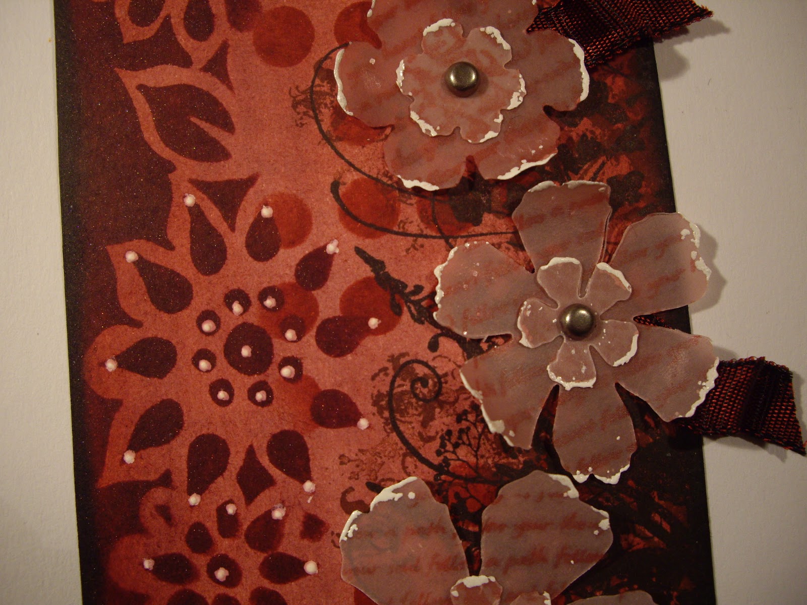
The flowers were die cut, all were then inked with DI and some also had stamping added for extra interest. The centres of some flowers are made from die cuts which again have been inked and stamped. This photo seems to show the liberal amount of shimmer spray added to many of the elements. I sewed beads onto the flowers using clear nylon thread - I've tried using wire but I find this method not only quicker, but easier too.
Behind the flowers is a piece of ribbon to set them off nicely against the egg.

 Here you can see the tag background which was built up using DI's, shimmer spray and stamping with archival ink. The leaves are Th tattered leaves which I cut up to a more proportional size for the flowers. I added a stamped die cut to the top of the egg for extra interest. The ribbon aspect for the challenges is found under the flowers on the egg as previously stated and through the top of the tag. I embossed the ring round the tag hole to match in with the other embossed elements.

Vintage. . . . . . Male & Boys With Some Lord Tim Thrown In!

So unlike me to do a male card but here we go with effort number two - I might get to like doing male cards at this rate!

The current challenge at Make My Monday is to produce a 'Vintage' male project. I adore most things vintage but had to give this one lots of thought before I came up with anything! I've worked on male orientated colours and an image which isn't just male but is less feminine than I would usually use!

The challenge at Simon Says Stamp & Show is to use some 'Lord Tim' techniques. As a mere beginner in terms of Lord T, I've done the best I can with this one using liberal amounts of blended Distress Inks, a resist stamping technique which is attributed to LT and a little beating up of the edges of my paper and card! I hope it fits the bill!

Shopping Our Stash Week also have a masculine challenge so I will show my work here too. I haven't bought anything especially for this project and have used things which I had in my boxes and drawers. The printed paper is from an old  book from Exeter University bought for 50p ages ago - I'll never need to buy another old book as it has plenty of pages - deathly boring to read though!

These are the elements I used to make my card. I used two layers of  Lord T C'oredinations card for the back matting, one layer made using a resist stamping, one layer made using dry embossed inked and powder embossed card and a piece of script from an old book. The tag was made from scrap card. The watch is a stamped image which has been cut out. For further details scroll down.


The finished card which could have a sentiment added to suit any occasion.

This image clearly shows the resist stamping which was done using crystal embossing powder and coloured over with DI's. On the dry embossed green layer, I ripped the edges to distress them and swiped embossing ink over the raised dots and added copper embossing powder to complement the green tone. 

The watch was stamped onto card coloured with DI and then cut out. I embossed some areas of the image with clear powder to give a vintage feel. The little tag has some very light stamping in the background of a watch image and in the foreground an appropriate Lord T verse. I used jute to tie through the tag to complement both the vintage and the male challenge criteria.

Sunday 8 April 2012

Vellum. . . . . .

The challenge at the over at The Stamp Man is to make a project which incorporates vellum. I haven't used vellum since the days of having a dabble in parchment craft - many years ago!

I often like the effect of vellum but find it quite challenging to work with to any degree of success. When coloured it has a soft, delicate look which is very attractive.

I decided that I would use the required vellum to make flowers for my project. I want to combine the vellum flowers with a strong, vibrant background so that they look softly feminine against it and stand out.

My choice of colour palette is familiar but I've tried to challenge myself by using much darker tones of my usual favourites!

The elements I made to construct my tag. I haven't left anything out this time either! To hear how I made each section, please scroll down.


The finished tag which has only one piece covered in Glossy Accents!

This image clearly shows the TH die cut lace at the bottom which has been inked with Black Soot. The tag background was developed using Distress Inks, a Dylusions stencil, random floral stamping on the left (under the flowers) in both black and coffee to give the illusion of depth and a white opaque pen to add the dots for extra detail. 
Couldn't resist just one tiny element covered in Glossy Accents! The circle re-enforcing the tag hole was inked first using Distress Inks.


This image clearly shows the background stamping and stencil work - I haven't really used stencils in this way before and I enjoyed the process and quite like the end results although more practice is certainly needed!
Here we have a clear view of one of the vellum flowers. After cutting out, each section was inked with Distress Ink, stamped with either a script or random floral image and the edges of the petals were embossed using True White powder - these link with the white detailing on the stencil work. The flowers are attached to the tag using matt, metal brads. Ribbon was added to complete the look using toning shades of both wired and organza ribbon. Finally the edge of the tag was inked with Black Soot.

I am also going to show my tag here:

Just Keep On Creating - Anything Goes (do look here as this is a new challenge blog so why not drop in and join in the fun).

Friday 6 April 2012

Wheels. . . .

I noticed on  Lainey's blog that she is a guest designer for a month at Make My Monday challenge blog. Congrats Lainey! I really liked her card and went to have a look. The challenge is for men and boys and the theme is 'wheels'. One word springs to mind: help!!! I'm not brilliant at coming up with 'male' cards but thought I should have a go as I had to make a card for a good friend of ours.

I don't really have any stamps which are male orientated but I do have an embossing folder which is a 'cog' design. As these are technically wheel shapes with bits missing, I hope I might get away with using the folder! I also have a barbed wire stamp by Andy Skinner which I love but hadn't found a reason to use yet so. . . . . .


The finished card shows an embossed tag with both letters and 'wheels' cut from left over embossed card.


This image shows card which was embossed with the folder, inked with Black Soot and finally randomly embossed with fine gold powder. I've left some white card peeking through because it seems to add depth to the texture. I cut out some of the 'wheels' or 'cogs' and attached them around the edges of the card for extra interest.

Here you can see the stamped image of barbed wire from Andy Skinners 'Gothic' stamp set. I kept the background very white and simple to ensure the texture of the embossed piece stood out.
The letters have been cut using a TH alphabet die from the waste pieces of the embossed card. I coated them with Glossy Accents before drying and attaching to the card. (Sorry the image is a little fuzzy!).

Although the gloss doesn't show up very well here, you can see how the definition made by the embossed card gives an interesting texture to the letters. All the dips and bumps are visible in real life and the gold embossing glistens under the glossy accents. I glued them down following the curve of the barbed wire image.

I was pleased with the finished result and the card was very well received I'm glad to say! It was difficult for me not to use feminine colours, flowers, beads and all the usual paraphernalia I include! I suppose a change is as good as a rest - as they say. I do need to broaden my horizons as far as producing 'male' projects is concerned but they don't come naturally to me I'm afraid!