Monday 30 July 2012

A Trip To Europe On A Tag. . . . . . .

The challenge at Artful Times is to make a tag and the theme is to show a trip to Europe - really like this idea.

 I chose to go to Paris and Rome on my tag. I have been to Paris a number of times and it never fails to engage me. The whole city is vibrant, colourful and so wonderful - I'm happy just to walk round and soak it all up - I don't perhaps walk quite as far as I used to but I have a good try before demanding a sit down at a lovely pavement cafe. . . . . (that's my excuse and I'm sticking to it)!

This year I was able to realise a long held dream of mine which was to visit Rome. My husband had been away for a very long time and one of our treats when he returned was  to spend some time in this most beautiful city. I know it  will always be my most favourite European city. There is so much to see and just walking up an ordinary back street you will be greeted with the most amazing architecture - love it!! Luckily I found lots of 'watering' stops here too!

The biggest problem with doing my tag was that the only stamp I have which was of use for this theme is very small and includes images from other cities too. I tried to get round this by including some relevant background stamping from a variety of stamps I have. I've included two very tiny stamped images of iconic landmarks from each of these two cities - both of which I have visited so they do hold personal meaning to me.

Here's the tag I've made:

The completed tag with stamped background.

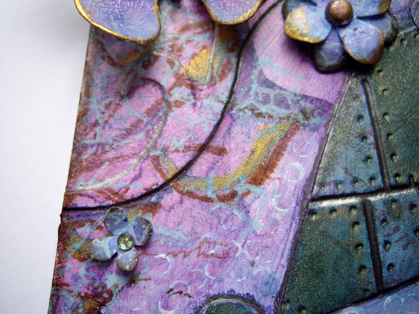
The first city on the journey is Paris. Both the chosen cities have been featured on die cut hearts which  have been inked according the flag colours for that country. The stripes were achieved using masking tape and distress ink. Both hearts were then coated with crackle glaze and lightly inked when dry. Each heart was manipulated into a domed shape - not easy to see here - and attached with foam pads so they sit proud from the background giving a 3D effect.
The letters were embossed and then cut out, inked and some gold embossing powder randomly and sparingly applied. The landmarks were both stamped, inked and cut out.

The Rome heart was created in the same way as described above.
The ribbon at the bottom was coloured using distress inks in the same flag colours used on the hearts. I then put a gathering thread along one edge of the ribbon and pulled it up into reasonably even little folds or pleats before attaching it to the base of the tag. The same ribbon has been used at the top of the tag but has been left flat.

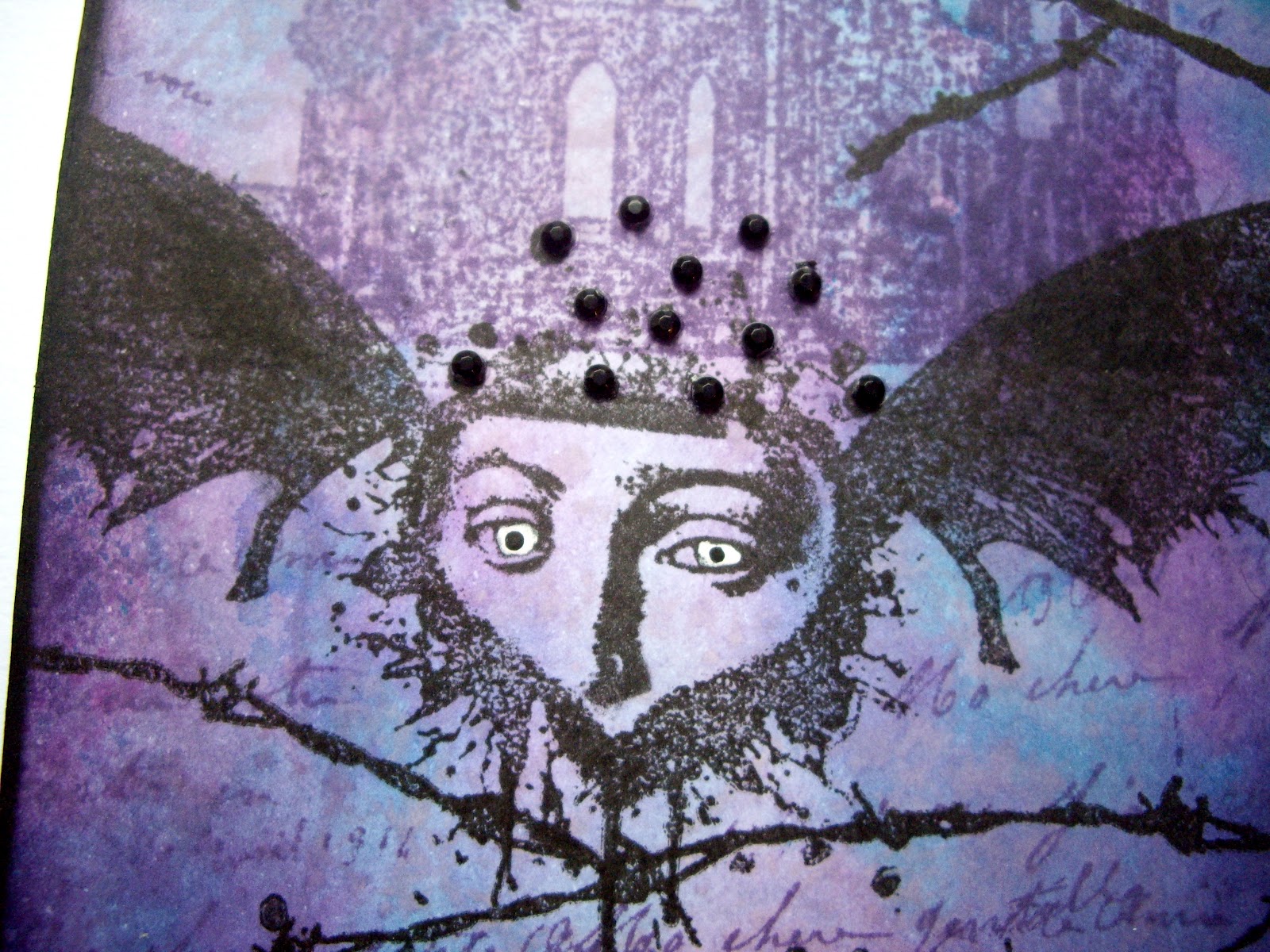
The tag was inked and stamped using various colours of distress inks and appropriate images.  There are postmarks, landmark images and even a French lady with her address. . . . . !!

One of the Tim folders has this little 'Paris' section, so after embossing, I cut it out, applied distress ink and some randomly placed embossing powder.
I really enjoyed making this piece - not sure what it is about making tags but I like them! Trouble is, what do you do with them afterwards, if you're not sending them to someone?? No idea at all!


Saturday 28 July 2012

Lady Sings The Blues. . . . . . . . . .

I'm hoping to get this challenge posted on time . . . . . . . . too much watching the Olympics I fear!!

The challenge at Make My Monday continues with the colour wheel and this week we are asked to use analogous colours: Light blue, Turquoise and Dark Blue.

I decided that I had to use my usual inky background technique and some new Indigo Blu stamps I had. The card is also being used for a friends birthday so I've kept it rather more traditional than perhaps I would usually. . . . .

I'd also like to show this card at Sunday Stampers where the challenge is 'Words' and Simon Says Stamp and Show where the challenge is 'Hey Girl' - really wanted to do something frilly and pink but never got round to it and perhaps that's not my style. . . . . . . . !

Here's the card I made:

The completed card. The main image and sentiment are layered onto coloured, textured card and then finally onto some sheet music - charity shop buy! - with the edges inked.
The blue background contains all the required blue tones but you need to look carefully to see them! The card was stamped with the main image and then inked and stamped using distress inks and the following stamps: crackle, script, flourish and music.


In this image you can see the distress inks in various shades but also visible is some light blue chalky ink which was used to stamp script. I love the effect these chalky inks give on top of distress. The sentiment looks smudged but if you have this stamp you will know that this is how it is! The sentiment layer has two eyelets and some lovely jute thread tied in a small bow. In the following image you can see the crackle stamp which was done in a distress ink turquoise equivalent:


Thanks for looking at this post and thank you to all those people who regularly visit my blog and to my new followers who are saying some lovely things about my work - I really do appreciate it.

Monday 23 July 2012

Considering Steampunk. . . . In Love!

The challenge this week at DragonsDream Tag It On is entitled 'Considering Steam punk'. The ingredients to be included are fantasy, inventions and Victoriana.

Quite a tough one this but good fun though! I decided to show the fantasy element as my steam punk man who travels on cogs wheels but has his own wings when he needs to fly - he is also one of the inventions shown as well as various stamped inventions! Victoriana comes from the beautiful lady he is in love with and of whom he thinks of constantly - hence the thought 'bubbles and heart' leading from his head to her, way up high in her heart shaped cloud. The steam punk is represented by industrial stamping, use of cogs, brads and other suitable items.

I kept to a very monochromatic palette with the exception of my lady who is painted like a portrait in Victorian art - I should also say that she's the nearest image I've got to any victorian lady! I have also included little touches of colour with some cogs cut from copper sheet which were heated to change colour - great fun and you never get the same result twice! I toned down the colours with some alcohol ink as they were too bright for this piece.

Here's my tag, hope it fits the bill:

The completed tag showing the lovesick steam punk man trying to float up to his lady - sadly he's tethered so won't get far!! The tag background was inked with distress, stamped with various images in both distress and archival ink.
The steam punk man is tethered by a chain made from jump rings and  brads. One set of cogs were cut from metal tape on card and the others from copper sheet. The metal tape cogs were embossed then coloured with alcohol ink. The copper cogs were prepared as stated in the main text.

Steam punk man has 'tortoiseshell' wings made by stamping stazon onto acetate then cutting out and assembling. The wings are angled to give a 3D effect.

The lady was stamped, painted and embossed twice with clear powder. The edge of her heart 'cloud' was finished with a gold pen. She has matching wings to the steam punk man. She also has a little crown peeking out which was made from a cog using the same method as the man's wheels. The key charm and ribbon finish the look.
Some feminine flourishes are stamped around the lady to give contrast to the 'manly' feel of the tag. The lady image looks blurred but really is how she stamps - she's like an Impressionist image: she looks better from a distance! 

Various inventions have been stamped in the background to comply with the  'ingredients' given in the recipe.  The date of 1898 has been stamped randomly on the background.

The steam punk man is thinking about the beautiful woman hence the little thought bubbles ascending to her cloud - one bubble is represented by heart shaped brad.

Hope you like this piece - I prefer it to the card made yesterday! 


Sunday 22 July 2012

Summer Colours. . . . . . . .

The challenge at The Stampman is to show some summer colours. Difficult, as we don't seem to be having a summer this year but nice to sit down and use some bright, warm colours for a change!

I decided to go with tones of red, orange, yellows, a splash of gold and some gorgeous blue which are all inspired by the sun, sea and sand we are all longing for in UK! (Have to say that the weather where I am has much improved today so better not tempt providence as they say!).

I must be in a bright colour phase at the moment! Mainly due to all the challenges I'm entering which seem to require such palettes - it's fun but not sure it's really me! We'll see how it goes. . . . . .

Here's the card I've made:

The elements used to make the card. The blue layer was coloured and stamped using distress ink in one colour. I love that this method allows the stamping to stand out but in a gentle way.

The completed card.
The flower shape was die cut in canvas which was coloured with dylusion inks and cropped. Texture paste was added through a mask and when dry, colour was added again with dylusion ink and a brush. Gold paste was randomly swiped over the textured area. The circles at the centre of the flower were stamped and gold paste applied.  


The warm orange background was created with dylusion and distress inks. Various stamping was applied using distress inks in order to create a rich inky effect. The sentiment was stamped onto canvas which had been coloured with dylusion sprays. The final stamping of the border and the background leaves was achieved using Dyan Reaveley stamps and spiced marmalade distress ink. Some highlighting was added with metallic acrylic paint. All edges were inked with walnut distress.
The sentiment was stamped onto a scrap of canvas and applied with some gold brads to link in with the gold paste.

Do let me know what you think - I really appreciate that people take the time to comment.

Thursday 19 July 2012

Complimentary Colours. . . . . . .

The challenge at Make My Monday continues with the colour wheel theme. This week we are asked to use two complimentary colours on our work: purple and yellow.

Purple and yellow?? I know they work well together but they are not a combination that usually appear together on my desk! However, not one to shirk a challenge, I put my brain in gear and had a very long, hard think about this one. How to make something that used the inky look I like so much but which kept true to the challenge? Not easy, was the obvious answer I'm afraid.

I began, as usual, by making a background and taking it from there - I like to do things this way round for some reason. Probably because I just love making backgrounds I suppose!

Here's what I've made this time - fewer photos than usual, (you may be pleased to see!):

My completed card.

The inky background was made with dylusion and distress inks. It's difficult to see but there is stamping in the background and some dylusion mask work too. A white pen was used to randomly highlight sections of  the mask work. There is also some embossing using crystal powder and some glossy accents work - truly - it really is there I promise!


Two butterflies were die cut, inked with distress and stamped with versafine ink. Crackle glaze was applied and when dried, some gold paste was swiped around the edges. Purple thread was used as antennae to finish the look.
The butterflies were placed on embossed card which was sprayed with dylusion ink - some distress ink was added to the edges. Finally, some gold embossing powder was roughly applied around all the edges - far too time consuming I realised half way through! I really wanted to add other colours to the embossed card but I did resist the urge to stray too far from the challenge requirements!

The main piece was then layered onto textured card which had extra distress ink added to give depth. The purple layer was also lightly sprayed with gold shimmer to link in with the gold paste and embossing powder.

To be honest, at the start, this was not a colour combination I would normally have used but it was a good experience to work outside my usual palette and I have the ladies at Make My Monday to thank for giving me the chance to so for the last three weeks. Do let me know what you think of my efforts - I'm always interested!

Tuesday 17 July 2012

A Mode Of Travel. . . . .

The latest challenge at Artful Times is to create something showing a mode of travel. I had to rely again on my trusty balloon embossing folder for this, although I've tried to make a little scene on my card using some stamping too.

The card features the main mode of travel - the balloon - and some other travel related stamping in the background to add depth.

Best stop waffling and show you what I've made:

The completed card.

The main background was inked and stamped in various colours and layers to create a scene with some depth. The arrow and the sentiment were stamped then embossed with crystal powder. I wanted the people to appear part of the background so chose not to emboss them.

The balloon was made from embossed metal tape on card. After cutting out, the balloon was covered with two shades of acrylic paint which was partially removed before drying. The letters were die cut, inked with the colours used in the background and coated with glossy accents. By using a general sentiment, the card may be used for a variety of occasions.

The main piece was layered onto an embossed and painted piece of card. An industrial  folder design was used, coated with coarse steel effect acrylic and graphite stick was applied randomly to tone down the acrylic. The rivets were made using an Andy Skinner technique I saw him demonstrate at the Craft Barn.

I seem to be making a number of 'male' orientated cards and I suppose I'm beginning to enjoy the experience! That doesn't mean that they will become my favourite - more 'girlie' challenges please!!

Saturday 14 July 2012

Orange, Green And Purple. . . . . . . . . .

The challenge at Make My Monday continues with the colour wheel theme. This week we are asked to create a project using secondary colours: orange, green and purple.

What a challenge this has proved to be! I couldn't quite get my head round the thought of these three colours together. I could imagine them in various combinations of two but not all together.

Eventually I decided to use mainly green and orange with a purple accent. I made a green background as my starting point and then went from there. Here's what I made:

The finished card.

The flower was die cut then inked with dylusion sprays and distress ink. Floral images were stamped in distress inks using two toning shades. The flower is only attached to the background in the centre which provides a three dimensionality to the card.

The background was created by embossing card with a texture fade folder and  colouring with distress ink,  picket fence stain and gold shimmer spray. The ribbon is wired and can be easily structured to make a reasonably neat bow - I have great trouble with ordinary ribbon so find this type works much better for me! The green ribbon has gold tones and works well with the background - the colour looks a little darker here than it really is.

The centre of the flower was constructed using card sprayed with dylusion ink - it looks slightly blue here but I promise that it really is purple! The gems were added and in real life they have both green and purple tones but that also seems to have been lost in the photographic process! Dots were added with a distress marker to add detail. The stamping is seen in close up here.

Hope you like this piece. I must admit it filled me with dread at the start but I really enjoyed the challenge - in the end! - and I'm quite pleased with this final outcome.

Can I also say a big hello and thank you to my latest followers. I feel very honoured to know that you drop by because you appreciate my work. I will always try to return the favour.

Tuesday 10 July 2012

Dream in Layers and Circles

The challenge at the Sunday Stamper this week is to use the theme of 'Dreamer'. Hels Sheridan used the work of Finnabair as inspiration so I popped over to have a look for myself.  Wow! Such amazing inspiration can be found here and I know I'll be going back very often. I've tried to use some aspects of her style by using layers and elements although I don't own a very large number of these so decided to  make them from die cuts.

I like the way that Hels split her tag into two sections. I decided to add a lace die cut and hang it from the bottom of the tag as my interpretation of what she did. It was fiddly but I really like the effect as it adds another dimension. I've used the word 'Dream' on my tag and soft, dream like colours with a romantic bias to the content in order to fit Hels' theme.

At Simon Says Stamp And Show, the challenge is to show layering. I've chosen to layer flat and embossed die cuts, inks, shimmer sprays, acrylic paints, texture paste through a mask and various stamping.

At Try It On Tuesday, the challenge is to select a line from the bingo card and the twist is to add a butterfly. The line I have chosen is: brads; flower; die cut or punch. I've used brads in two of the flowers and made all the flowers from die cuts and the smaller ones from punched shapes. The required butterfly is there too!

The Stampalot Challenge is to show your crafty passion. I've used distress inks, shimmer sprays, stamping, flowers and glossy accents - all of which I love! The only one I left out was my beloved powder embossing because it didn't really fit this time. I added gold highlights with Rub and Buff gold leaf paste instead.

The challenge at The Artistic Stamper is circles. I've used gesso stamped circles to help build the background of my tag.

Here's what I made this time:


The main elements of the tag before construction.
This image was taken after the die cuts & canvas had been glued down, inks and shimmer spray had been applied and gesso painted over all the layers so far. At this stage I thought: YUK - IN THE BIN YOU GO! However, I recovered and refused to give in! So, from the above, to this:

The completed tag where colour has been spritzed and painted to create depth and interest.


Die cut flower coloured with dylusions sprays and distress ink. Stamped with a crackle image and chalky ink then layered over a similar flower. Seed beads attached with glossy accents. The tiny flower to the right was made the same way but has a gem for the centre and was a die punch.
TH lace die cut inked as before, stamped with script, gold leaf paste randomly applied and then lightly brushed with gesso. Lace then wired to the bottom of the tag. Die cut letters inked, stamped and gold paste as before then coated with glossy accents. Wired to lace so they dangle. I needed one more letter - perhaps I'll add an S at some point but that would mean undoing all the letters. . . . . 

Heart die cut embossed (same for the other heart), inked with dylusions, stamped with script (it's there, really it is!) and then acrylic metallic paint wash applied. Grooves and edges outlined with graphite stick. Small amount of gold paste smeared here and there.
Die cut cog treated as before with dylusions etc. Leaves applied through dylusions mask using texture paste. Painted with dylusions, acrylic and swiped with gold paste. The other leaves on the tag were created the same way. This is the first time I've used texture paste and I love it!


A snippet of the background showing dylusions and gesso colouring. The brown leaves (dylusion stamp image) were stamped onto tissue paper then applied. Gold acrylic was used to highlight the leaves. Script and crackle images were stamped lightly with various inks. Circles were stamped with gesso.

Die cut butterfly was coloured with dylusions then coated with crackle glaze to achieve aged look. The edges were enhanced with gold leaf paste. The shape was manipulated a little when almost dry to achieve a 3d look. Some walnut distress finished the look.

Die cut was inked, painted and gold leaf paste applied as before. Punched flower treated the same and a brad finishes the look. Small punched flowers were attached to the jute thread to add interest. 

The background can be clearly seen here with the circles and other stamping.  I really like the effect created by the graphite stick. I saw Andy Skinner use one on his aged metal finishes and wondered how it could be utilised in other ways - here's one! Thanks to the super talented Andy. (Er, not that he reads this blog of course but credit where credit's due!!).

Saturday 7 July 2012

Primary Colours. . . . . .very scary!!

A very simple, mainly 'clean' offering from me this time using the die cut bought with a gift voucher. The challenge at Make My Monday is to use primary colours. . . . . .yikes this is so not what I do normally!! Still, if you don't have a go then you never know do you?

I kept things very simple and tried  hard to keep to the colour palette requested. Hopefully a little distressing around the edges is acceptable! At first I tried making the elements without inking of some kind around the edges but it simply didn't work for me. I often don't use sentiments either so this was a challenge in itself as I only have a very SMALL number of sentiment stamps - they amount to no more than an A5 sheet I suppose. I really must do something about that I think.

I'm reasonably pleased with the end result and can see it being a useful general card to send out. See what you think:

The completed card.

The die cuts were layered to add a little more depth.

Simple sentiment stamped with coffee archival onto scrap card coloured with dylusion ink and stamped with script using mustard seed distress ink.

The foreground die cuts were inked with dylusions and the ones at the back with distress inks. Simple script was stamped in toning distress inks.
The layer beneath the die cuts was embossed with a vertical stripe design and then cut diagonally into three. Each section was then sprayed with dylusion inks in each of the primary colours. When dry an embossing ink pad was swiped over the raised sections, crystal powder was then added to provide additional texture and if you catch it in the right light, a little sparkle. Edges were inked to distress.

That's me done with primary colours for a while as I just can't resist mixing colours but it was fun and challenging having to limit myself to only three colours with limited neutrals.


Embossed Enamel. . . . . . . . .

The challenge over at the Craft Barn is to produce a piece using embossed enamel and/or mica flakes.

As some of you may have noticed, I love embossing powders and already own a number of the Stampendous! Frantage Enamels. I like the varying tones within each shade and all the metallic elements they contain. I also really favour them because they are chunkier than other powders and can be used very successfully when applied in a more random fashion - like I tend to favour. My sister Sandie does the most amazingly precise, beautiful embossing but try as I might, I fail to achieve her perfection and find that these particular powders are more forgiving for my style. 

I can't believe I only needed to take three photos this time. Including the matting, I only used four elements or layers this time and that must be a record for me!

Here's the card I made for my entry at The Craft Barn this time:

The completed card. I've left it without a sentiment so one can be added at a later date to suit any occasion.

The 'red' layer was developed using layers of distress inks and various stamped TH  images. I watched Neil at the Craft Barn Extravaganza on Saturday doing this and had to rush home and have a go!
The main floral images were stamped with coffee archival, bleached with a water brush and inked with a highlighting shade of distress ink.

The die cut flowers are a Memory Box die which Karen used on the Craft Barn blog and I fell in love with it. (Bought with a thank you voucher from my lovely Sister and Niece!). The flower end of the die cuts were stamped with olive archival then the whole die cut was inked with distress. I applied clear embossing ink to the die cuts using some sequin waste. Aged green embossing enamel was then scattered over and heated gently. See the next photo for a more detailed image of this.

The embossing enamel can be seen clearly here in a vaguely circular design - from the sequin waste. I wanted to achieve a random effect with the powder hence the reason for using the sequin waste.
The edges of the main card were inked with walnut distress but I decided that the other two looked better left 'nude' - unbelievable for me I know!! Sometimes, as they say, less is more!
The final task was to cut white and kraft card layers and assemble the card. I did think to cut the long stem but decided that I liked the way the image was coming out of the main display area so I left it.

Short and sweet from me this time - hope you like it!

Tuesday 3 July 2012

Don't Fear. . . . . . . . .

The challenge at Dragons Dream Tag It On this time is 'Don't Fear '. The following 'ingredients' are to be included in the 'recipe':
A scary image; a crowd of purple and some texture.

A very interesting proposition this one! I decided to think about things that used to scare me when I was younger in order to find some inspiration. Most of these I now 'don't fear' simply because with age comes tolerance, acceptance and the fear of being ridiculed if you let people know what scares you! My family will understand why I haven't used anything to do with spiders - I'm STILL scared stiff of them even though I know I shouldn't be!

So what used to scare me? Usually images, anything with a dark, mysterious appearance, clowns, church yards, crows, bats and Nuns! Nothing to do with real Nuns I assure you. I once saw an old 1947 day time film called 'The Black Narcissus'. I don't really remember the story very well but it involved some Nuns and what happened to them when they went off to live somewhere. My lasting memory is of a clip showing the eyes of one of the 'nuns'as she manically rang a bell (an actress I now realise!) and I couldn't watch any more of the film. It took years for me to accept that it was only a film and that not all Nuns were scary - how strange are the fears of childhood?


 I chose to work with an image of Whitby Abbey (which is amazing - if you haven't been, go!); a bird, some barbed wire, a female image which could be a nun and a winged creature similar to a bat. No clown? Mmm, I'm still not very keen on them I'm afraid!

Here's the tag I came up:

The finished tag. I do think it's scary so perhaps it's 'do' fear not 'don't ' fear?!

The background was made using a mix of dylusion sprays, distress inks and script stamping. The abbey was stamped with versafine as was the barbed wire and the 'bat'. The trees were double stamped in two toning shades in order to achieve depth and atmosphere. The edges of the tag were inked with black soot distress ink. The 'bat' is made up from two different stamp images which involved some masking to develop them into one image. Some black stick on gems give the illusion of a headdress and adds texture.

The bird was stamped onto acetate, cut out and applied. This gives sheen and makes the image stand out and lends a sinister air - I hope! The splatter stamp image adds to the sinister quality of the scene. At the lower edge of the tag some die cut lace was applied. The die cut was embossed with enamel then stamped whilst still molten to add more texture and give it a rather distressed, Gothic feel. Some more black gem stones complete the look.

A die cut flourish received the same treatment as the lace at the bottom before being applied. The word 'fear' was added - perhaps I should have added a question mark? Purple wired ribbon completes the look - it looks rather blue in the photo but it is certainly a gorgeous shade of purple!

The eyes were coloured with a white pen and the pupils were made with a small dot of acrylic paint. The eyes really are odd in the original image! I find this element the most unsettling I think - what do you think?