Wednesday 29 May 2013

Our Creative Corner - Recipe Challenge


We have a new challenge going live today at Our Creative Corner. Buttons is the host and she has provided  a 'recipe' to help everyone play along. You are asked to select one 'ingredient' from each of the three lists below and create a project of your choice. You can of course use more than one item from each list but you must tell us which are your three main ingredients on your make.


List A
List B
List C
Lace
Metal
Inks
Fabric
Wood/MDF
Paints
Ribbon
Clay
Stains


My three chosen ingredients are:

            LIST A: Fabric                             LIST B: Clay                            LIST C: Paint


I couldn't resist using a number of the other ingredients too - you know how it is! 

The starting point for my tag was a beautiful stamp made by Oxford Impressions. The stamp depicts part of the painting by John William Waterhouse called The Soul Of The Rose (also the name of the stamp plate):

John William Waterhouse - The soul of the Rose by John William Waterhouse

Waterhouse was a member of the Pre-Raphaelite Movement and he painted this wonderful piece in 1908. 

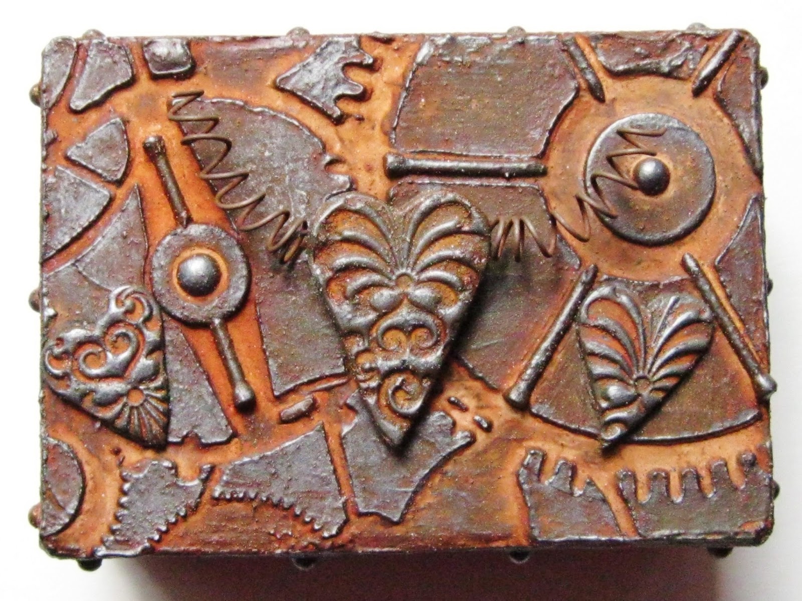
Here's the tag I made, which, besides my chosen three ingredients, also uses lace; metal (rusty wire) and inks (archival):      (there are quite a few pictures I'm afraid)

For some reason, this has been the hardest piece I've ever photographed -  must be the pale colours and the rotten weather giving no light!

The background was created using the following DecoArt products: Traditions paints, two step crackle,  and some Crackle Paste which only crackled slightly. All stamping was done with archival ink. I've used the crackle paste again since and I realise I didn't apply it thick enough! Some modelling paste was applied through a stencil to create the raised areas. 
Various washes of paint were applied prior to the crackle. The stamping can be seen to the right of the centre. The stencilled modelling paste had some Treasure Gold (white fire) applied to give it definition.
I used Fimo clay to make the heart; once cut into a heart, a rubber stamp was used to add texture. After baking the heart was coloured with various washes of paint. Some crackle was applied with black acrylic paint giving the crackle definition. A hanging loop for the heart was created from rusty wire.
The image was stamped onto card coated with acrylic. At first, I didn't like the effect achieved with archival but I decided it gave the image an aged appearance so I kept it. I removed the lady from the background because I wanted her to appear part of the tag rather than just an add on.
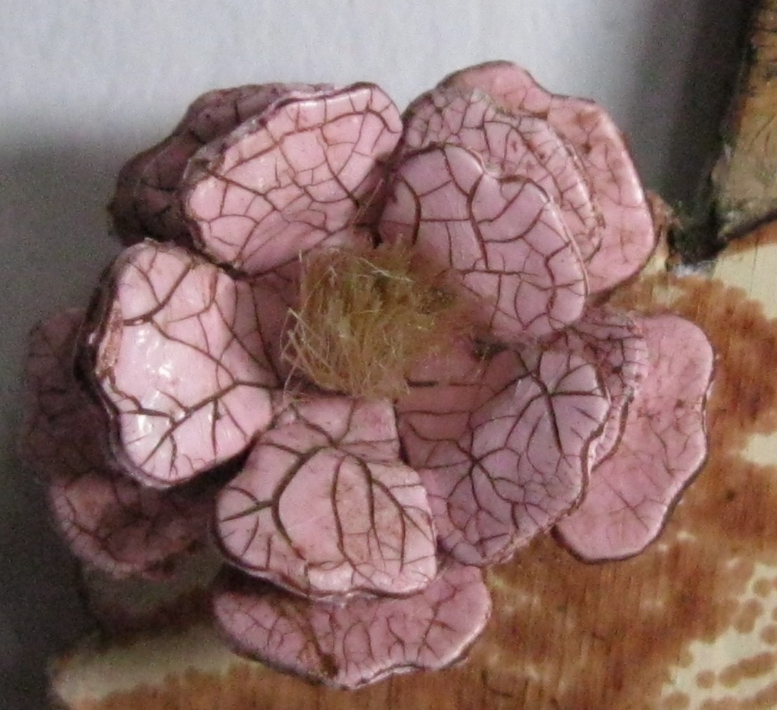
Firstly, I used a mulberry paper rose on the image but didn't like it. I decided to make my own little bloom from  some die cuts which were painted, crackled and some twine was used for the centre of the flower.
The quote was stamped onto painted card with archival, a light wash applied followed by more crackle. I curved the card banner to lift it from the background.
For each end of the banner, I made little Fimo 'buttons'. The texture was achieved as before, as was the finishing method.
Another heart was made and placed behind the knotted silk on the tag. You can just see some lace peeking out from underneath the fabric.
More silk fabric was pleated by hand and added to the lower edge of the tag. Here you can see the only part of the crackle paste which crackled to any degree! Also in the image is some stamping with archival. I hoped to create two 'aged'  finishes in my background.
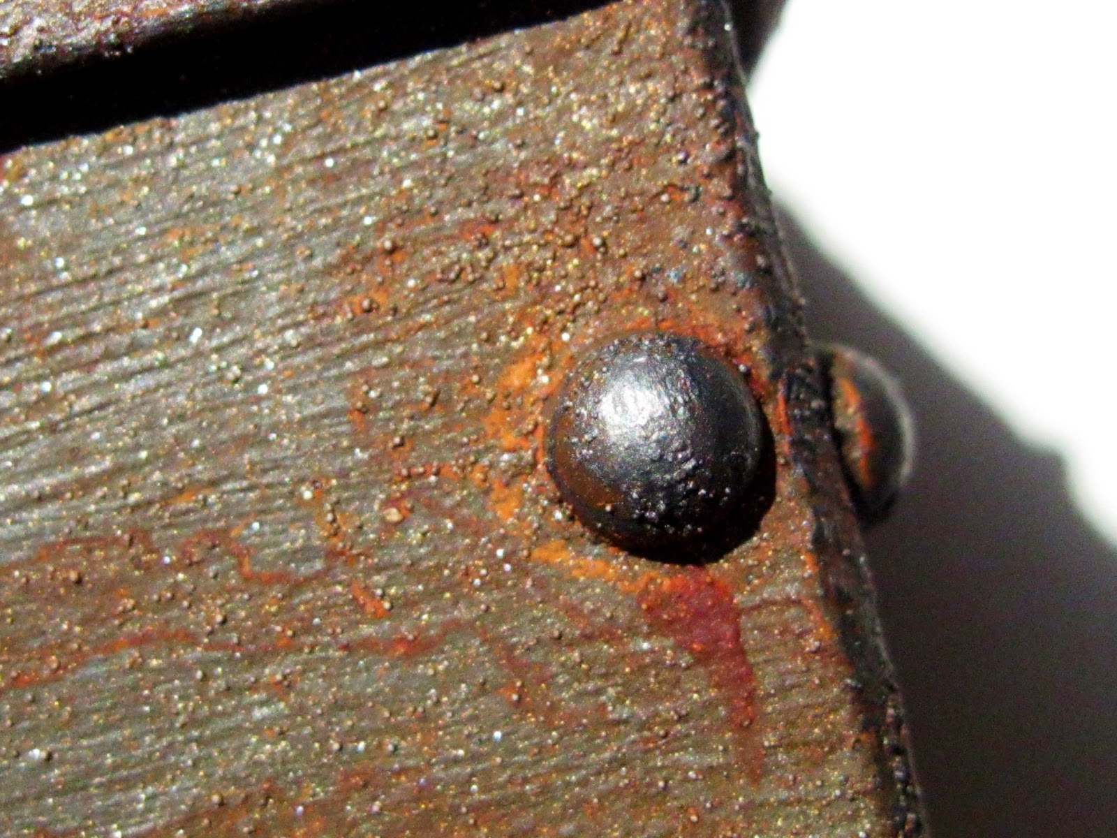
Detailed image of the stencilled modelling paste.
 I loved this challenge because it gives you so many possibilities for creating. Can't wait to see what you come up with!

Don't forget to come back to Our Creative Corner in two weeks time for more inspiration from the other half of the team - you won't be disappointed!


Sunday 26 May 2013

Dust Off Your Older Supplies For Anything But A Card. . . . . Challenge Twenty

For the next fortnight at Anything But A Card we are asking you to '' Dust Of Your Old Supplies''. There's no other theme so you can make anything you fancy, except a card of course! You need to have a good rummage around and see what you've got that has been hiding for far too long.

I decided to use up one of the many little boxes I've either bought or been given, prepared with gesso and then put to one side in favour of other projects. The little box I have used for this project was the first alterable item I ever bought from a craft shop but I didn't really know what to do with it until now.  This is how the box looked before gesso:
I couldn't resist doing another rust creation using techniques learnt from the online Timeworn Techniques workshop by Andy Skinner. I'm not sure why I like rusty projects so much; perhaps it's the number of processes needed - I'm a bit of a technique junkie!

Here's how my box became a rust project:

The lid and sides were embellished with a range of objects. The lid was further detailed by using DecoArt  modelling paste through a stencil. Once dry, two coats of gesso were applied. Some of the rougher edges were lightly sanded when dry.
Top of the box shows a rusty Timeworn finish using DecoArt products.The little hearts are made from Fimo.
Sides of the box with faux studs, card diamonds and rust finish.
The fimo hearts were cut out then stamped to imprint the design. Once baked to harden, the hearts also underwent the rust treatment.
Some rusty wire was cut and coiled then attached to be like wings on the large heart. 


The 'studs' have rust runs just like you see on weathered metal objects (hopefully!).
The textured background on the sides was created by using DecoArt Sand Texture paste along with some of their Traditions paints.

So, it's over to you now. Pop over to Anything But A Card and see what my other Teamies have come up with to inspire you. Don't forget that the second team will be showing their creations next Sunday too. Can't wait to see what you make. . . . . . . . .

I'd like to say a big hello to my new followers. I'm always so amazed that people are interested in what I do!
I hope you like my rusty offering. I've yet to give the inside of the box a makeover - the outside took me too long! I won't put this one aside now though and when it's finally finished, I promise to show you.


Wednesday 22 May 2013

Craft Barn Alpha Challenge. . . . . .Letter K

It's time for me to show you another page spread in the dictionary I'm altering as part of the Craft Barn's Alpha Challenge. This fortnight the challenge is to use the letter K. As usual, I looked through the 'k' section to see if anything jumped off the page at me but after the third time, I realised that there wasn't much going for the letter K as far I was concerned!

After discounting one or two obvious choices, I settled on the word KIND. Not in the sense of a helpful, sympathetic nature but in terms of something being related to others by having similar looks, characteristics or even genus origins.

Not joined in yet at the Craft Barn? There's still time so why not have a play too?

Here's my pages using the lovely Tim pear stamp:

The word definition was masked and the pages were coated lightly with gesso. Black archival was added last to the page edges to give definition.
(As usual, please excuse the clips - my book is becoming more and more unmanageable! Oh and the poor photography - grey day as usual and there seemed to be little in the way of light).

Masking off the definition keeps it free from the background layers applied. I used a black pen just to highlight the area.

The image was stamped four times onto the page spread and the same number of times onto vintage book pages. The pears on the vintage pages were coloured with distress markers and a waterbrush. The three little pears and the large one were then cut out and applied in the correct place on the dictionary pages.

After the gesso, script was stamped using archival ink colours related to pears. Followed by more archival through some sequin waste (I love using this stuff!).


Letters were die cut from scrap packaging and painted with DecoArt Traditions paint to achieve a wonderful matte black. (you get fab results with these paints due to the high levels of pigment they have).


I didn't enjoy cutting the little pears - 'fussy cutting' just isn't me!


Thanks for stopping by and having a look. I think these pages are about as 'clean and simple' as I ever get! I keep looking at them and wondering whether to add something more but my brain tells me to leave well alone!

A big thank you to my latest followers - I'm honoured to think you want to visit me from time to time.

Wednesday 15 May 2013

Blooming Marvellous At Artful Times. . . . . . .

The challenge this fortnight at Artful Times asks us to show how we display our flowers. I love making flowers and just had to find time to play along with Von and Neet. If you don't know these lovely ladies, follow the links to their blogs and to Artful Times - you won't be disappointed!

Another tag from me - I just can't resist making them to be honest. I love the display area they provide and you can pack so many elements into your design on just one tag.

I've used another family photo (copy, of course) and I'm so proud I can say that because I think it's delightful. The photo shows my paternal Grandmother as a little girl and the family resemblance is certainly there.

The finished piece. The photo of my Grandmother looks a little blurred because the original doesn't have anything like the resolution we can achieve now. The main spray of roses is attached to some wire which I've covered with the sari silk so the tag looks reasonable from the back as well as the front.
I've used some more sari silk at the top and bottom of the tag. In real life, the colours match perfectly but I couldn't achieve that on the photos!
The tag was coated twice with gesso. Scraps of Tim tissue tape were glued here and there. The two layers which followed were a mixture of DecoArt Americana and Fresco paints.
Stamping of florals was done using archival ink. You can see the tissue tape peeking through here. The little diamonds are waste from some washer die cuts used previously. They have been painted using the same colours.
After the paint, the diamonds were coloured with pencil, followed by Treasure Gold, dry brushed Americana and finally a thin later of crackle. Some tissue tape also peeps out on the left of the photo.
All the rose blooms were made with die cut tattered florals. Before construction they were painted with Fresco. After construction, archival ink was randomly applied, mica spray was spritzed all over the blooms and when dry, the edges of the petals were swiped with a little Treasure Gold.
Sari silk was pleated and added to the bottom of the tag. To the right of the diamond shapes you can see some script. To achieve this, modelling paste was applied through a stencil and then the area was treated in the same way as the rest of the tag.
For the 'frame', thick card was embossed, layered with Americana acrylics, antiqued with several washes using Americana paints and finally a light coat of Treasure Gold was applied to give definition. You can also see some dry brushing in this image (on the right, under the stamping) which was applied to the tag background.

Hope you like my tag. I've missed a few challenges at Artful Times so it's really good to be back playing with the ladies again.


Sunday 12 May 2013

Anything But A Card Colour Challenge. . . . . . . .

This fortnight at Anything But A Card we have a colour challenge for you and the inspiration comes from this image:

You can make anything you like as long as you use something from this colour palette on your piece. You can use all the colours or select those that inspire you the most - it's your call. Don't forget to come back to Anything But A Card in two weeks time to see  the rest of the team's inspiration.

I'm going to admit that I looked at this image and intended trying to use them all but what a mess I made of it! Couldn't mix the right green/blue; the muted cranberry like tone was too dark, the pink was too bright GRRRRRR. . . . . .!

In the end, I decided to use the reddish tone and the pink (or as near to as I felt able) with other colours of my choice and was able to produce something I felt happy with (I also added the green tone on the left in a little place!). I now know that there is a reason why I avoid challenges with these colour palette themes: I'm useless at them!

Here's my make - a tag of course - hope you like it even despite little affinity with the colour inspiration image:

My finished tag which uses two colours from the palette and others of my choice.
The background was created by using random brushings of two blue shades and white acrylic paint (Americana from DecoArt). The face image was then transferred onto the tag using image transfer paper and a photograph which had been manipulated in Photoscape. This particular image was given to me in a recent class (with Mr AS) but I've been playing with my own photos and it's so addictive - watch out for more pieces like this!
The dragonfly was stamped in a cranberry like colour with barely pink was of acrylic over the top to soften and blur the image.Some script was stamped on the lower tag using the same method. Once transferred, the appropriate features were painted black several times to build intensity and layers.


To stamp the dragonfly, I masked off the black features with masking fluid. When removed, this left faint marks on the black so I had to repaint. I then knocked the bottle of fluid over and spent forever trying to get some back in the bottle and the rest off from where it spilt. . . . . .this tag was NOT going well!
Some twisted sari silk was added to the tag to tie in the black used elsewhere. 
The washer die cut was added to the tag top and bottom. Painted with black and sprayed with  a shiny 'varnish' - one layer only because I wanted to keep the texture from the card below and just add a subtle sheen.
The flower was cut from various Tim dies. Each layer was painted with acrylic, then stamped and stencilled randomly with archival ink. Once constructed, the bloom was sprayed with the same product as the washer die cut and lastly, sari silk was used for the flower centre - can you see the little extra colour from the inspiration palette I added? (it was all I had of that colour - in anything!).
The washer die cut was given a spray shine finish because I wanted to have a contrast to the very matte look of tag.

There you have it then! Do I think I've answered the challenge? Mmmm, not fully no, but I have tried to use something from the brief and turn it around to fit what I like! That's what this is all about really isn't it? Personal interpretation and making art that you believe in.

I can't wait to see what you come up with and I'm sure you'll be far more successful than I was with matching the colours!


(NO MORE COLOUR PALETTE CHALLENGES FOR ME!!!)


Thursday 9 May 2013

Craft Barn Alpha Challenge - Letter A

At last, I have something to post - seems like ages since the last one (I always seem to be saying that these days!). We're really busy here preparing our house for sale so you can imagine that I don't get much time to sit and create. . . . .

My entry for the Craft Barn Alpha Challenge has been under construction for quite a few days. I knew what I wanted to do but as with the best laid plans, it took some time to get onto paper what I wanted to achieve from my head! (Hopefully that makes sense!).

For my letter A, I've chosen a very obvious word: Angel. I have a number of Crafty Individuals stamps which depict some very pretty little 'angelic' girls with wings and I wanted to use one of those.

I've toned my colour palette right down and I really like it but it was a devil to photograph. Trying to get the subtle details of the background in proved a nightmare! Anything with sheen or metallic shine gives problems but I almost gave up with this one; it seemed a shame to waste it after enjoying the make, so here it is:


I wanted to create a background that looked like old plaster with a worn and faded painted design. I used a combination of DecoArt acrylics, Fresco acrylics, archival ink, distress ink and metallic gel pens to achieve this. Excuse the black clip again - it's the only way I can keep the pages open.

The chosen word and definition as required by the challenge rules. Various colours of metallic gel pen were used to highlight areas; here you can see the silver one. The stamping in the background was all done with DecoArt acrylic paints and champagne gold from their metallics range. I hoped to create a very timeworn appearance.


Die cut letters were inked with archival, randomly stamped with versamark and taupe EP applied. The metallic look of this EP works well with the metallic acrylic which shows quite well here next to the die cut letter.

The main image was stamped with archival onto card coloured with Fresco paint. Pencil was used to shade around some edges of the image. 

I love this image and as the word 'Angel' is part of the stamp, it seemed perfect for this challenge.
An Andy Skinner stencil was used in two corners with archival ink and metallic gel pens.

I think the metallic acrylic works quite well with the normal acrylic paint.

Thank you so much for looking today. I really appreciate that so many of you stick with me during my absences! Hopefully, I'll be catching up with you all soon and fingers crossed for the house sale!