Thursday 28 June 2012

Pockets On The Beach With A Depth Of Distress. . . .

Strange title I know but all will become clear - I hope!

This week the challenge at Sunday Stampers is to show some pockets. I had a few ideas for this but one I really favoured was to use a pocket off an old pair of jeans. Whilst catching up with my blogging I saw a gorgeous piece based on the same idea so felt I couldn't do the same - don't want to be thought of as a copy cat (my husband already thinks I'm a mad cat woman so I suppose if the cap fits. . . . !). My next idea was the obvious one of putting a pocket on a project, but what to put in it?

Luckily I then saw that Artful Times had a new challenge with a seaside theme and it was just what I needed to help decide what to put in my pockets!

I recently made ATC's for the first time ever so thought I'd do some more of those. I find them quite challenging because they are so small but I think I may have the bug!

I love the beach - not sitting sunbathing (which I hate) but walking along them in all weathers. I was born near the sea and I think it's remained in my blood ever since. When I lived in Wales I was less than 10 minutes walk from the beach and I miss it so very much. My goal is to move back to a coastal town or village one day.

The challenge this week at Simon Says Stamp And Show is to show depths of distress. The natural move for me would be to reach for the distress ink pads - which I did of course! - but all these themes reminded me of my sadness when I left the beautiful coastal National Park I lived in. One day. . . . . . . . . .

I'm also going to show my work at a dedicated ATC blog called Fun With ATC's to hopefully get some suggestions to put me on the right road for making these gorgeous little pieces - what is it about small things? They're like magnets to me!! The challenge asks you to show stamping on your ATC's.

At Try It On A Tuesday the challenge is for anything goes so I will link up there with this piece too. I always like an open challenge - no panic as to whether you've hit the required mark or not!

I based my project on the colours of the beach and the sea, some of them can only be found in more exotic waters than our own though!!  Here's my entry for all these challenges:

The various elements used to make the ATC pouch and ATC's. The letters for the front don't appear here as they were a later addition - I thought the front looked unfinished before they were added.


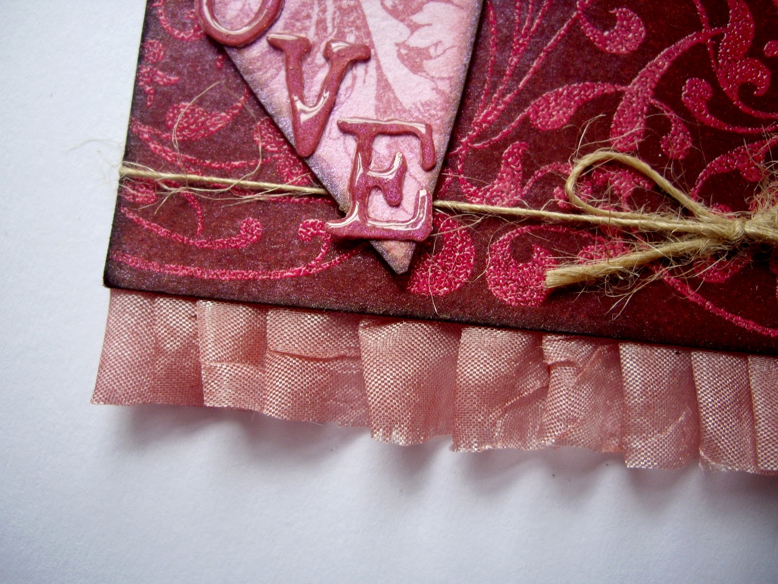
The front of the ATC pouch with a thick jute string tie. The background card was coloured using a combination of Distress Inks, Dylusion Sprays and gold shimmer spray. I love the way the mica appeared to react with the dyes - a bit like putting salt on wet watercolours. The letters were die cut from some scrap backing card and covered with glossy accents (I HAVE to get it in somewhere!). All edges were inked with walnut distress ink.
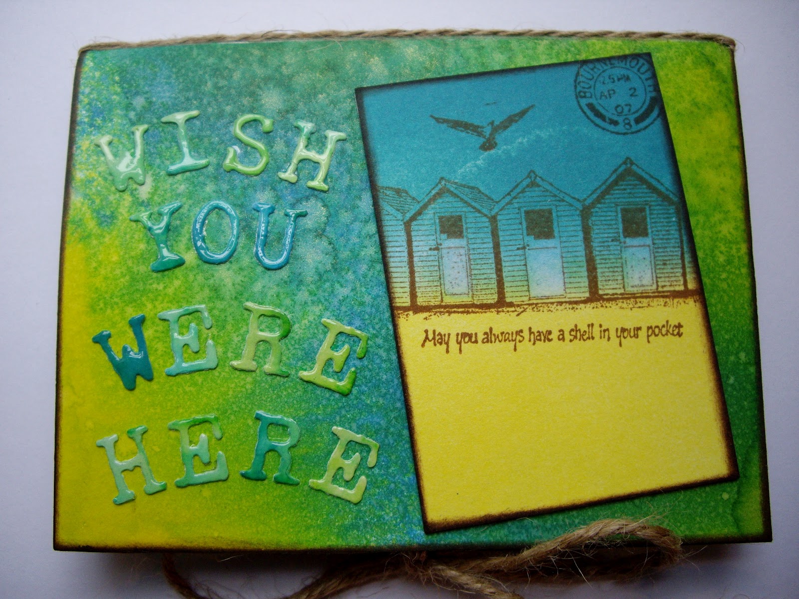
The first ATC was put on the front. The background used distress inks & gold shimmer - love the 'cloud' effect which appeared after adding shimmer spray. The images were stamped in coffee archival ink. Edges inked with walnut (now more favourite than victorian velvet!).

The open pouch showing two 'pockets' to hold the ATC's. Backing cards were all coloured as previously described. The stamped 'waves' were highlighted with a white pen. The beach words were stamped with coffee archival ink. Jute string was added to hide the fold in the centre.

This stamped image was added because it reminded me of a spiral shell and all the words are beach related.

Both ATC's have inked backgrounds. Stamping has been done using a various archival and versa colours . The 'waves' on the right have been embossed with pure white powder to imitate foam on the waves - the stamp was free with Craft Stamper. The ATC on the left has water bubbles stamped in 'versa color'. The words were stamped with versa color and some  were randomly embossed with clear powder to make them stand out more. The beach huts and the paddling lady are made from shrink plastic.

Close up to showing the shrink plastic lady. She was stamped with stazon and coloured with pencils prior to being shrunk. A hole was punched before she went in the oven so a jute thread could be tied on. The beach huts were produced the same way.

The original sized lady and shrunk counterpart!
The remaining two ATC's. Backgrounds the same as before. Stamping done with coffee archival. Tickets stamped on kraft card. The lady was coloured with watercolour pencils and a water brush.

Please leave a comment if you wish - any tips are very gratefully received I can assure you!


Thursday 21 June 2012

A Bit Of Brown . . . . . Vintage Style!

The challenge this week at Simon Says Stamp and Show is to make a project and include some Brown. I particularly love using walnut stain distress ink and coffee archival ink colours in my work, so I knew where to start with this project. In my previous post I used one of my favourite stamp images and couldn't resist bringing her out again this time! I love Lynne Perrella stamp designs but only own one set at the moment, so they may feature here from time to time (the others are ALL on my wish list of course!).

I wanted to make something with a very vintage feel and decided to make another book mark. I love making these as I feel they can be beautiful and functional at the same time.

See what you think of my latest piece:

The finished book mark. No picture showing the individual elements I'm afraid - I was busy assembling the piece when I remembered I hadn't taken the first photo!

The top of the piece is constructed from the stamped Lynne Perrella image in coffee archival,coloured with antique linen with some walnut distress ink on the edges. The face was bleached out using a water brush to make the features stand out and to give that 'vintage' look of porcelain skin.

The cheeks were lightly blushed with victorian velvet distress marker and covered with glossy accents to make them a feature.

The 'hat' was made from die cut flowers. Each flower was stamped with a floral image, coloured with victorian velvet distress ink, edges inked with walnut distress ink  and finally covered with glossy accents. When dry, the hat was assembled with brads and wired beads used as additional detailing.
The background was stamped using various distress ink colours and was kept as vintage looking as possible by stamping lightly and with randomly applied levels of colour. Paper ageing 'spots' were added using a stamped image to continue the vintage feel. The flower was made using the same techniques as the hat. The little sentiment hopefully says 'Save My Place'. I opted to print it out in Italian as it is such a romantic language and I felt the whole project has an historic, Italian feel. I did the translation on my phone so fingers crossed it's accurate!

I stamped the main image twice and layered them to give more detail. The little faces were again bleached using water brush to give them prominence. Note the inked edges which really help with the vintage feel. I wanted to add ribbon as a finishing touch but it looked out of place. The natural jute thread looked more in keeping with the theme and far more authentic.


Sunday 17 June 2012

Industrial Chic And Men/Boys. . . . . . . .

I have been wanting to join in at Dragons Dream Tag It On for some time after seeing their link on May's blog. Must admit to feeling a little intimidated as the work over at Dragons Dream is amazing but I decided that there's only one way to develop and grow and that's to have a go! Their theme this week is 'Industrial Chic' which was quite difficult for me as I had to improvise with the industrial imagery part of the 'recipe'. I don't have anything that fits this ingredient so I decided to tackle the theme from the only angle I had open. I had a stamp which shows the construction lines used to develop industrial type drawings - hope this is a good enough link! Cogs and vintage browns was a little easier to achieve even if cogs are not my favourite thing!

Today is another week over at the lovely Hel's Sunday Stampers and of course I can't resist having a go. The last two themes Hel's came up with suited me perfectly as I was already working on an appropriate piece. So this week the theme at Sunday Stampers is Men/Boys and I'm hoping that this piece will fit there too. I asked my nearest and dearest if he thought this piece was 'manly' and he seemed quite convinced so I'll have a go and link it to the Sunday Stampers blog - fingers crossed!

I love working with metal tape and card so thought I'd use this technique on my tag - again! The difference this time is that the girly colours have gone out of the window and are replaced by a very masculine palette. See what you think:

The elements used to make the tag.

The completed tag.

The 'flowers' were made from white card covered with metal tape and die cut. The flower shapes were further embossed and along with the cogs, were coloured with alcohol inks. The flowers were shaped and screw head brads finished the look. One cog shape was combined with a flower shape to create an interesting effect. I added the stamped clocks as an additional industrial element - on the first photo, you can see that I've also stamped some barbed wire to fit in with the theme.

The tag background was created by embossing metal tape covered card and coloured with acrylic paints to achieve a metallic look.

The clock images were stamped and inked. The cogs were created as before. Instead of ribbon through the tag I coloured a split ring with alcohol ink to match the other elements and attached a little charm from a clothing label. The key and screw head brad finish the look.
The 'headdress' on the stamped image was created using part of a cog and an off-cut from a floral die cut which was embossed with distress powder and then coloured with gold mixative. Underneath the headdress you can see the walnut brown distress embossing powder which is there to represent hair. Another screw head brad was used to finish the headdress.

I love this image! Hopefully, the 'industrial' element can be loosely acquired here: technical drawing (now often done on the computer using CAD software) used lines to help construct a range of shapes accurately. On this Lynn Perrella stamp image, the construction lines can be clearly seen on right of the image. I couldn't resist adding a little girly touch with the red lips which was added with distress marker. The face was inked but this was removed in the eye region and the 'cheek' circles - this seems to make the features really stand out.

Friday 15 June 2012

Men. . . . . . . . .

I'm not one for making male cards - sure I've said that before! - but the challenge at 'Artful Times' this week is 'Men' and I do like trying to enter something for each of their challenges.

The challenge at 'Make My Monday' is for a 'Father's Day/Masculine' theme so I'm going to show my work there too.

Having already made a Father's Day card, I decided to make a 'Dad' card which could be used for a variety of occasions.

I struggle with male images but I do like this little car stamp although I'm not sure such a car would be much fun to drive! I decided to choose an earthy colour scheme with browns, cream and a little gold. I love kraft card and have been wanting to use some that I had so made the card blank out of a sheet. The ridged card was of the same tone so I livened it up with some inking and embossing. I've had the faux screw brads for sometime but never found a use for them until now. . . . . .

I made a liner for the card and stamped the same image inside and added it to the envelope too just for good measure!

Here's the details of how I made my card:

The elements used to make the card. The spotty background was applied to the kraft card using a mask and Distress Ink. The car on the left is stamped onto the paper used to make the card liner.

The completed card.

The letters were cut from card covered with metal tape. They were coloured with alcohol inks and I tried to achieve a 'nicotine' tone. I like the way the metal tape crinkles when it is cut on small items. The letters were applied to scrap card which was coloured with Distress Inks and lots of flicking! The ridged card was inked on the edges and gold detail powder was randomly embossed to add a little glitz. 

The main image was stamped onto water colour paper to help give a textured, aged appearance. I tried it first with Distress Ink to achieve a water colour appearance but it didn't suit the image chosen so I used Archival Ink instead. The area around the image was lightly inked and water was used to help achieve an aged look. The edge of the paper was torn and inked. Faux metal fasteners hold the image in place and add to the masculine feel.

I enjoyed making this card and particularly liked working with this colour scheme and the kraft card - need to think of something else to make, using the same palette and materials. . . . . . .!


Pink With Double Ribbon (well ribbon and twine in my case!). . . . .

The challenge this week at the Sunday Stampers is to create something with the theme of 'Pink'! This made me remember my daughter when she was little and how everything had to be pink otherwise it was rejected immediately! She's now twenty and is far too sophisticated for most shades of pink but the memories  are something special to keep hold of. I love pink but prefer what I call the 'dirty' shades of pink rather than baby pink. One of my favourite Distress Ink shades is probably Victorian Velvet so that gives you some idea of where I'm coming from! I decided to make a tag for Hel's challenge as I'd already started a pink background and didn't really know what to do with it . . . . . . I think she's reading my mind as her last challenge fitted perfectly with something else I was doing at the time!

The theme at Simon Says Stamp and Show is 'Anything Goes' so I'm going to enter my tag there too.

At 'Shopping Our Stash Weekly' the theme is 'Double The Ribbon (or twine or both)' so my tag will fit in with their challenge too. I love ribbon and natural twine and I've been trying to use them a little more in my work. I've found some lovely crushed ribbon in a natural shade which is easy to dye to the colour of whatever you're making, so now I've decided I need more Distress Stains. . . . . . . luckily I had the right colour for this project (I only have three distress stains anyway!) and everything else was all there just waiting to be used.

So, here's what I've made this time:

The elements I used to make the tag. I've shown four flower 'tiles' here but in the end I only used three on the tag as I felt it would have been too crowded.

The completed tag with three flower tiles instead of four.

The ribbon trim was dyed with Distress Stain and then pleated and attached. I love all the wrinkles which give a slightly 'shabby' look.

The heart was die cut from scrap card which had already been sprayed with pink shimmer. Part of a floral image was stamped on the heart and the edges were inked. The letters were die cut, coloured with Distress Ink and shimmer spray. When dry, they were coated with Glossy Accents and attached when dry. They have the look of pearl nail varnish in real life - love this look! I used an offcut of the ribbon to made a tiny rosebud which was tucked behind the heart.
The bottom edge of the tag was stamped with a floral border image and then embossed using Crystal powder to act a resist medium. I really like the way this lightens the pink tone against the background colour. A piece of natural twine finished the look on the lower part of the tag. I used twine which is very fine to keep to the delicate, feminine theme. 

The background was created using Distress Inks, an old 'Impress' ink pad and shimmer spray. Water was sprayed through a dot stencil and allowed to spread a little before being dried. A floral stamp by Paper Artsy was used with Coffee Archival to add depth and interest to the background - I was pleased that this colour looks more like plum than coffee and will try to recreate this effect again. The edges were inked with Walnut Distress Ink. The little sentiments were stamped onto the same scraps as the tiles and fixed with brads which were coloured with alcohol inks to match the pink theme.

The flower images were stamped and then cosmic shimmer powder was brushed over the wet image - in real life they have a lovely, pearly sheen but it's not easy to catch on camera (for me at least!). The edges of the tiles were powder embossed with 'Aged Rose' embossing enamel by Stampendous. This was repeated several times to achieve a ragged, dripping effect. The various colours in the embossing powder seem to show up really well when a more random approach to embossing is used - I love using this method as it gives a very textured, tactile finish.

Hope you like this piece of work. Please leave a comment if you wish and many thanks to all those new followers who visit me and say such nice things. I have tried to visit you too but if I haven't got there yet, I will soon.

Friday 8 June 2012

Red, White and Blue. . . . . .

The challenge set by Hels at Sunday Stampers this week is Red, White and Blue. Very in keeping with the celebrations over the weekend and for an ATC swap I'm involved - luckily for me!!

I've never made an ATC before and I must say it's quite a challenge working in such a small space. I had to think hard for this one as I only have one set of stamps suitable and I needed to use something that wouldn't look out of place on the small card. I wanted to build in some texture too and did this through using fabric, embellishments and by making a 'coin'. I really enjoyed doing this and will most certainly make one of these again.

No more explanation needed as hopefully, the pictures will tell the story:


The elements used to make the ATC and a little fabric tag made to accompany it. 
The completed ATC plus front and back views of the fabric tag.
The tag was made by stamping two patriotic designs onto fabric using Stazon. A layer of vilene (fabric stiffener) was ironed on to the back and the two pieces were then stitched together. An eyelet was attached in one corner (not brilliantly unfortunately but that's another story!) and some ribbon threaded through. For those who have visited here before this stamp and the use of fabric will be familiar to you but I couldn't resist using the technique again!


The background on the piece was stamped using Distress Markers straight onto the stamp - this enabled two colours to be used. Can you spot the mistake I made on the 'flag'?! The thin strips down the sides were made by the technique previously described and then stitched on. The little crown is a silver brad embellishment which has been coloured with a little gold rub n buff paste (very smelly stuff if you ask me!). The gems were coloured with alcohol inks (the red & blue ones).

The 'coin' was made by cutting a circle of card to match the size of the stamp chosen. Three layers of gold detail powder were embossed and whilst it was still molten, the stamp was applied. The stamp was inked with embossing ink prior to use - I saw this technique on a blog ages ago but can't remember where: if it's your blog then a big thank you because it's a great little skill. A little rub n buff was applied to the coin just to even out the tone and it was then attached over a piece of ribbon - a thin strip of acetate was glued on the back of the ribbon to keep it in shape.

I made five of these two items in total and I'm glad I didn't have to make more - not sure 'mass' production is my thing! Hope you like this deviation from my normal style!

Wednesday 6 June 2012

Texture And Anything Goes. . . . . . . . . .

When I saw that the challenge at Simon Says Stamp And Show was 'Texture', I knew I had to have a go at the challenge! I really enjoy building texture into my work and sometimes have to stop myself from going bananas and adding everything bar the kitchen sink to my work!

The challenge at 'Try It On A Tuesday' is 'Anything Goes' and I always appreciate a lovely open theme to work to!

I have returned to making a tag for these two challenges. I don't know what it is about them but I do love making them! I've concentrated on the theme rather than making it for a particular person or occasion. The design is such that I can add an appropriate sentiment when I decide to part with the tag.

Unfortunately, the photo I took of the individual elements used  was so blurred that you would have wondered what it was showing so I can only start with the completed piece:

The completed tag with natural hemp string at the top and used as flower centres. The background was coloured with various Dylusion inks and Distress inks. A small flower image was stamped on in a toning colour to add depth and detail after the tag had been dry embossed and de-bossed using the same folder - read on for further details.

The flowers have (again!) been die cut from card covered with metal tape. They were coloured lightly with alcohol inks and stamped with Stazon using a floral image. When dry they were embossed in a 'dotty' folder. Next, a coating of Crystal embossing powder was applied all over each flower. Once teased into shape some random gold detail powder was added to some of the flowers. Tufts of hemp fibres were threaded through for the flower centres.

The embossed image was powder embossed with Crystal powder to give it shine. The centre of the flowers were constructed using seed beads and Glossy Accents. When dry, some gold detail powder was randomly applied and embossed. I left the de-bossed image quite plain so that it created a more detailed backdrop for the more showy images.

Another close up showing the background and the 'metal' flowers. I really like the softness the tufts of fibres give to the flowers.

The different embossing methods can be clearly seen in this image, along with the stamping on the background.

For the top of the tag, part of a die cut was used to add interest. It was coloured and embossed in the same way as the main tag. Extra walnut Distress Ink was added to this section and to a lesser extent to the remainder of the tag. I like the shadow effect it gives where it has been applied.


Saturday 2 June 2012

Faux Antique Metal. . . . . . . .

One of my most favourite places to visit is the Craft Barn in Lingfield - I know how sad that sounds but I just love going there with my sister and having a natter whilst drooling over all the products!! Perhaps even buying the odd thing or two. . . . . . . !!

They haven't run a challenge for some time so I was delighted when I saw that they had another on the go. Their design team produced some gorgeous samples based on 'faux finishes' and the challenge is to use one or more of these techniques in your project.

The challenge at The Stamp Man this week is 'Make It For A Man'. I will also show my card here as I do like to join in with their challenges when I possibly can.

One of my favourite techniques is to use metal tape from B&Q in my crafting so I chose to use the faux antique metal technique on a Father's Day card for my father in law. Luckily he doesn't look at this blog so I know it's safe to show it here. I think if my Father were still alive he would certainly have liked this card and the techniques used.

The main elements I used. When I'd put these together I decided to add another layer and some 'faux' rivets which are not featured here I'm afraid.


The completed card.

I embossed one piece of plain white card in the balloon folder and coloured it using various shades of blue Distress Ink. A second piece of card was covered with adhesive metal tape and embossed using the same folder. The metal embossed sheet was then covered with black acrylic paint, left to dry for a few minutes and then wiped off leaving residue in the crevices for an 'antique' look. Sections of the 'faux' metal sheet were then cut out to be applied later to the blue sheet.
I die cut some letters for the word 'Dad' from off cuts of the blackened 'metal' sheet.

In this image you can see the middle layer which is a sheet of music that has been coloured with  shades of Distress Ink.
At the side of the image you can see the 'faux' rivets I made from eyelets  and paper fasteners which I added for extra detail.

Before attaching the 'metal' elements' I added some embossing powder to create a halo effect on certain parts of the design. You can see it here around the word 'LO'.