Friday, 1 April 2016

Spring Is In The Air for A Vintage Journey

Hi everyone. It's time for a new challenge at A Vintage Journey. This month, the lovely Sandy is our host and here's what she has to say:

Leave those winter blues behind. Make anything which says SPRING using pastel colours. It is your choice: a card, canvas, 3D, a card or a tag etc. Please remember it should be in one or more of the following styles we favour: shabby,vintage, mixed media, art journalling, industrial or steampunk.

I always associate little lambs, chicks, bunnies and gorgeous flowers (which brighten our gardens and hedgerows after the winter) with Spring. I decided to make an ATB for my project. (Thanks to the lovely Anne Redfern who sent me some ATB's as die cuts many moons ago!).

Here's my Spring inspired ATB:


A super sweet vintage scene with the little girl, lambs, bunnies (playing trumpets!) and some gorgeous spring inspired blooms.


I made a rusty fence from two die cut pieces of grunge paper.


The little girl image is printed from Pinterest then stuck onto card. She's fussy cut, sealed with matte medium then given a coat of crackle glaze to age her. The edges are inked and some raw umber acrylic paint has highlighted some of the cracked areas.


Her hat was a little bare so I added a small crackled flower with a gem to pretty it up.


The bunnies were found on Pinterest too. To give a good group of them, I printed out two bunnies as they came but flipped the image to get two facing in the opposite direction. They then received the same treatment as the little girl.


Die cut leafy stems were stuck onto the shape after constructing. A layer of gesso was applied. Four faces of the ATB were layered with DecoArt fluid acrylic green gold paint. Next came dry brushing in two colours to tone the green down a little. This was followed by some stencilling with DecoArt chalky paint in a toning green shade. The flower stems are dry brushed with gold metallic fluid acrylic then everything is give a coat of crackle glaze. The gorgeous lamb image was made in the same way as described before and also came from Pinterest.


The stencilling which gives a lovely vintage look to the sides and echoes those wonderful Spring green shades.


Little die cut leafy stems for the flower blooms to sit on.


Four feet are made out of silver beads which are given some colour using a DecoArt Metallic Lustre cream. The edges of the block are finished by applying some jute string to unify the look of the edges.


The tiny blooms are punched from scraps of gelli plate prints. They are given a layer of crackle. some inked edges and a little raw umber fluid acrylic highlights the crackle. Each flower is then shaped with the end of a paint brush, glued together and finished with a toning stick on gem.


The top of the block is painted as before but without stencilling. To complete the look I've added some real moss collected whilst walking my dog and a range of blooms all made as before. Love how the little girl's feet look as if she's stood in the grass amongst the flowers.

So there you have it - an almost cute little project from me but still with enough grunge to hopefully give it some street cred!!

You really must pop over to A Vintage Journey and see the beautiful projects made by my teamies - you will absolutely love them! 

Our generous sponsor this month is Country View Crafts who have kindly donated a £20 voucher for the winner of this challenge. you need to be in it to win it remember!! You could also be one of our Pin Worthy mentions so it really is worth linking up and having a play with us.

Thanks so much for popping by. If you are interested in any of the techniques and/or products I used for this project please just drop me an email and I'll do my best to answer you as soon as possible.

This is one of two posts I'm sharing today. If you'd like to see the other post, please click here.

Gypsy Fayre For Our Creative Corner

It's time for another challenge over at Our Creative Corner and our hugely talented host this month is the lovely Candice. Here's what she has to say with some inspirational images too:

Blessed are the gypsies. The makers of music, artists, writers, dreamers of dreams, wanderers and vagabonds, children and misfits: for they teach us to see the world through beautiful eyes. This month's challenge invites you to let us see your gypsy nature. 

Gypsies are wanderers, purveyors of exquisite things, mysterious things, free-spirited bohemians curating the beauty of life and sharing the wonders with you as the travel along.

So for the challenge let your creativity run wild and free like a gypsy. 

I want you to create interesting items you might imagine finding at a traditional Gypsy Fayre.
You may create whatever your gypsy heart desires, but it must.... contain at least 3 colours from the featured colour palette or show us how your project is inspired by this gorgeous ode to the gypsy soul!

So craft with the soul of a gypsy and share the wonder with us.

I was a little lost at first I have to admit! However, I then remembered that when I was a child we would regularly have Romany folk calling at the door selling small bracelets, lucky charms and such like. My Mother always bought a sprig of heather which she was told would bring good luck and this started an idea in my head!
Here's what I made:

My own version of a good luck heather sprig with some 'gold' trinkets added for good measure! I presented them all on a tag so they could be sold exactly like this at a Gypsy Fayre.

Here's how I made the 'gold' trinkets to adorn my good luck heather sprig:

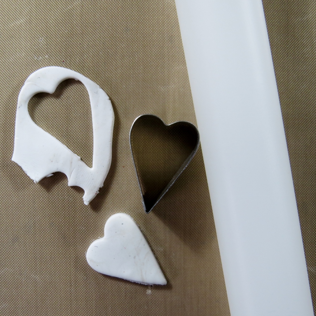
Some Fimo clay is rolled out and a cutter is used to cut a heart shape. 

A rubber stamp is used to add texture to the clay heart. At this stage, objects made in Fimo need to baked to harden them. Follow the instructions on the packet. I've tried paper clay and air dry clay but I just can't get such crisp imprints from the stamp - must be me!

For the bee, a ball of clay is forced into the aperture on a silicone mould. The excess clay is cut away using a spatula. 

The silicone mould is gently manipulated to release the bee. At this stage, follow the packet instructions for baking your clay pieces.

The clay pieces are sealed with clear gesso followed by a generous coat of gold metallic fluid acrylic. Leave to air dry.

Add crackle glaze to the clay pieces and leave to dry to create those lovely crackles.

Gently rub in some raw umber fluid acrylic to highlight the crackles. Glue a jump ring to the back of each piece to enable it to be used as required.

The bee is used at the top of the tag. It can be easily detached and used by the purchaser. According to old gypsy lore, it's really good luck if a bee flies into a gypsy caravan.

The heart is used to decorate the silk wrapped stems of the heather. Some gold embroidery thread is twisted around the sari silk and through the jump ring on the heart. White heather is allegedly the luckiest because it shows that no blood has been spilt on the battle field in that place. My heather is dried and came from our wonderful holiday on the beautiful north west highland coast of Scotland. I just had to bring it back nearly two years ago - good job I found it again!

The background of the tag is sprayed with three colours close to some of those on the colour inspiration image. I used DecoArt acrylic misters and a water spray for the task. This was followed by more crackle glaze and when dry, some white Antiquing Cream. The excess antiquing cream is removed with a baby wipe and once dry, everything is buffed with a soft cloth.

The gold design started as a thin layer of modelling paste prior to the painting of the background. Once the misters had added colour, the stencil was replaced and the modelling paste was give a good coat of gold metallic fluid acrylic.

The letters are die cut from scrap card and coloured using two shades of acrylic misters. Next, crackle glaze is added followed by gold fluid acrylic to highlight the crackles. The edges of the letters are coloured with a Krylon pen.

I love those gorgeous rich tones in the background! The little silver 'blob' above the letter U is made using Liquid Glass (DecoArt). This dries in the raised shape as you see it. The 'blob' is coloured with the same gold paint as before prior to the crackle layer being added.

When my Mum bought the heather, the stems were wrapped in silver foil but I had some sari silk scraps and felt these looked so much better!

Finally, the edges of the 'packaging' are finished with some gorgeous green toned Metallic Lustre from DecoArt.

Over at Our Creative Corner you'll see some wonderful projects made by my hugely talented teamies!
Our generous sponsor for this month is:


Can't wait to see how creative you're going to be with this challenge! Thanks for your visit.
This is one of two posts I'm sharing today. If you'd like to see the other one, just click here.

Friday, 11 March 2016

Andy Skinner, DecoArt and Stampendous! Blog Hop

Morning everyone. It's my pleasure today to be featured over on the DecoArt Mixed Media blog as part of the Stampendous! blog hop. We are featuring the new stamps designed by Andy Skinner for Stampendous! along with DecoArt Media Line products.

Here's a sneak peek of my project which will go live today:

I wanted to do something a little unexpected with the stamps so you'll have to see what that was by visiting my link below!


For the DecoArt Mixed Media Blog click on the links here:
   Monday Andy Skinner
Tuesday Mark Gould
       Wednesday Mel Hookham
       Thursday Jools Robertson
                      Friday Julia Stratford-Wright (Me!)

For the  Stampendous! Blog click on the links here:
   Wednesday

You'll find all the info about joining in the blog hop over on the links above - you need to comment to be in with a chance of winning one of three prizes which will all be available for international shipping! Today is the last day to join in so don't forget to get hopping! Good luck and thanks for your visit.

Friday, 4 March 2016

DI Travel Bag At A Vintage Journey

Hi everyone. Today I have some really exciting news!! I've been asked to join the hugely talented team at A Vintage Journey and today is the first project I have made for them as a Creative Guide! I feel really honoured to have been asked and I do hope you'll like what I've come up with for the lovely Nikki's challenge. Here's what she has to say:

'For our birthday challenge we thought it would be fun to challenge you to use the products in our DI Travel Bag this month. You’ve seen how the Creative Guides have used the products in the past and you will see how they use them this month too. So join us in using the following products and enjoy the journey!

Substrate: Board (eg grey board, coaster board, cardboard)
Main Colour: Lilac or Pale Purple
Technique: Rust Effects (perhaps using rusting or embossing powders or rust coloured paints)
Product: Something Metal'

Here's the piece of wall art I've made for the challenge:


I've used grey board for both substrate layers; metal for the heart, wire, oval embellie and the decorative band and finally, I rusted the band and the oval using acrylic paints. The heart and wire were both pre-rusted.


One piece of grey board is sealed with gesso and stencilled with a home-made stencil and some modelling paste. A piece of lace is applied along with a second stencil design and modelling paste which is kept very sketchy and rough. White, turquoise and magenta misters are then used to add colour. To add a more purple hue, acrylic paint is then added but it still looks blue I'm afraid - no matter how many photos I took!! A little interference paint was also added to highlight some areas.

Detail shot.

The large stencilled areas are stamped with script and white gesso. Quinacridone gold paint is applied and dried. Thick crackle glaze follows and after drying, white antiquing cream is used.

Vague stencilling is applied with purple acrylic paint and the roughly stencilled modelling paste is given the same treatment as the main areas.

The decorative metal band is part of an old bracelet I bought in a charity shop. This has been given a rust like finish using texture sand modelling paste, grey and quinacridone gold paint.

The heart and wire are pre-rusted but the oval embellishment received the same rusting process as the metal band seen previously. The wire has been curled around a paintbrush handle.

This is the metal embellishments prior to rusting. I've added the pre-rusted heart so you can compare.

For the base layer, card is folder embossed and sealed with gesso. A light lilac colour is mixed and applied. This is followed by lots of dry brushing with titanium white fluid acrylic, a layer of crackle glaze and more quinacridone gold to highlight those cracks!

The embossed card is then applied to more grey board and all naked edges are finished with a Krylon pen.

All paints and mediums used are by DecoArt and they just happen to sponsoring this birthday challenge so you really must link up a project to be in with a chance of winning a wonderful prize! Remember that the Creative Guides will also be selecting their top three projects to win a pinworthy badge. Please do pop over to A Vintage Journey to see the wonderful inspiration from my lovely teamies!

Tuesday, 1 March 2016

The Return Of The Challenge

Hi everyone. It's time for a new challenge at Our Creative Corner and here's the challenge:

We are taking a trip down memory lane for this challenge! We would like you to re-visit a project that has been featured at Our Creative Corner. You need to choose your challenge from the following list and make sure you mention which challenge you have chosen in your post:

"The Return of the Challenge!" (click on the links for info)

June '13 "Recipe"

July '13 - "Captured Memories"

August '13 - "Words, Words, Words"

September '13 - "Forgotten Things"

November '13 - "Tic Tac Toe"

January '14 - "No More Shopping Sins!"

February '14 - "Three Colour Challenge (without the use of black)"

April '14 - "With a Song in Your Heart"

May '14 - "Love Those Leftovers!"

June '14 - "Flaming June"

July '14 - "Homemade Flowers and Hand-dyed Ribbon"

August '14 - "Summertime"

September '14 - "Autumnal Image Inspiration"

October '14 - "Go Rustic!"

November '14 - "It's Magic!"

February '15 - "Tic Tac Toe - Fun!"

March '15 - "Junk in Your Trunk"

April '15 - "Colour Your World"

May '15 - "April Showers Bring May Flowers"

June '15 - "What Makes You Smile"

July '15 - "Mexico Moods"

September '15 - Shades of Autumn"

November '15 - "Topsy Turvy!"


So there you have it! Have fun and link up your project with us this month.

For my project I chose 'Flaming June' from June 2014. I chose this not just because it was originally my challenge but because I love bright colours and the challenge asks you to use orange as your main colour. Here's the piece of wall art I made:

A piece of wall art featuring the following from the inspiration image: the colour orange and a female. Although the painting is beautifully traditional, I decided to go very modern with some retro overtones. Here's the inspiration image:

Perhaps a little artistic license on my part but it goes to show that a challenge can be interpreted in many different ways! I love this painting but it was the colour I really used for inspiration from it.

Firstly a gelli print is made using orange and yellow paint brayered together. The print is lifted on white copy paper. For the next step a stencil and some black acrylic paint is used to add the female image to the gelli print.

After this, many layers of gloss medium are applied until the original paper feels very pliable. Once completely dry, the backing paper is removed with water and a gentle rubbing motion as shown here:

Once the paper is removed, the areas without paint become transparent (perhaps a little milky).

The back of the acrylic skin once all paper has been removed.

A background is made on a piece of greyboard which is primed with gesso. The first step is to spritz the acrylic paint sprays (not white) until the desired effect is achieved. Some water can be sprayed onto the paint to help it combine. Once dry the white spray is used liberally and randomly over the orange toned layer. Stencilled images are then applied using black StazOn .

The background stencilling can be seen through the acrylic skin to add extra depth to the piece.

Detail shot.

To hold the skin in place, some upholstery tacks are coloured with black StazOn, the points are shortened with tin snips and the tacks are then stuck on.

The background images all revolve around circles and tear-drop shapes.


The edges of the grey board are swiped with the StazOn ink pad to frame the piece.

I hope you like where my journey took me from the inspiration image to my final piece.!

We have a generous sponsor this month so if you are lucky you could win the prize provided by these people:

We will also be featuring our Top Three Talent followed by one amazing artist who will become our Top Talent and join us with their own art work the following month. Don't forget to pop over to Our Creative Corner to see the wonderful inspiration from the rest of the team.

Thanks for staying with me and I look forward to seeing your entries when they're linked up!