Saturday, 1 February 2014

A Three Colour Challenge - With No Black At Our Creative Corner


Hello everyone. It's time for a new challenge at Our Creative Corner and this month our hostess is the wonderful Jenny from Pushing The Right Buttons. Jenny has come up with a real treat of a challenge which will have you putting your thinking caps on!

The challenge set requires us to use three colours: Blue; Plum/Purple and Brown. No black lines are allowed at all! This had me thinking for a while but I eventually decided to choose three colours of paint, some stencils and a stamp to see what I could come up with.

Before I show you what I've made, don't forget to visit Our Creative Corner and see what my very talented Teamies have come up with. We all show together at the start of the month now so you're in for a treat - so many different makes from the same starting point! Check the rules and details of our fab sponsor while you're there too.

For me, the colour combination had a contemporary/retro feel and the use of geometric shapes came to mind. My first attempts on card just didn't work and I wasn't getting anywhere fast. I then decided to substitute fabric for the substrate and I was away. . . . . . . . I didn't have a clear outcome in mind but decided to use the colours, stencils and stamp to produce a piece of fabric first. I would work out what to do with it after!

I chose some DecoArt paints, one of their fabric mediums which means you can use ordinary paint on fabric, a piece of white pure cotton, some stencils and a script stamp to make this:

The completed fabric was used to make a glasses case - I can NEVER find my glasses and it drives me mad! I usually have them on a beaded chain but I've now broken two and don't think it's worth buying another!
I started building up the design by using the desert turquoise paint with the 'block' stencil. Some mulberry paint was then used to edge each block. Further stencils were then used to fill in the design.

The script stamp was used with burnt umber paint and fabric medium onto white cotton fabric. I didn't take particular care with this task because the fabric was to be cut into 3cm strips. This fabric was cut on the cross to enable it to be used on the curved edges of the case.
When stamping with acrylic paint, I find it best to brush a thin layer onto a craft mat. Tap the stamp  several times - gently - onto the paint to coat the stamp. I tend to hold the stamp in position a little longer when working on fabric. 
A scrap of fabric was used to cover a 'self cover' button which I thought would look good.
A loop for use with the button was worked in matching thread.
A nice snug closure to keep those glasses safe!
I love how the paints work together and the mulberry paint almost seems blue when it touches the turquoise.
Back view of the case. I should add that there is a layer of cotton batting fabric between the outer and the lining. This is to protect the glasses against sharp objects in my handbag.

Something very different from me this time and I hope you like it. I keep thinking I should use fabric more but I do love to grab card, paper and things to alter too.

So, it's your turn to make something using blue, plum/purple and brown (but NOT black remember!), link up with us at Our Creative Corner and you could have the chance to win a prize from our wonderful sponsor. For more details click here.

Thanks for taking the time to visit today. I will have a second post later today if you'd like to take a look.


Thursday, 23 January 2014

The Ombré Technique At Craft Stamper. . . . .

Hello everyone. I've been gone again for quite a while - sorry. Just settling in to our new home, having chimneys swept and not really having a crafting hat on for much of the time. I really don't like it when you want to play but the mind is blank and no amount of messing around produces anything that satisfies.

I decided to look around for some inspiration and thanks to a reminder on Facebook by Jenny, I went back to my Craft Stamper and flipped through until I found the article on the Ombre technique. I didn't have a clue what it was and then realised that this was probably something we've all done from time to time with our inks and paints. I just didn't know it had a name!

The latest challenge on the Craft Stamper blog asks you to produce a creation using the technique and this seemed to be the just the kick start I needed to get inky again.

I decided to get three distress colours out and some stamps and have a play. I wanted to make something useful so decided on a card - you don't see many of those here do you?!!

Here's my latest offering. Something a little different but so much fun to make (thanks Jenny!):


I chose three distress colours: barn door, spiced marmalade and mustard seed along with a much loved LP stamp and a sentiment stamp. Some die cutting, punching, dry embossing, stamping, water brush work and finally a little twisted wire (because I can't resist it!) and there you have my card. Oh, and of course, the Ombré technique!

I've used three different layers to work with: plain card, dry embossed card and canvas. Each layer displays the Ombré technique using the colours chosen. I so love the stamp used and I was pleased how well it worked over the coloured background.

I used parts of the stamped image to make little punched blossoms and used a water brush to bleach out the colour from the iconic LP cheeks. I used all three distress colours in turn for all the blossoms so they kept the technique going throughout the card.

The top layer of card was firstly inked in the manner described in the magazine then embossed in a folder for extra texture. The middle canvas layer was also coloured using the technique and some walnut stain distress was added to the edges.

Some card was again coloured with two of the shades, stamped to add extra detail using a combination of both inks on the stamp. When dry a label was cut and stamped with the sentiment in archival. Some brads coloured with alcohol ink finish the label.I used some foam pads to attach the label for extra dimension. You can also see the stamping on the bottom layer here - it's very subtle.

As you may have guessed, I stamped the image several times and then used various sections on my card. Here I have cut out the 'rose' image, used a ball tool on the back to add dimension and attached it in the appropriate place on the card.

In this image you can see how even the tiny flowers have been given dimension by using a ball tool on the reverse.

Some rusty wire was gently coiled and added to the card. I used the direction of the embossed pattern to determine where to put the wire.

I used most of the stamp image but did remove a little section at the top because it looked to fussy when cut out. This stamped strip was attached to the embossed card using foam pads for extra height.

So love those little faces peering out from the blossoms! Tiny black gems were used for the centres of the blossoms - bling's not my thing but I like these tiny ones for this purpose.


I really enjoyed this little make and the great thing is of course, I get to add another card to my rather small collection (I should make more!).

Thanks for having a look and not giving up on me completely! Two more projects are almost ready to go so perhaps you really WILL see more of me now. Hope you are all well and I look forward to trying to catch up with you.

Saturday, 4 January 2014

Challenge 31 At Anything But A Card. . . . . . . . Balance.


Hello everyone. Hope your first week in 2014 is going well. It's time for a new challenge at Anything But A Card and this time the theme is based on the photograph below and one word:  Balance.


I had to think quite hard for this challenge! Eventually I decided to take the word Balance and use it in a fairly literal sense.  I could have used the colours, the shapes, the sea or a host of other starting points that this photo and the word conjure up. That's the wonderful thing about challenges at Anything But A Card - you can think as far outside the box as you like and as long as it's NOT a card and you reflect the theme in some way, then we are always thrilled to see what you come up with!

I couldn't get the image of something balancing out of my head so here's my little ATC which depicts balance as I see it:

I've used my favourite Oxford Impressions steampunk bird stamp and he's balancing on some 'rusty' machinery.
For the 'rusty' machinery, I used an old mirror fixing, two die cut card gears and a heart brad to secure them together. The rust was all achieved using DecoArt Traditions paints, their sand texture paste and some Andy Skinner Timeworn techniques.
An ATC was die cut and covered with part of a gelli plate print (made using DecoArt Americana and Traditions paints) then run through an embossing folder. To tone down the brightly coloured gelli print, some DecoArt Metallic Lustres were applied along with a little Treasure Gold to add a green tinge.
Both hat and bird are stamped with archival ink onto white card then cut out. The hat was embossed with clear powder, decorated with some rusty wire and the theme word added using a label maker.
I wanted to make the bird look as if he was balancing on his perch. The rusty wire is used to help secure the foot on the 'machinery'.
I decided to colour the bird in a bright colour to make him stand out yet still tone with a similar colour used in the background.

Hope you like my little bird. I'll have to try not to use him again on an ATC but I can't promise!
So what will you make? Need some more inspiration? Why not pop over to Anything But A Card and see what the first team have come up with and remember, the DT is split into three. That means that each of the following weekends will provide some further inspiration for you! Click here to see what my teamies have made for you. Can't wait to see what you make for this challenge. . . . . . . 

Wednesday, 1 January 2014

No More Shopping Sins. . . . . . . . . . At Our Creative Corner

Hello Everyone and a very happy and healthy New Year to you all!
(I'm hoping that 2014 brings more good times to our family than perhaps some of us experienced in 2013.) 

A new challenge begins at Our Creative Corner today, hosted by the wonderfully talented Claudia. You are asked to search out supplies which you bought but have yet to use - we all have those little goodies hiding away somewhere don't we? We may be holding onto them because they are so precious or perhaps you bought something and then wondered what on earth to do with it!

This month we have a wonderful sponsor on board too for a randomly drawn entry. We are delighted to be able to offer a prize, kindly provided by Crafty Individuals! Not only is Claudia's challenge a great deal of fun but you get the chance to win a lovely Crafty Individuals treat just for entering. No brainer really isn't it?

Why not pop over to Our Creative Corner and see what my other teamies have come up with? I promise that you're in for a treat if you do. The best part is that you get to see all the design team's work now,  at the start of each month. A feast of inspiration for you all!

I had absolutely no problem fishing something out of my cupboard. I bought these flowers when I first started crafting with any regularity so they have been hanging around for nearly two years. They are very pretty but I have never found a way to combine them in my work - I prefer to make my own these days!

Delicate 'baby's breath' flowers which were just asking for a makeover!
Here's what I made to help show off my 'new look' flowers:

A beautiful sunny day took me outside to take my pictures. Some detail was lost in the shadows but you can see the details in the coming photographs.
The flowers were coated with acrylic wax followed by some rusting powder. This was left for a while then sprayed with vinegar and left to dry. So simple! The flowers were mounted on a painted scrap from my 'bits' box.
Some rusty wire was used to make springs and tiny rusty bells were attached to the ends.
I've had a number of rather battered bracelets for sometime now and decided to cut one and use it to finish the bottom of the tag. Some DecoArt Lustre was smoothed across the bracelet and buffed.
An oval shape was cut from card and coloured with distress ink. This beautiful Chapel Road stamp was then added using VersaFine ink. The edges of the oval were roughly embossed with gold powder.
The tag background was coloured with distress ink and then architectural and floral images were stamped using distress inks in various tones. The edges of the tag were shaded with Versafine ink. Embossed gold script was used randomly in the background of the tag.
A little rusting powder was used around the edges of the stamped oval too.
I still had a few of my leaves left so decided to use one to mount the oval on. Before using the leaf it was coated with some matte medium to help preserve it and prevent it crumbling.
The top of the tag is finished with some chunky jute and rusty wire.


I hope this inspires you to go and have a look over at Our Creative Corner to see the gorgeous pieces made by the other members of the team. It's over to you then to rummage through your craft stuff and find something that you've never used before in a project of your choice. Link up with us at Our Creative Corner and you may be the lucky winner of the Crafty Individuals prize; you may be chosen as one of our top three talents by Claudia and you could even be our 'top talent' next month! What are you waiting for? Can't wait to see what you come up with!

Sunday, 8 December 2013

Mixed Media Birthday Card

I've just made a birthday card for my sister and thought I'd share it with you all. You can tell her age from the front so I won't make it even more obvious and write it here!

Happy Birthday Sandie - hope you have a lovely day!!

She's a gardener by trade - one of those amazing people who know the latin names for plants and how to prune things properly, graft cuttings etc. I wanted to make something which would appeal to her love of plants and trees. I decided to go for the trees as I recently picked up a few beautiful, fallen leaves meaning to do something with them and then just watched them curling up on my desk! Luckily, they weren't too brittle so I set to and designed the following card and gift card/cheque holder. During the making I did lose one leaf tip but I hope that doesn't detract too much from the finished piece.


Birthday card featuring real leaves - inside and out.
Gift card / cheque holder again featuring a real leaf. A circle punch is used to cut away a section of the top to allow access to the contents.
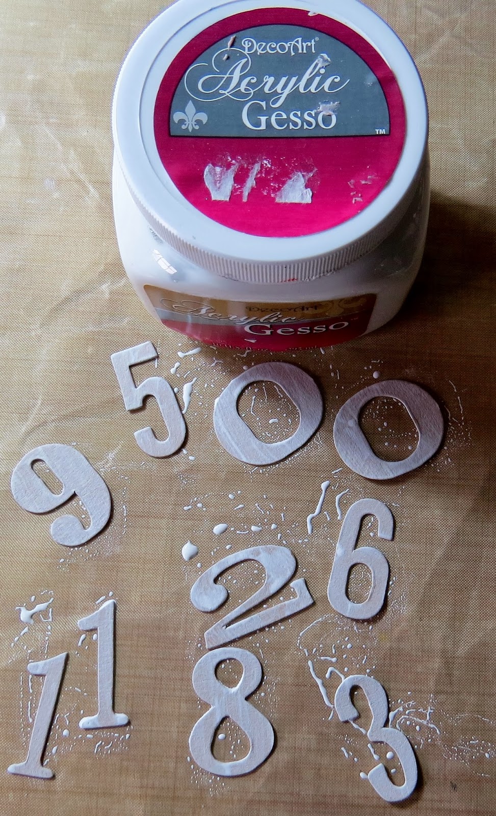
Die cut numbers from scrap card. Paint with two coats of DecoArt gesso in preparation for painting.
Beautiful autumn leaves 

Leaves coloured with DecoArt Traditions paints using a brayer.
Using the same paint colours as the previous step, paint die cut letters.
For the card front, a base was made using a combination of  distress stains and inks. A little water spritzing adds interest to the background.
To complete the background, some Tim Holtz stamps were used in a random fashion. 
The die cut letters were crackled with DecoArt Perfect Crackle followed by a coat of DecoArt Triple Thick glaze. Also in this image, you can see a fabric leaf. These were made by stamping onto TAP paper and transferring the image to fabric. Each leaf was then carefully cut out and edged with some distress ink.
Machine stitching in an appropriate colour finishes the edges of the card front. You can also see the DecoArt Metallic Lustre which I added to the leaf to enrich the colours against the background.

For the inside of the card I made a liner using kraft paper. Two sides of this were stamped with suitable images and detail was added with distress ink and a water brush.

The inside stamping was allowed to overlap onto the leaf - this was done using Stazon ink.

A second liner was made for the inside using calligraphy paper. 

The calligraphy paper was also stamped in white to give a watermark effect and extra interest. The sentiment was stamped and powder embossed, applied to card then cut out.
All the card layers are held together with tied twine. Wooden beads are tied to the ends of the twine to finish the look.
The card/cheque holder is made from two pieces of white card. Each piece was stamped with a woodgrain image and archival ink followed by a toning shade of distress ink.
The two layers of card are stitched together to match the card front. Another dried leaf is used to decorate the front but it has been left in a natural state.
Some dried twigs, twine and curled rusty wire are arranged to decorate the leaf and tied in place with the twine. Wooden beads are used again to finish the ends of the twine.
As I write this post, the card and gift card holder are on their way to my sister. I won't post until she has received her card but I do hope she likes it!


I enjoyed dusting off my distress inks and having a play with them. It seems ages since I did that and I'd forgotten how much fun they can be. Combine that with my favourite paints and crackle medium and I'm a very happy bunny! Thanks for visiting and I look forward to catching up with you soon.