Friday 7 October 2016

Make It Spooky. . . . .


Good morning. Today sees the start of a new challenge at A Vintage Journey. Our host is the lovely, talented, Anne who asks us to 'Make It Spooky'. Here's what she has to say:

As we approach All Hallowes' Eve, we want you to create a vintage, shabby, steampunk or mixed media project to celebrate the spookiness of Halloween. Don't limit yourself to black, orange and purple: just make it spooky!

I just love making projects for Halloween so I knew this would be fun! I decided to use some very spooky images from the internet on mixed media boards. These could then be used as notebook covers, card fronts or even as part of a canvas, box, storage unit - the list is endless!

Here's what I came up with:

Love those spooky eyes! 


I created two backgrounds using media boards from Tando Creative. Each was prepared with gesso then completed using the products shown in the photos. If you have any questions just email me!


I found two vintage style images on Pinterest. The first image of the two girls (not including the die cut shape) was already coloured and just needed cutting out. The children in the second image came from two different photos. They were cut out and tinted using the colours shown. The black and white pens added details on the eyes - the spooky bit!

I die cut some embellishments and gave them a quick rust treatment using the products shown. These were cut up and shared between the two media boards.

One of the media boards was given a word made from die cut letters. The letters were made from a stamped background coloured with the product shown. The letters were arranged on one of the rusty die cuts. (A Seth Apter design).

A piece of the stamped card shown above was used to create a quote for the second media board. The letters are rub ons. The spooky eyes are made using pens.

A piece of card was folder embossed and given a crackled, antiqued finish using the products shown. The frame design was cut to fit the media boards and each was given a portion for embellishment.

Lots of little eyes are watching from the background design! Not quite sure where the two girls are looking. . . .

I love how placing the black dots in different ways appears to make the eyes look in varying directions.

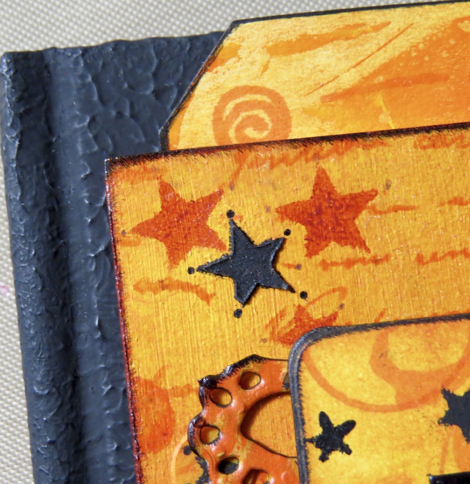
Detail showing the letters and rusted die cuts.


Not quite so many eyes in this one but those pumpkin heads are very spooky!

I love the little pumpkin she's carrying. The Distress pens work well when tinting pictures - being able to dilute the colours to just the right depth is great.

Using masking tape and paint gives a great shabby look to the background. The yellow showing through is where paint has been wiped away before it dries. The Archival ink gives adds to the shabby look when stamped onto acrylic paint. For a perfect image I would use Stazon.

The rusted die cut finishes off the media board and adds to the shabby, antiqued look.

I do hope you like my spooky children on their shabby backgrounds - I had lots of fun making these so thank you to Anne for a wonderful challenge!

Need more inspiration? You must go and see the work produced by the other creative guides. Just click HERE to be taken to AVJ for more spooky fun! Can't wait to see how spooky you will get!

Friday 29 July 2016

Tag Friday at A Vintage Journey

Today is Tag Friday at A Vintage Journey and it's my first time joining in with this event so I'm really honoured to show my tag along with the other Creative Guides. Whenever a month has five Fridays, a number of the Creative Guides choose to make tags. Anything goes as long as it is a tag and you should see what the other ladies have made for your inspiration!

Here's the tag I've made mainly using scraps (broken collar bones and crafting are not a match made in heaven!):


I've gone completely pink! I decided to use this month's 'Monochromatic' theme as my starting point. 

I've had these two tags hanging around for a while so thought I'd get them used up. The tag on the left was a try out of my one and only Distress Paint. The other tag was cut from a gelli plate print which didn't quite go as planned but which I held onto.

The gelli print was used to die cut various circle pieces.

The distress paint tag was given layers of pink toned stamping with various objects including credit card pieces, home cut stamps and bottle tops. I forgot to take a photo of the finished layers before constructing the tag - sorry!

A quick peek at the pink tones used in ink and paint along with two types of black ink for details.

Another discarded gelli print is used to stamp my chosen images onto. Thanks to Sam for making me buy these!! I love these Teesha Moore stamps.

The girl image is fussy cut and applied to the background. The white streak from the original gelli print has been left for effect.

The tiny girls were stamped just for their heads which are fussy cut and used as clock hands on the die cut circle pieces.

Another Teesha Moore stamp is used behind a die cut to complete the top of the tag. A piece of die cut scrap is used to finish the look.

My original inspiration came from a song I heard recently. Those of you who are of a certain age will remember the lovely Dusty Springfield who does a fab version of the song this line comes from. Any idea which song? The die cut has inked edges and the words are rub on individual letters.

The background layers can be seen more clearly here in the various pink tones along with black ink. The spiral type image is a home made stamp made by Kate Crane - so useful!

Detail image showing that white flash across the eyes - I just had to keep it!

This little face comes as a separate stamp. I really like how even a not very inspiring gelli print comes alive when stamped on.


I know my celebration of all things pink won't be to everyone's taste but I hope it inspires you to use that monochromatic theme and join in our latest challenge which is still live. Find all the details here. Thanks so much for joining me today.

Friday 1 July 2016

Monochromatic. . . . . for A Vintage Journey

Morning everyone. Seems ages since I was here. Today sees the start of a new challenge at A Vintage Journey and our host is the hugely talented Tracy. Here's what she has to say:

'I love monochromatic themes in artwork; I love the balanced look it gives to a design. If you ever struggle with knowing what colours to use this should be right up your street, one colour alone or hues of one colour (plus black and/or white) - simple! Please just check that your entry is vintage; shabby; mixed-media; art journaling; industrial or steampunk to be in with a chance of being a winner or Pinworthy mention'.

I love using just one colour in various tones and intensity to create depth so this really is right up my street! I decided to alter a notebook using tones of orange and some black. There is a little orange streaked yellow which has crept in so I hope I'm forgiven for that!


An altered notebook which has been kept neutral by using black. Layers of substrates coloured using tones of orange and various textures, die cuts, stamping, stencilling, gelli print and good old mark making.

Simple, kraft paper covered notebook containing lined paper.

A thick layer of black gesso is stippled over the front and back covers, both inside and out.

Colours used for spraying, stencilling, stamping and gelli printing.

Mediums used for adding black to project. Black modelling paste has been used but is not in the image.

Stipples black gesso was taken inside the book and colour plates are added for lists etc. The card has been sprayed with misters - the colours allowed to mingle to create tones of orange. Stamping is then added using Archival ink.

Four layers have been created to enhance the book. The base layer is a piece of card. The next two layers are greyboard and the final layer is card.

The base layer is a gelli print which didn't go quite according to plan. It has been cut to shape and stamped with Archival Ink.

The next layer is the first piece of grey board used. It has been stencilled with modelling paste and coloured with acrylic misters. It is then enhanced with stamping, stencilling and doodling.

The second piece of grey board comes next. This has been coloured with acrylic paints, spray misters and then stamped. The black stars are stencilled with black gesso.

The final layer is a section of gelli print. The movie star image comes as a collage and has been stamped and black embossed onto the print.

The punched flower is made from a leftover scrap which I couldn't throw away! The colours matched this project perfectly and the look is completed with a stick on gem in a soft orange shade.

Another piece of gelli print is die cut into a faux lace design and the edges - like all the edges in this project - have been swiped with black ink or paint.


The final touch is to add a little embossed black star which has been cut out and applied.
Many thanks to Tracy for a wonderful challenge this month, I loved it!

Our generous sponsor this month is:


Our winner will receive a $20 voucher to spend in this fab online store!

Please remember to see the wonderful inspiration provided by the other Creative Guides at A Vintage Journey - stunning projects one and all!
Thank you for joining me today. I am aware my blogging is sporadic at the moment but please bear with me. Have a great weekend.

Wednesday 1 June 2016

A Beautiful Mess

It's time for a new challenge at Our Creative Corner. For this month, our challenge is as follows:

How about getting messy?? Can you do it with me???
Can you be free and filthy? Are you brave???
I believe YOU can do it... you can create... 
Whether you make a messy looking project or just use 'messy' techniques...
we want to see every inch of your 'Beautiful Mess'!

Now that is a fab challenge don't you agree?!! I couldn't wait to get started on this one and here's what I've made:

A piece of wall art which has been made in a very distressed style, using very messy techniques!

I started with a laser printed image found on the internet. It's printed in black and white. The image has been glued onto a piece of strong grey board.  Before altering the image, a layer of matte medium is applied to seal the surface. This prevents damage and paint tainting the image.

A resist product was applied to the areas where the background needed to show through. The whole image was then covered in fluid acrylic paint (DecoArt).

Once the paint is dry, the areas over the resist product are removed with a baby wipe. The swirl design in the centre at the bottom edge was stamped and embossed with clear powder prior to the application of the paint. 

More resist product is applied over the areas to keep.

Another layer of paint is applied over the resist product.

Getting nice and messy removing the resist product!

Mess in progress as the paint and resist product is removed!

The white writing is stencilled on using chalky paint (DecoArt). Quinacridone gold and translucent yellow iron oxide paints are applied to age the writing.

Detail image to show the embossed swirl stamped with versamark. Love how the paints change the colour of the clear embossing if they are not fully removed.

Gold paint is used to randomly stamp the swirl around the edges. The image clearly shows the layers of paint.

Hope you like my messy, distressed piece of art! Yes, I loved getting messy for this challenge! The rest of the design team have produced some amazing creations for your inspiration so please click HERE to see what they've been up to.

Our generous sponsors this month are:


The winner this month will receive a $20 voucher from our generous sponsor!

Your turn now - can't wait to see what you come up with. Just have lots of messy fun!!