Friday 30 November 2012

Craft Barn Calendar Challenge #9

Can't believe we're in week 9 of the Craft Barn Calendar Challenge already - and I'm up to date!! The challenge this week is to use three colours: Teal, Rust and White. I rather like this combination and I have the perfect embossing enamel called aged teal, so that became my start point.

Love rusting and anything that is rusty but this time I decided just to use a rust colour: the lovely rusty hinge distress shade. I felt that something steampunkish would go well with these colours so I used my Oxford Impressions stamps called Steampunk Works.

Here's my latest calendar page which some may find a little unusual so sorry if the eyes aren't quite your cup of tea:

Finished piece complete with calendar stub. I added the stamped eyes simply because it seemed right to have them peeking out through the 'glasses'!
The bird was stamped, inked with rusty hinge and cut out. A second bird was stamped and the 'wing' and neck 'label' were cut out. All bird pieces were then double embossed with clear powder.
The background was created by stamping the cogs with versamark then embossing with clear powder. Layers of distress ink and distress stamping were then built up. Some appropriate watch parts were added to parts of the design. The edges of the page were randomly embossed with aged teal enamel. I love the gold glints in this powder and it works well with the rusty hinge.
The 'glasses' were stamped, cut out and embossed with the aged teal enamel. Rust hinge was added to any gaps.The eyes were stamped from a Tim image using coffee archival then double embossed to lend a 'glassy' look.
The 'glasses' were linked together with rusty wire then the calendar stub was attached. The top of the stub was finished with tissue tape, edges were inked then some versamark was added through a mask followed by the aged teal embossing enamel.

Hope you like the page and that the eyes don't put you off!! Do let me know what you think.


Tuesday 27 November 2012

Festive Sparkle In Vintage Fashion. . . . .

By the skin of my teeth (not sure where that saying comes from!), I've managed to finish a tag for the wonderful challenge over at Crafty Individuals. This is my first time entering there but I own a number of their stamps which give some of the crispest images you could wish for.

My entry is a modest tag (compared to the other projects over there!) based on their theme which is 'Festive Sparkle'. As it's nearly December I decided that Christmas Angels are acceptable! I love sparkly things although I don't often include it in my work but having bought Tim's wonderful dry glitter and the metallic distress stains, I knew what my starting point would be. I love the angel stamps by CI and have chosen to use three out of a set of four gorgeous little images.

I'm also going to enter my tag at the Sunday Stampers run by the lovely Hels. Her theme this week is Vintage and I think my tag falls into this category so will link up there too.

Here's my tag with quite a few pictures and an explanation of how I achieved my look:

The background was created on a kraft card tag using metallic distress stains. When dry, snowflake images were stamped with pewter and brass stains, white acrylic paint and versamark with aged rose embossing enamel to match in with the victorian velvet used on the little dresses.
The three angel images were stamped with coffee archival then coloured with distress markers and a waterbrush. Their wings were finished with dry glitter and they really sparkle in real life!
The lace is a gold sparkly piece which I've fallen in love with and have sneaked it onto a couple of projects now - it's lovely for autumnal and sparkle projects I think.
You can see the aged rose embossing enamel here. I'm not as keen on this shade as I am on some of the others as I find the lovely gold flecks are overshadowed by the black/pink finer powder particles.
The mulberry paper flowers and berries were given the dry glitter treatment after a light coat of gesso. The beads are part of a bracelet & earing set bought in a charity shop - the beads are opaqe glass and weighty.
The tag topper is something I cut from a project which was consigned to the bin but I liked the top and bottom so saved them! It's made from embossed grungeboard painted with gesso and distress stains. A coat of gold paste added extra sparkle.
The letters are die cuts which have been coloured with ordinary distress stain and brass metallic distress stain.

Hope you like this tag. I enjoyed making it as it's a style I love and hope to develop my skills in over time. Do let me know what you thing won't you?

Sunday 25 November 2012

Anything But A Card Challenge #7: From The Seaside OR Picture Inspiration

A new challenge goes live today at Anything But A Card. The theme for this fortnight is the seaside or you can take inspiration from this picture:


For my DT piece, I chose to use the seaside theme but it was a close call because I think the picture is wonderful and it conjures up all kinds of inspiration.

We'd love to see your creative pieces over at Anything But A Card. Why not pop over and see what the other designers have come up with? I can promise you an amazing mix of styles and makes on offer and they are bound to spark those creative ideas.

I'm also going to enter my box at Artful Times. It's a lovely, friendly blog and they have some wonderful themes. Their theme this fortnight is anything goes - a real favourite with me! Von and Neet always leave such wonderfully encouraging comments and many of the other entrants will visit you too. Do go on over and have a look - you won't be disappointed!

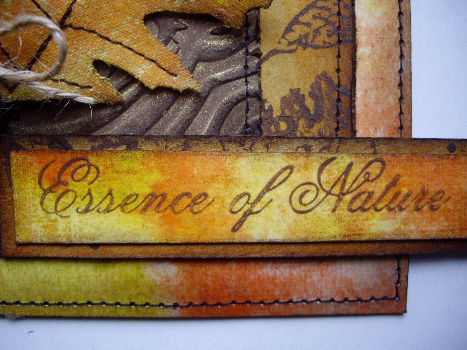
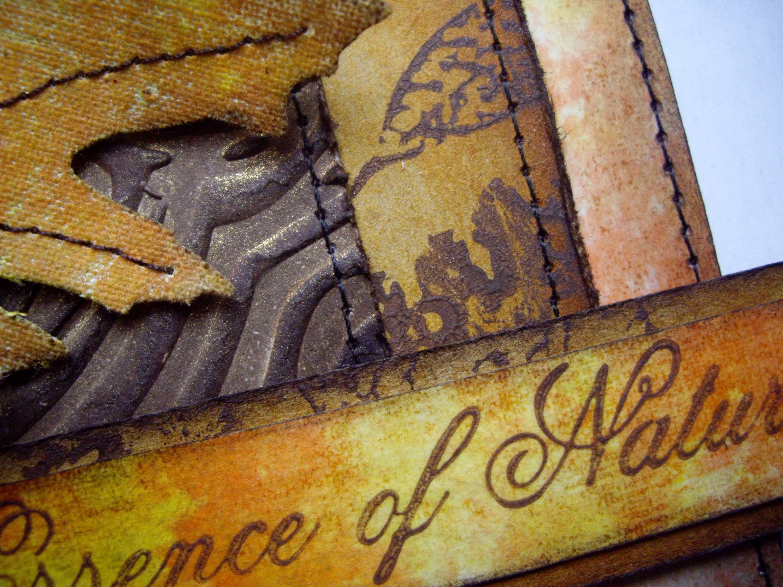
So, onto what I made this time. In the summer, I picked up a rather sorry looking wooden cigar box of the cheap and cheerful variety and decided to give it a makeover:
As usual, I forgot to take a 'before' picture and only remembered when I'd moved to the inside with my gesso!
The inside of the lid was covered rapidly!

The completed box with stamped images and two step crackle finish. I tried to clean the catch up but couldn't do so without scratching off the gilt - I'll have to think about that for a little longer!
The images on the lid were stamped onto card coloured with water soluble wax crayons and embossed with aged teal enamel. Once cut out, a coat of glossy accents was applied before gluing the pieces into position. 
The inside was finished with two card panels. Each panel was coloured with water soluble crayons, stamped and embossed and two step crackle applied.
The narrow rim around the lid and base was coloured with gold paste and buffed to a shine.
Acrylic paint was rubbed over all the crackled areas and the excess removed with a baby wipe.
In this close up you can see the gorgeous tones in the teal enamel. Teal powder with gold and silver chunky crystals make this a real favourite of mine.
The stamping on the sides was applied straight to the box and the same embossing enamel was used. The stamp was a freebie from CS which I used to represent waves - hopefully you get the idea I aimed for!
Final photo so well done for getting to this point! This shows the wonderful crackle which I think looks like crazed porcelain. This crackle method really needs the final addition of the acrylic paint to make it work.

Thanks so much for looking at my box. Please leave a comment if you like it or you have any constructive criticism - all comments are gratefully received!

Why not pop over  now to Anything But A Card, have a look at the rest of the DT's pieces and start planning your entry. Remember: you can make anything, as long as it's NOT a card!

Saturday 24 November 2012

Craft Barn Challenge #8 & Emboss It At The Stampman

Firstly, I'd like to say a big hello and welcome to my latest followers - it's lovely of you to want to keep up with what I do.

The latest theme for Craft Barn Calendar challenge is children/cute - I'm now up to date as well, for how long, I've no idea!

I don't really do cute so it had to be children for me. I've got some children stamps but they weren't really shouting out at me so I decided to dig out my La Blanche stamp of the girl with the sunflowers. I love this stamp but find it quite difficult to choose the right context in which to use it.

I'm not sure about choosing pink for my main image but in the end, I was happy enough with it.

I'm also going to enter my calendar page at The Stampman. Their challenge this month is to emboss it. I've used an embossing folder and embossing enamel so I think this piece fits the criteria.

Here's my calendar, see what you think:

Using artificial light is not the best but there seemed to be no light today! I've hidden much of the stamp by framing it but I wanted to add a 3D element with the little flower and it wouldn't match the sunflowers used on the stamp . I also like the oval shape so didn't mind cutting off the bottom of the image.
The frame is made from a Tim folder which I cut pieces out of including the central oval panel to make the frame. Distress inks were used to colour the frame followed by some chunky embossing enamel to give an aged effect. The frame is mounted onto card stamped with archival and coloured with distress inks. Some machine stitching finishes the look.
It was difficult to place the calendar stub but as I have another one which protrudes to the left, that seemed the most sensible option. 
The cotton lace on the bottom edge adds a feminine touch to the already 'girlie' piece.
The little flower is punched with a little pearl in the centre. The calendar stub has some Tim tissue tape on the top edge to hide the ugly holes left after removing the stitches holding the calendar together. Some archival was swiped round the edges followed by some machining to match in with the main background.
Hope you've enjoyed looking at this piece and reading how it came about. I do tend to waffle on but you could always look at just the pictures if you wish! Wonder what the Craft Barn will come up with for their next challenge?  


Thursday 22 November 2012

Craft Barn Calendar Challenge #7

I'm still running one week behind with my Craft Barn Callendar Challenge entries. Challenge #7 asks us to use the theme of candles. I thought and thought about this but just couldn't come up with a piece using candles in the literal sense. When I looked at the challenge wording again, it said you could use the theme in any way you choose. That changed my thinking and I decided to use wax from a candle on my project as demonstrated by Gio who is a member of the Craft Barn DT - you can see the technique she used here.

I started by melting candle wax onto a scrap of card and brushing Perfect Pearls in a green shade over the wax when it had set. The wax was then re-melted and a stamp (coated with versamark ink) was pushed into the molten wax. When the wax had once more set, some gold paste was applied to bring out the texture.

Here's my latest calendar page:

Not a candle in sight but white candle wax was used for the green and gold textured 'tile'. 
The top and bottom of the page was embossed in a folder. After inking, the embossed areas were highlighted with gold paste.
The red background was created with distress inks in two shades. It includes random stamping and some stencil work to add depth. The black compass stamping was done with archival ink.
The textured 'tile' looks far greener in real life but I hope you get the idea of the technique used (explained in first part of the post). The candle wax lends a lovely translucent finish to this technique.
The 'tile' is further embellished with some jute thread which appears to hold it in place. Two red wooden beads were added for further interest.
The calendar piece was edged with Tim tape, stitched around the edge and inked lightly on the edges with distress ink.
You can see the spots created with some random stencil work and in the background some stamping of the compass image in distress ink - hopefully! Water was also flicked at the background so the white areas aren't bits I've missed!!


I hope this entry counts, even if there aren't any candle images. Having already completed my December page, I didn't really want to use a candle image for another month - I know using the wax is a tenuous link but it suited my style better - fingers crossed!

Thanks for looking and if you like the page do leave a comment and I'll get back to you.


Saturday 17 November 2012

Stamp Without Ink. . . . . .

The challenge at Simon Says Stamp & Show is to stamp without ink. I love using acrylic paints for all kinds of things so I've chosen to stamp with some burnt umber paint.

I already had some leaves left over from my fabric tag project (you can see it here if you wish), so they were my starting point. The leaves are die cut from fabric which I coloured using distress inks applied to TAP and then ironed onto the fabric - if you haven't tried this stuff yet, you should as it's wonderfully versatile. The large bottom layer of the card is the TAP backing paper after  it had been used to transfer the colours to the fabric. I looked at it and just couldn't bear to bin it so here it is put to good use. The berries are from a very inexpensive decoration which I took apart. I enjoyed being able to make another project with my leaves - probably no more now for this year!

Here's the card I made with the same leaves, berries and sentiment but hopefully, a different look:
My card front is a little warped because I usually weight them down for several hours (if I can) before I attach the final pieces but I ran out time so it really needs some strong card on the back to flatten it.
The berries are faux but I like the look. To complete the leaf spray it was wrapped with some fine jute thread - I love this thread as it can work in such a variety of ways.
The leaf spray was attached to a piece of wood grain embossed card which was coloured with distress and heavily sprayed with shimmer spray. The matting layers were all stitched and inked; the top two were also distressed with a distressing tool.
Some jute braid was knotted and added to complete the look.
The leaves are cut from quite a heavy weight calico and the threads in the fabric show up well. The stitching is in brown thread to tone with the colour scheme chosen.
The sketchy stamped leaves can be seen in the background here and on a few other photos. These were stamped onto kraft card with the paint. I love how the paint gives a matt look with a little texture too.
The sentiment was also stamped in paint onto a scrap of the TAP backing paper which was stuck on card. I love that you can see the texture of the fabric left behind on the back paper! A scrap of the paint stamped leaves was used under the sentiment layer with some ink around the edges.

I hope you like the card. I've made it for the birthday of someone special so I hope that person will like it too! Thank you for spending time looking at my work and welcome to Chrissie my latest follower.

Friday 16 November 2012

A Fabric Tag. . . . . . .

The challenge at Artful Times is to make a fabric tag - how could I resist or not find time for this one?! I decided to make something appropriate to nature because I've been playing around with fabric leaves and wire again.

I used TAP again but in a slightly different way. Instead of stamping on it, I coloured it with distress inks using a Tim technique. When dry, I transferred the coloured piece onto plain white cotton and some calico. The colours remained vibrant and true although they were a little lighter on the calico which was quite heavy weight.

My tag is cut from two layers of calico and one layer of very lightweight padding just to give it a little extra body. Here's what I made:
 The sentiment was stamped onto inked card with some jute attached at either end. The cotton lace is a double layer, which were both inked then stitched into position. Read on for further details of how I made each element of the tag - or found them in a box, cupboard etc. (even in the garden!).
Sketchy leaves were stamped onto the calico using Stazon. Gold shimmer spray was then applied over the tag but you can't see it here as the light was so flat. The tag pieces were layered together, stitched down the sides with a scallop stitch and trimmed. Distress ink was applied to background for an aged effect.
A tag topper was cut from grunge board covered with some book text. This was then die cut twice: once to fit the tag top shape and a second time using a Tim die to add pattern to the edge. The edges were inked.
The leaves were die cut with a Tim die. The edges were inked then stitching applied. Thin wire was woven through some stitches on the back to allow the leaves to be shaped. The thin twigs are real (as are the tendrils) but the berries are faux. The leaves, berries and twigs were wired together with a rusty old piece of paper covered  florist wire which I kept because I thought it might be useful!
Detail to show the rusty wire, stamped / inked background and the scalloped edges.
Detail to show the tendrils (love them but they snap if you look at them!) and the leaves.

I have made another project using the last of the leaves and I was even able to use the waste TAP backing layer which is normally put in the recycled bin!

Hope you like the tag. The leaves were rather fiddly but it was a very satisifying make - especially when I realised I'd finished sewing back all the machine ends!

Monday 12 November 2012

Self Propelled Flowers . . . . .

The challenge at Dragons Dream Tag It On is entitled 'Self Propelled Flowers' and butterflies, flowers and some form of movement are the ingredients that must be included. The theme was inspired by a quote by R. H. Heinlein: 'Butterflies are self propelled flowers'.

I liked the sound of this challenge but it took me a while to work out how I was going to approach it. Then other things got in the way so I'm only entering in the final hours of the challenge.

For the aspect of self propelled flowers, I decided that mine would be using their initiative and hitching a lift. I suppose they are working on the premise of 'why do yourself, what others can do for you'!! Hope that makes sense!

Here's what I made and I'll explain where the ingredients for the challenge come in as we go through the pictures:

The finished tag which I hope gives a sense of movement from the cog stamping, the  pink 'paths' , the butterflies flying along the paths and the flowers hitching a lift on their wires attached to their butterfly friends.
All the butterflies were die cut, from kraft resist paper glued to grunge board. Water soluble wax crayons and a water brush were used to colour the butterflies followed by some walnut stain ink on the edges and a generous layer of rock candy crackle paint.
The tag was coloured using the same method as the butterflies. The pink path has some extra layers applied with distress inks and a stencil followed by the two step crackle technique - I didn't want to use rock candy on this larger area because I think the two step gives a better crackle. Some acrylic paint was rubbed into the cracks when it was dry.
In the gaps around the path, a cog stamp from Oxford Impressions was used to help create the feeling of flow and movement. Some watch parts were used as embellishments on various areas of the stamping.
This photograph and the next two, show the text stamped onto card coloured with dylusion ink sprays. It's a Tim stamp from which I chose the relevant sections for my tag.
As well as the next part of the quote, you can also see the punched flowers making their own way slowing along the path moved by the cogs. They're made from card coloured with dylusion ink sprays, distress inks  and some tiny gems.You can see a close up of one of the watch parts used on the stamped cog images.
The last section of the quote.
This view of the tag gives a clear image of the smaller flowers 'hitching' a lift from the butterflies. The flowers are double sided and some wire was twisted together and glued between the two flowers and then attached to the butterflies.

I had great fun making this tag although it did stretch the brain a little which is another reason why it's taken me so long to get it finished - it's not that I'm slow in making of course!

Hope you like it. If you do, please leave a comment as I read them all and will visit you in return.

Sunday 11 November 2012

Anything But A Card Challenge #6 - A Stitch In Time

The new challenge at Anything But A Card goes live today (I'm a little early with post) and I absolutely love this one! The theme is 'A Stitch In Time' and this can be taken so many ways. You can take the time aspect and use clocks, dates, postage stamps, calendars, and watch parts or gears etc. You could take the stitching route and get your sewing basket out to do some real stitching or use faux stitching of some kind perhaps with a stamp or pen.

On the other hand you could do what I've done and combine the two. I seem to be in a sewing mood at the moment and decided to make a cover for a little address book I bought in a charity shop. I've used my machine, some stamping, some embellishments and some ink just to grunge it up a little!

We're really having a great time at Anything But A Card looking at all your wonderful creations so why not give this challenge a try if you haven't entered yet or please do join in again if you're one of our 'regulars'. Please do go over to the blog and see what the other DT members have made this week too - I'm sure you'll be in for a treat!

Here's my DT piece for this challenge:

The front view of the cover which was made from some vintage linen I've had for a very long time, some white cotton fabric and some twine. Some watch parts and wooden beads were used to finish the look.
The back view of the cover complete with inky finish to provide an aged look.
All the stamping was done using coffee archival ink and a Paper Artsy stamp set. Many edges and certain areas were inked with distress walnut stain ink mainly because I love the look it achieves.
The top and bottom hems of the cover were stitched with two parallel rows for a quality finish. (I also did this inside the front and back of the cover but forgot to take a photo!).
Nylon thread was used to hand sew real watch parts to various areas of the design. A combination of straight stitch and zig-zag stitch was used to attach the stamped pieces.
Two ties were made from linen - all raw edges were encased for a neater look and each tie was top stitched around all edges. To ensure the chunky ties don't slip open, some jute twine has been added with wooden beads as both weights and embellishments.
I really like jute twine and it's natural appearance matches really well with the linen fabric.
Although ziz-zag is a modern stitch, I felt it was appropriate to use it here to ensure that the raw edges were properly encased.

Hope this isn't too grungy looking for you! I've been producing stitched items in my career which had to be as perfect as possible and it's good to do something which is less restricited and a more arty feel. Not sure what my pupils would have made of 'Miss' doing work like this though!!