Thursday 31 May 2012

Words. . . . with flowers, lace and ribbon

Seems ages since I was here posting a little something! Had a truly memorable short visit to Rome with my husband. I cannot describe how beautiful that city is. . . . . . or how much I want to go back again!! Came back to better weather here and a new craft room to set up - a room with enough space to sew and craft AND not have to pack away one before doing the other! My husband has been amazing as the move involved some re-decorating in my daughters room and making up flat pack furniture - neither of which he particularly enjoys! I did help with both tasks but his contribution was way larger than mine!!

I have missed creating things so I had a look at my usual challenge blogs to see the themes available. As usual, Hels over at Sunday Stampers has a lovely little challenge based on the theme of 'Words'. Dedicated to the sad passing of Robin Gibb - I so love the Bee Gees and would find it difficult to name a favourite track!! I like the idea of using words but don't have a great many stamps for this so have used some that I felt were appropriate and improvised with a little old book paper too.

Over at Artful Times, the challenge is to use some ribbon and lace. I love both of these elements but don't often use real lace in my craft work. This time I've dug out a little piece of white cotton lace, added some Distress Ink et voilà! A lovely challenge which allows a wide range of creating to take place.

Another challenge blog which I enjoy visiting is 'Shopping Our Stash Weekly'. I seem, like all of you out there, to have loads of 'stuff' in my collection which should be used up before buying anything else . . . . . . . . . it's so difficult when you NEED to buy that new Distress pad or Dylusion spray ink though isn't it. . . . . . . . ! The challenge here is anything floral related so I knew I had to join in as flowers are always something I enjoy using in my work.

So, here is what I've created in my new, lovely room:

The elements I used to make my card. As usual, I'm merrily sticking things together and then remember that I haven't taken any pictures - OOPS! Sorry, but I know you will get the idea from this image that the flowers, button & ribbon embellishment and the main image have already been assembled!

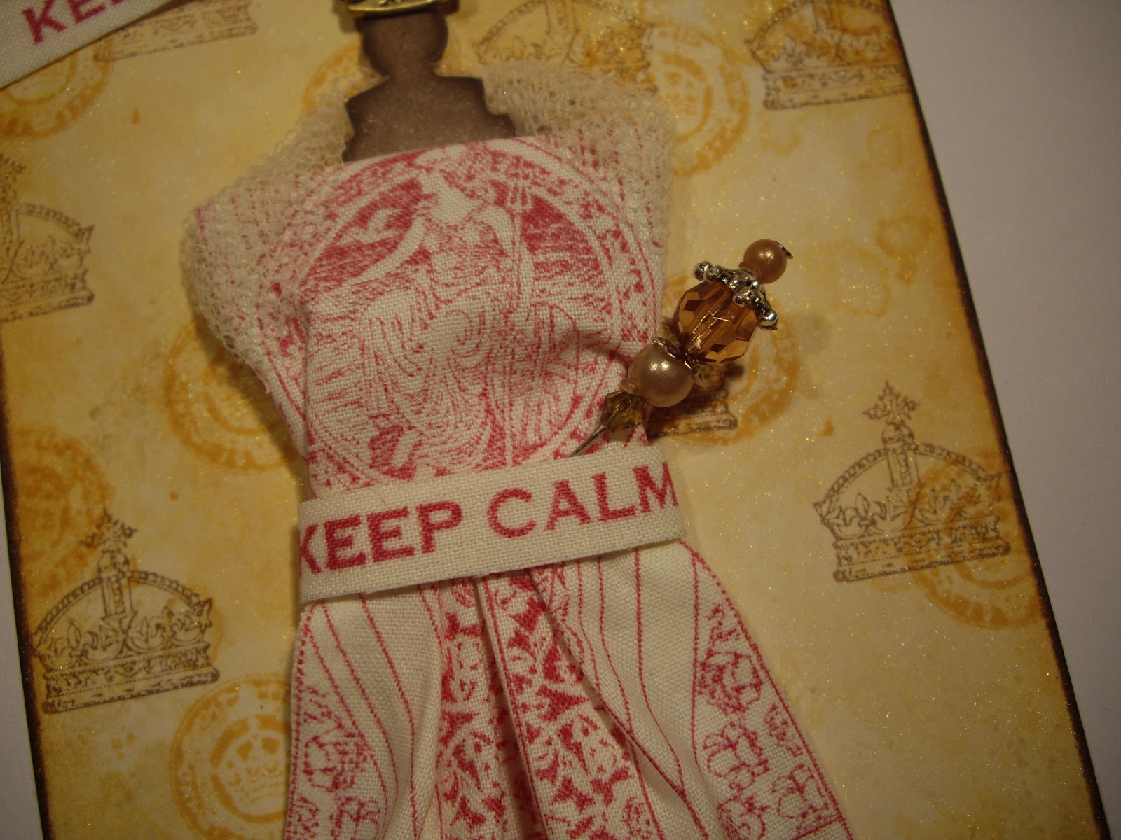
The completed card. The flowers, embossed panel and the words panel have all been shimmer sprayed liberally but it barely shows in this photo.

The flowers were die cut, shimmer sprayed and coloured with Distress Inks. The small, central flowers were also stamped with an Andy Skinner stamp which I masked off so I only used the floral element. I did the same with the die cut branches.
I tore some paper from an old 50p book and added some Distress Ink to tone with all the other colours used. For the first attempt, I inked the edges with Walnut Distress Ink but it was far too dark so I left them pale on the second attempt and I prefer this effect.
I wired some beads for the centre of the flowers choosing some iridescent purple ones but that doesn't show up so well here!

I dry embossed a Tim Holtz folder and cut out the central panel to make the frame. I inked the folder with Distress Ink prior to using to lay a foundation for the colour work. Once dried, I added more Distress ink to build up the colour combination you see here. Final step was to add some randomly distributed gold embossing powder - how much do I love that stuff?!!
The centre panel was shimmer sprayed, coloured with Distress Ink and then stamped using Andy Skinner 'words' images. I so love the main sentiment and I'm sure Robin Gibb would have approved of that phrase!

I die cut a button and embossed it with gold detail powder. I wanted to tie a bow through it but quite honestly my attempts were pathetic! I decided to use some wired ribbon and gold embroidery thread to attach the two elements together and I'm much happier with this second attempt!
The lace is a little 'fuzzy' in this image but I think you can just about see that I've dyed it with the same Distress Inks to ensure it tones in with the rest of the piece. The lace is much more variegated in real life and shows the three colours used very clearly along the length.

My first piece from new craft room - hope you like it! If you've got down to this point, thank you for reading all my ramblings!


Thursday 17 May 2012

Birds. . . . . .on a bookmark!

The latest theme at Artful Times is 'Birds'. I love looking at the birds in the garden but really need to learn more  so I can identify them. Having a killer cat probably means that some clever species give my garden a miss on their daily flight over the neighbourhood!  I think their colours and markings attract me the most and obviously the way they fly to and fro collecting bits and pieces for their nests is always captivating. I would love to have a bird table but for obvious reasons that's not possible!

I'm also going to play along as a visitor, at 'Tag Tuesday'. They have a 'Gardening' theme at the moment and as birds are a very important part of gardening (not always in a good way when they steal our goodies which are growing!) I hope this bookmark will be applicable. Some amazing artists show their work here and I'm constantly in awe of what they produce! Very inspirational.

I love bird stamps and although my collection isn't huge, there are a few which I'm always looking for an excuse to use.

I tried to avoid making a tag as I seem to make so many of these and decided that something slightly unusual was needed. I read a great deal - mainly what my husband calls 'trash' (I love detective type thrillers and he's convinced I'm collating evidence to help with a future, perfect crime!!) - so with that in mind, I thought I would make a bookmark. I have an electronic device for reading but nothing beats handling a real book in my opinion.

So, with no further waffling, here is what I've made:

The elements used to make the bookmark. A brad and some jute thread were added later.

The completed Bookmark.
This close up shows the shimmer spray used on each of the bird 'tiles'.
(Shimmer spray was applied to all elements of the bookmark).


The jute thread was added to give a natural element to a nature themed tag.
This image clearly shows the shimmer on the bird tiles and the embossed edge given to each. The tiles were stamped using VersaMark and mica powder in various colours was brushed over the stamping. The edges were embossed with gold detail powder to give a framed effect.
The birds on background were stamped using the new spring Distress Inks which were applied to the stamp in random fashion. I wanted to achieve a watercolour effect by using the Distress Inks.


The coloured birds was stamped using Distress Inks and then blurred by spraying with water. Further colours were then sponged on. The music was stamped in coffee Archival ink. A quick burst of gold shimmer spray and some embossed gold detail powder finished the task. I repeated the same bird but stamped in Archival - I wanted to achieve a 'shadow' effect by placing the coffee coloured bird behind the main image. 


Tuesday 15 May 2012

Queens And Crowns. . . . . .

Seems a very long time ago since I did a post - life gets busy, inspiration runs dry and there are so many things to concentrate on all at once!

I've also been involved in a card swap with the theme 'Pirates' (more of that another time!) which stretched me beyond belief but I didn't give up and managed to produce an idea - eventually.

Something more up my street is the fun challenge over at Hels Sheridan's blog with the theme 'Queens and Crowns'. I decided to make a tag but had to cut a larger sized one to accommodate the dress form.

Simon Says Stamp And Show have an 'Anything Goes Theme' so I would also like to show my tag there.

As a one time Textiles teacher, I never seem to use fabric in my paper crafting so this time I got out the calico and the stamps and the results of my labour are as follows:

These are the main elements I used to make the large tag. I put the white die cut and the stamped fabric there to show how I arrived at the finished, clothed dress form. (I made it up then realised I hadn't taken the photo. . . . !). 

The completed giant tag.

I stamped the patriotic designs onto calico using Stazon - it didn't bleed into the fabric- phew! The 'sash' obviously says 'Keep Calm and Carry On' but I particularly like the words shown here!! I wrapped some netting around the shoulders after draping the calico to imitate a dress and bodice. The beaded pin was a later addition  and is supposed to be a sceptre - with a stretch of the imagination! The dress form was inked with walnut Distress and then covered by a second acetate die cut to add shine.

I added a crown at the base of the tag to add to the 'Royal' feel. It was originally silver but I coloured it using some alcohol ink and gold mixative. I used a Dylusion stencil to imitate a tiled floor using scattered straw Distress Ink so the dress form looked as if it was grounded.

This image shows the background I created using Distress Inks, shimmer spray and stamped images. The crowns are done using coffee Archival ink and the circular stamp uses scattered straw Distress ink. The lovely ribbons pick up the tones used on the tag and were given to me by my crafting friend BJ - thank you!! The sentiment is again stamped on calico which has some interfacing on the back to help give it shape. Finally, the tag was inked around the edge with walnut Distress Ink.

A change for me - hope you like it!

Sunday 6 May 2012

Time With A Kaleidoscope Of Colour. . . . . . .

I've come back from a lovely holiday with family who live in Cyprus and all I seem to have done is wash and iron - no time to sit at my desk and have fun until last night. Trying to catch up with all my favourite blogs and challenges is taking ages but I promise I'll get round to it - asap!

My initial inspiration came from the theme at Artful Times - quite aptly they've chosen 'Time'. At Simon Says Stamp and Show, the theme is 'A Kaleidoscope Of Colour' and at the The Stampman they ask you to show your favourite technique - how to choose is the problem for this one!


 I would also like to play along at Just Keep Creating where 'anything goes' but you have to include a holiday tale too! Where to start on that one? Perhaps my most favourite holiday was spent with my husband skiing in Banff, Canada. This holiday was very special because we also attended my sister Vikki's wedding which was held outside with a very snowy, mountain backdrop - it was magical (but oh so cold. Even the champagne froze in our glasses!). A sleigh ride completed the ceremony and a beautiful meal in the evening with the newly weds finished off a truly memorable day.


I decided that I would make a card which could be used for a variety of occasions and one which hopefully fits all themes at my chosen challenge blogs.

So, with no further delays, here is my card. . . . . . . .better put on your sunglasses for this one!!!

These are the individual elements I used to make the card.

The finished card.


This image shows the backgrounds I made. The top layer was made using Dylusion inks, a stencil and some spritzed water which was applied after the inks. Once dry, I used an embossing folder to create a raised design which was then embossed with gold powder. I like to do this without too much accuracy as I prefer a slightly more distressed finish. The edge of the top layer was inked around with Walnut Distress Ink. For info on the other layers, please read below.

In this image the centre layer can be clearly seen. Again, I got out the metal insulating tape and covered some card which was then dry embossed. I then added layers of acrylic paint in various colours to try to achieve a 'metallic' look. I do like the finished effect - it's so masculine but perhaps my taste is changing??!!
The bottom layer was coloured with Dylusion inks but I spritzed the card before applying them rather than after as I wanted to achieve a softer, more translucent effect. Watch faces were then stamped in onyx black versafine ink. The sentiment was printed out, applied to card, inked, roughed up around the edges and fixed into position using a brad (we used to call them 'split pins' in my day!!). Again, walnut distress ink was used around the edge.

I hope you like this rather bright, colourful offering from me - please leave a comment if you do as it so lovely to know that people are enjoying looking at what I do!