Morning everyone. Seems ages since I was here. Today sees the start of a new challenge at
A Vintage Journey and our host is the hugely talented Tracy. Here's what she has to say:
'I love monochromatic themes in artwork; I love the balanced look it gives to a design. If you ever struggle with knowing what colours to use this should be right up your street, one colour alone or hues of one colour (plus black and/or white) - simple! Please just check that your entry is vintage; shabby; mixed-media; art journaling; industrial or steampunk to be in with a chance of being a winner or Pinworthy mention'.
I love using just one colour in various tones and intensity to create depth so this really is right up my street! I decided to alter a notebook using tones of orange and some black. There is a little orange streaked yellow which has crept in so I hope I'm forgiven for that!
An altered notebook which has been kept neutral by using black. Layers of substrates coloured using tones of orange and various textures, die cuts, stamping, stencilling, gelli print and good old mark making.
Simple, kraft paper covered notebook containing lined paper.
A thick layer of black gesso is stippled over the front and back covers, both inside and out.
Colours used for spraying, stencilling, stamping and gelli printing.
Mediums used for adding black to project. Black modelling paste has been used but is not in the image.
Stipples black gesso was taken inside the book and colour plates are added for lists etc. The card has been sprayed with misters - the colours allowed to mingle to create tones of orange. Stamping is then added using Archival ink.
Four layers have been created to enhance the book. The base layer is a piece of card. The next two layers are greyboard and the final layer is card.
The base layer is a gelli print which didn't go quite according to plan. It has been cut to shape and stamped with Archival Ink.
The next layer is the first piece of grey board used. It has been stencilled with modelling paste and coloured with acrylic misters. It is then enhanced with stamping, stencilling and doodling.
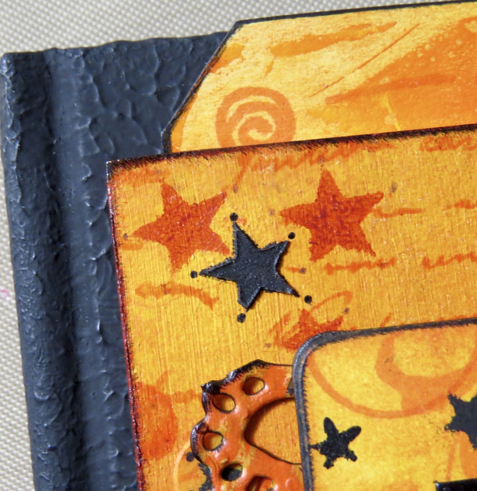
The second piece of grey board comes next. This has been coloured with acrylic paints, spray misters and then stamped. The black stars are stencilled with black gesso.
The final layer is a section of gelli print. The movie star image comes as a collage and has been stamped and black embossed onto the print.
The punched flower is made from a leftover scrap which I couldn't throw away! The colours matched this project perfectly and the look is completed with a stick on gem in a soft orange shade.
Another piece of gelli print is die cut into a faux lace design and the edges - like all the edges in this project - have been swiped with black ink or paint.
The final touch is to add a little embossed black star which has been cut out and applied.
Many thanks to Tracy for a wonderful challenge this month, I loved it!
Our generous sponsor this month is:
Our winner will receive a $20 voucher to spend in this fab online store!
Please remember to see the wonderful inspiration provided by the other Creative Guides at
A Vintage Journey - stunning projects one and all!
Thank you for joining me today. I am aware my blogging is sporadic at the moment but please bear with me. Have a great weekend.


