Sunday 30 September 2012

Shine On . . . . . . . . . . At ABAC


The challenge for the next fortnight at ABAC is to add some form of shine to your projects. You can be over the top with full on shine, sparkle and bling or just add a little gentle sheen somewhere on your project. Make anything except a card, add in the theme somewhere and then link up your work at ABAC so that we can come and visit you all! Remember: we like comments too so do visit the DT members and leave them a word or two.

I haven't managed to join in the Sunday Stampers for a little while. The theme Hels has chosen this week is 'What Makes You Happy'. The answer to that is: making inky backgrounds, metal flowers and creating texture so, I hope she thinks that this tag fits the bill! Don't know Hels? You MUST go and visit her and be prepared for some amazing crafting and some of the funniest and interesting posts you could wish for. (Gushing over - I promise!).

I'm not an overly shiny, bling girl but I do like a touch of glossy accents, some mica spray, embossing enamels with metallic tones and of course some gorgeous metal tape (er, lots of gold and diamonds too but sadly my husband thinks I've got the set!). I've used all of these on my tag so see if you can spot each one:

This tag was really hard to photograph with the large flower and the metallic distress stain  in the background but hopefully you get the general idea! The sentiment links to the challenge theme but I kept thinking of the Pink Floyd song 'Shine On You Crazy Diamond' and that's how this tag was 'born'. (That shows my age doesn't? They were the first group I ever saw at age 14 in the 70's. . . . ).
The flower was made by covering white card with metal tape, cutting some tattered florals and colouring with alcohol inks & gold mixative. Next stage was to stamp them with script using versa mark and then emboss with distress powder. The die cuts were shaped and layered before adding some jute thread to represent stamens.
An inky background was made with metallic distress stains and inks. Stamping used the same distress inks. A mask was used with distress ink to add depth. Now here's the problem for me: the metallic distress stain just makes the background look a little grey here but in real life it adds a gentle pearly sheen which is really attractive - I'm not convinced about them but I won't give up yet. . . . . .
The little bee charm was coloured with gold mixative, covered with Duncan Z which was dried and then partly removed with a baby wipe. A quick spray of matt sealer ensures the black won't rub off - using Duncan Z is another Andy Skinner trick, don't you just love his talent?! You could do this just as easily with black acrylic paint but I wanted a dirty, matt look.
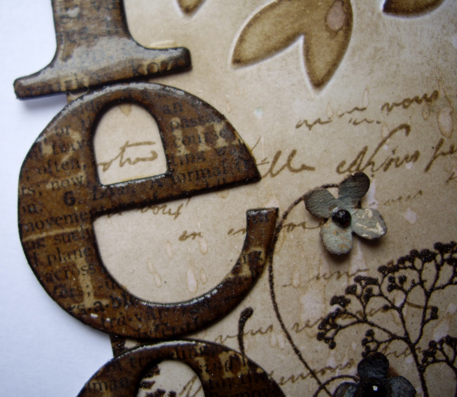
The letters were cut from textured grunge paper, inked and coated with glossy accents and I LOVE how they turned out!! To grunge them a little and add some different shine, I swiped some gold rub & buff over some of the edges. The flourishes were made in the same way but no rub & buff was applied. Their shine is better seen in one of the following photos.
You can also see some green ribbon here. This was gathered by hand and attached behind the corrugated card. I liked the soft feminine touch it added to the grungy background.
The stamped bees link to the little charm - why? I don't know really, I just like them!
The flower and flourishes sit on a piece of inked kraft corrugated card with torn edges. Some of the edges of the card have embossing enamel applied in a very random way. I love the texture this provides. I think these flourishes would work well on a Christmas tag too!
Hope you like this tag; it was great fun to make and contains many of the things that I love in crafting. 

You may find that this post is a little earlier than the ABAC challenge goes live but we're out this afternoon and I still haven't mastered the art of scheduling. . . . . . one day perhaps??


Saturday 29 September 2012

'Child's Shoe' Blog Award. . . . .

The hugely talented Ana recently nominated me for the 'Child's Shoe' Blog Award. I was very honoured for Ana to include my name in her list as I love her work very much.

The criteria for the nomination and acceptance of the award are as follows:

1. The blog should be in its infancy ie. below 200 followers.
2. The recipient should post about the award on their blog.
3. Include a link to the nominator in your post.
4. Forward the award to another 5 bloggers and tell them about the nomination.
5. Insert these rules into your post.

My nominations are as follows in no particular order:

Spesh Ink - Mark

Pushing The Right Buttons - Buttons

Sam21ski - Sam

Messy Me - Von

Live The Dream - Jennie

I know the name is a bit odd but I think the idea behind it is really good and I hope my five nominees will agree. Off to post on each of their blogs now so fingers crossed!

Tuesday 25 September 2012

Trees. . . . . . .

I'm very keen on trees and would probably be a tree hugger if the weather allowed here in UK (and I wasn't so vertically challenged!)! I know it sounds daft but they can be so beautiful and of course, as the seasons change, their beauty changes and draws us in more. (My husband does the odd eye roll as I'm always pointing out trees when we're in the car and I think he's pretty bored with my obsession by now!).

The lovely ladies at Artful Times very kindly chose trees as their theme this time so I needed no mojo searching and had a lovely, inky play to produce this tag:


A white card tag was embossed in a tree folder. The tree was inked with walnut distress ink and the 'sky' was coloured with watercolour pencils. 

Some floral images were stamped and then embossed with distress powder to give that lovely textured look. The lace (another huge favourite) was cut from Tim's resist paper and double embossed with clear powder.

The letters were also cut from Tims resist paper and inked then embossed twice with clear powder. I love how the original resist on the paper still shows through the inking and embossing. Embossing twice seems to have made them darker thus lending an aged appearance which I rather like.

I used several watercolour pencil shades for the blue and blended lightly with a water-brush - I wanted it to work well against the brown and act as a lifting element - I hope you think it works. The little flowers ( I can't resist using them!) were also cut from Tim's resist but they look so different without the embossing and just the addition of inks and some have picket fence stain too. The little gems are really red and have been toned down with alcohol ink but some red is allowed to shine through for added effect.

The remaining white areas of the tag were lightly inked with walnut distress and stamped with script. Some water was spritzed and flicked to create a distressed finish.


Hope you like the tag and thank you so much to my new followers who have left such lovely comments - it's always nice to know that someone is looking!

Thank you too, to the lovely and hugely talented Ana who recently nominated me for a 'child's shoe' blog award: namely one which supports those with less than 200 followers in order to promote more visitors to their blog. Thank you for that Ana and I'll be in touch with you again about my possible nominations.

Sunday 23 September 2012

Something Fishy. . . . . . . Swap Card

I was recently involved in a card swap with a small on line craft group I belong to. The theme was 'Something Fishy' and the brief was to make a card. Now, I don't much like making cards(and the theme wouldn't be my first choice either but I had to have a go didn't I?). Obviously I do make them but for some reason I feel constrained by them. As I was wondering what to do, I hit on the idea of making something like a card with an insert, but which could be used as a little book. The lady I'm sending to makes the most beautiful little hand stitched books and although I can't reach her standard, I thought if I used some handmade paper (not by me!) and stitched the layers together, it could have a dual purpose.

I only have a seahorse stamp and some shell stamps which fit the theme so I used the seahorse as he is rather attractive and he can be grunged up very easily - most important for me! I also decided to make a seahorse charm and tag to go in the package as a little surprise - I do hope she likes them as I really didn't want to give them away once I'd made them! I had a lot of fun making these pieces and from being somewhat of a chore, they became a pleasure and that's what it's all about isn't it? If you're expecting to see cute seahorses with other fish, seaweed and shells, look away now as here's what I made:


Envelope, card/booklet (complete with scrap of paper in top right corner - sorry!) little charm and tag.

The two matting layers were made with dylusion inks and a liberal amount of water spritzing and some rock salt technique thrown in for good measure. The 'bubble' layer was stamped on to watercolour paper using distress ink to get a softer look. Mummy seahorse was stamped onto card, embossed with distress powder, coloured with distress marker and cut out. Baby seahorse was made from shrink plastic coloured on the back with a gold pen - luckily this looks similar to the green of the large seahorse for some reason.
The envelope was stamped - second generation stamp - with distress ink. Large seahorse was stamped lightly with distress, coloured with watercolour pencils and water-brush used to blend the colours. Baby seahorse is again from shrink plastic but a hole was punched before shrinking then and linen thread was wrapped around and attached to a wire hanger. Dare I say 'so cute'??
Grungy close up.


Pages stitched together using the sewing machine.


Hope you enjoyed looking at this little effort - think I might use some more shrink plastic soon as it really is fun to play with.

Sunday 16 September 2012

Texture . . . . . New Challenge At ABAC

The second challenge goes live at ABAC today. We had a fantastic turnout for the first challenge and I really enjoyed looking at all the entries. It made me realise how many talented people there are all over the world.

The theme this fortnight is Texture and you can make anything as long as it's not a card, so the scope is endless! I love this theme because there are so many fantastic ways to incorporate texture into your work and I'm sure I'll learn a few more by the end of this challenge!

For my piece, I decided to make a canvas using a family picture (my beautiful daughter) as this is something I've wanted to do for ages. I've seen some amazing examples and have been inspired by people such as Finnabair, Trish Latimer and Michelle Webb to name but a few.

 I'm not sure that the finished piece works that well (my Husband thinks it just showcases techniques and has had everything but the kitchen sink thrown at it!!) but what it does do is show a number of ways in which texture may be added to a project.

 Here's what I made and I'd love to hear what you think:  (I had to take these in very bright light so they may look a little bleached - sorry!)

The canvas started with a layer of texture paste through a stencil, followed by some strips of fabric glued in various layers. A coat of gesso was applied to these. The different layers were then built up: paint, inks, die cuts, elements such as shells, charms, beads, scrap jewellery and wooden embellishments - I'm sure I've forgotten some too!


The hinges are die cuts which received the same finish as the flowers and the key plate. The inky spots which are randomly placed around the canvas, were made using distress ink and a stencil - I used a heat gun to dry them to avoid smudging.
You might also notice the edge of the photo was finished with embossing powder for a distressed look.

The flowers were made using die cuts then finished with an Andy Skinner paint technique. I wanted to make the rust flowers so they stood out against the other very feminine elements - not sure if this is what Andy intended for his paint techniques but I don't think he'd mind! I just love the 'rivets' and I have loads of ideas for using this in the future!

The letters are die cuts using Crafty Individuals paper which was stuck onto scrap packaging card. After cutting, some gold Rub & Buff was applied randomly to each letter and you will see it around the canvas and on some of the elements used.
The die cut behind the letters was given a coat of acrylic paint then some texture paste through a stencil; this was inked when dry. I love the way the acrylic paint and gesso changes the distress ink colour - Walnut DI was used. 

Various fabrics were used including hessian (burlap) and a beaded/sequinned fabric for texture.
A strip of corrugated card was embossed with shabby white enamel and some gesso was swiped across to tone down the brown. Even the metal heart didn't escape the treatment!


I know this post is very 'picture' heavy but I wanted to try and show you as many of the elements as I could - not an easy task in this case! Will I make another canvas like this? Oh, I think so because I have a beautiful 4 year old Niece who would be an ideal candidate. . . . . .and I had fun making this despite some misgivings and I'm realising that's what it's all about!

Friday 14 September 2012

Grunge Flowers. . . . .

Thank you so much for the lovely comments I had from people on my last post. It was not a good time for me  craft-wise and then it got worse due to a lovely friend's sad family news. Your support has made me rethink what I do and although I'm still going to join in with challenges, I need to just sit and create without worrying about anything except the enjoyment it brings. If it goes wrong - which it will! - I'll cope far better with it I'm sure.

I started this tag a few days ago because I wanted to play with some ancient watercolour pencils I've had since before my daughter was born and she's twenty!

I made a background in various layers and I loved how I could build on the colours and almost create a freehand stencil effect (mask for you trendy people!). This is how the first layer looked before adding water:


Doesn't look much does it?! I then used a large brush and washed over it with water, dried it and continued adding layers and a vague pattern with the watercolour pencils. Each layer was then moistened and dried before adding the next. Finally, I used some distress ink through a stencil in a toning green shade and some walnut ink around the edges. Scroll down for the finished tag.


You can see that the background had a number of layers added after the previous image. I used orange, red, two shades of green, and yellow pencils for the various layers. The small spots were achieved with distress ink as was the random script stamped in the background. 
I love the quote from Kahlil Gibran too - it can conjure up so many images for so many situations and emotions.


The lace die cut was coloured with the same pencils (and water), then coated with three layers of clear embossing powder. I stamped into the molten layer using a floral stamp with gold brilliance ink and a little coffee archival too. I love that you have to look very closely before you see this - it's just there, making a contribution to the project.

The grungy, scruffy but delicious flowers were made from card die cuts, stamped randomly and then coloured with dylusion ink after spritzing with water. When soaking wet, they are scrunched up (VERY messy!), teased apart to suit and then left to dry. I have to say thank you to the very talented Neil Walker who shared a tutorial for this which I just had to try - I now have  soggy lumps in various stages of drying around my room. If you want to read how Neil made these gorgeous creations then follow this link.

You may also notice that I've added some layers of netting behind each flower. It seems to soften their appearance and I really like the effect. It's more obvious in real life.


I was going to stamp some flower stalks but decided to use my sewing machine and stitch them instead. I chose a toning shade of green and a stitch which I felt worked well as a stalk with some 'leaves'. I'm pleased to be gradually using my textiles skills here and there in my craft work.


I'm very happy with this tag and at the suggestion of Alison, Buttons, Anne and others, I have now looked for some challenges to enter it in and here they are:

Sunday Stampers - A Riot Of Colour

Frilly and Funky - The Great Outdoors

The Stamp Man - Summer Sizzlers

I think this is the way for me to go. I always like to share at Sunday Stampers and have often entered at The Stamp Man. Frilly and Funky is a new one for me but I do keep tabs on a number of their designers and thought I should have a go!


Thursday 13 September 2012

Inchies At Artful Times. . . .

Just checked at Artful Times to see how much time they have left and yikes: 1 hour+!!!
I've messed around with this for a week now so I'll just put it on and hope I'm in time. No time for waffle, here's what I made and I have to say it has caused me endless trouble and I don't think inchies are for me. . . not in the near future anyway:
(rubbish photography too - all in all, not a good week!).

I made a corner bookmark using my inchie tile as an embellishment.
The card was cut then coloured with distress inks and stamped with distress. The lace is a die cut which was inked using matching colours to the card.
I originally made three of these tiles and this is the best of a bad bunch! I cut inch sized pieces of thick card, painted with black acrylic and coated with three layers of black embossing powder. Next I dusted with various mica powders, heated the tile and stamped with brilliance gold ink into the molten powder. You can't see the colours so well here but it is beautifully iridescent and probably the main and only thing I'm happy with! 

The back of the bookmark has a piece of acetate attached to prevent it falling off the page.
The card was inked and stamped as previously described.
 Not sure where Mr Mojo has gone but I wish he'd come back! Perhaps later!!


Friday 7 September 2012

Andy Skinner Clock Class. . . . . . .

Last weekend I was lucky enough to attend a workshop run by the very talented Andy Skinner and I do urge you to go and have a look at his work if you're not familiar with it. It really was an amazing class and I had fun with some lovely people including Alison and Mark.

I thought I would share the picture of the clock I made which incorporates some of Andy's timeworn techniques. I'm also doing his on line Timeworn Paint Techniques course. I can highly recommend this if you're interested in paint techniques. I'm learning so much and over the coming weeks and months I hope to incorporate some of them into my crafting.

The clock base we used came as part of a Tando kit and this is the first time I've used one of their products - I've now got my eye on one of their Christmas kits. . . . .

Here's my clock which now has pride of place in my craft room:

The clock has a working mechanism so isn't merely decorative.


I aged the centre of the hand movement using a stick on gem coloured with some gold and black acrylic paint.


I chose a gorgeous vintage paper for my clock face.

I just love the look achieved using the timeworn techniques. Looks just like aged, rusted metal doesn't it?

Hope you enjoyed looking at my clock - even my Husband thinks it's wonderful! 


Wednesday 5 September 2012

Stamped Flowers. . . . . .

The challenge at the Sunday Stamper is to make something using the theme 'Stamped Flowers'. If you haven't already noticed, I love using flowers (the grungier the better!) in my work so I made a tag for my entry.

I decided to have another play with my TAP paper which I bought at the Craft Barn extravaganza. I really like this stuff and I need to play with it lots more! Last time I printed on it from the computer but this time I've stamped and coloured in.

Er, isn't Julia going to waffle on now about everything including the kitchen sink? No. I'm going to make this post a short one because they seem to be getting longer and longer and I want you to stay awake so you can look at the pictures!!

Here's my tag, it's flat, uncluttered but I so enjoyed making the background and the flowers and decided it didn't need anything else; see what you think:

Finished tag looks a bit dark but that's my fault entirely - lack of  photography skills!

 The images were stamped onto the TAP paper using archival ink (on the side which has a chalky appearance). Next, I coloured them using my distress markers and left them to dry - this doesn't take very long.

I followed the instructions to place the design face down onto the fabric and iron all over using a very hot, dry iron. You'll know when it's ready because the paper lifts easily off the fabric. Remember NOT to allow the paper to move when ironing otherwise your image could blur.

Remove the paper and that's it!
I used Tim's kraft resist paper again (when I like something, I can't stop using it!) for the background. I built up layers using distress inks,  stencil work and stamping. I love the way the original varnish on the paper pops out here and there!


You can see the stamped, coloured and transferred fabric image here with the addition of my latest craze: the white gel pen - I've now got one which works after much trial and tribulation!! I cut out two of the individual flowers in the set for my tag. The flowers in the bottom right hand corner were used straight from the set.


In the above image and the one to the left, you can see the lettering a little closer. These are die cuts which were stamped with the same floral stamp as used on the fabric, inked with distress and covered with glossy accents to match the resist on the paper.


That's it from me this time - short and sweet, well, I hope you think so as I thoroughly enjoyed making this tag and the colours may well feature again as I've rather fallen for them!

A big welcome to Katy and Laura who have recently started to follow my work - thank you so much and I will be over to see you soon - promise!


Sunday 2 September 2012

Anything Goes At ABAC. . . . . . . . Challenge #1


For my first design team offering at ABAC, I decided to make a book which could be used for journalling, doodling, scrapping or anything else you might want to do!

If you've been here before, you may have noticed that I like to use metal tape on some of my creations so when I saw the article by Sarah Engels-Greers piece in Craft Stamper, it was love at first sight! I used this as  inspiration for my project. I did let Sarah know and if you haven't seen her fantastic work before, you can find it here.

It was wonderful to make this A5 sized book because I used up a whole load of packaging card I'd been saving and I got to use my grunge paper for the first time since buying it (I know, I'm probably the last person in the whole of the craft world to use it!!).


I cut a frame from some very stiff cardboard and glued leaf skeletons and die cuts on before covering it all with metal tape - sorry but I forgot to take a photo of the one I used but this frame is almost identical.

On the frame I used for the book, I attached some metal washers in two of the corners because I wanted my flowers to have a base to sit on. You can't see them very well on the final piece but they are there.

After applying the tape, I used an old pen to make marks on the frame  between the strips of metal tape - you'll be able to see these in one of the later photos.


So, from a nearly naked frame to this:
The finished journal complete with  a 'J' - for journal or Julia?! You can now see how the frame looks when the metal tape is applied, marks are made with an old pen to mask the tape joins and alcohol inks have coloured the tape. I used white mixative for the verdigris type colour along with a mix of blues and greens. This same mix was used to colour the rings and charms which hold the journal together. The flowers and heart are die cut metal covered card as is the leaf in the centre and the one on the back. Espresso alcohol ink was used to highlight.
The back of the journal was given a peeled paint treatment using a Decoart product. The top leaf was prepared as described above and the one behind was painted with acrylic paint to provide depth to the piece and in a matching colour to the one used as the base coat of the peeled paint technique.


The flowers were shaped after colouring and a heart brad - coloured with alcohol ink - was added to form the centre. Just below the flowers you may get a sneaky view of the little washers under the metal tape - if you look hard enough! They are the same brown as the brads and I just think they give a little shadow and depth to the flowers.


A die cut heart was made from the metal tape covered card and this was embossed using a Tim folder. The heart was coloured with the alcohol inks as described earlier and some brown was added to the seams to age the heart. Some jute thread was tied round the heart as a finishing touch.


The main layer under the frame was cut from grunge paper, embossed in a folder and then coloured with distress ink. I love the way it feels and looks like faux suede! Think I may just have been converted to grunge paper!


The pages inside were made from acrylic paint paper with some vintage book pieces glued on for interest. Some gesso was dry brushed randomly over these layers to tone down the print.


I've started adding colour to two of the pages with distress stains as the first layer. After this, layers of stamping and stencilling using archival ink, distress colours and acrylic paint have been applied. They still need work and lots of the other pages are still blank but I will get there! I think these two pages are the stage when you look at them and think 'where do I go from here?', however, I won't worry too much as I know they'll look very different when they're finished. That's for another day, another project though.
I hope that you like my first DT piece as much as I've enjoyed making it - please do let me know what you think.

Please pop over to ABAC - Anything But A Card - and post a link to one of your creations! It's a fortnightly challenge blog so it gives a little more time to get things done and we'd love to see you there. Winners are chosen by the design team and blog blinkies will be given as a reward.

Thanks for taking the time to look at my work. . . . . . . . .