Friday 29 January 2016

Wanderlust Book Prompt. . . . . .#1

Hi everyone. Like many of you, I signed up for the year long Wanderlust classes. Twice a month we are given a prompt to use in a journal and I'm sharing my first pages here today.

Now, I'm NOT an art journal artist but have always fancied having a go so some of the course is ideal for me to learn the basics and see if I like it. As usual I'm playing catch up but I've got all year so hopefully I'll get there!

I can't give you a step by step but I'm happy to share the materials and mediums I used and I'm sure you can work out the techniques too! Please be gentle with me as I'm way out of my comfort zone with this kind of work - it's great fun though! I used the word believe for my prompt because it resonates with my current situation.

A double page spread with die cuts used as my starting point. This is a Prima Marketing journal which I've decided to use for the journalling. I've also made a journal for other aspects of the classes and you'll see that in a post here shortly.

Some hand written journalling and the main word is done with rub on letters.

Lots of paints and dry brushing going on! I used my faithful old DecoArt Traditions which I just can't bear to waste!

The textured areas have a real shimmer but it hasn't been captured at all. Lots of dry brushing with metallic gold fluid acrylic too as well as the mica in one of the misters.

Hand written journalling in India Ink used with a dip pen. I love the free way we are advised to apply the paint. I'll list all the colours used at the end of this post. We are able to choose our own colour palette or use the one given. I chose those colours I felt comfortable working with.

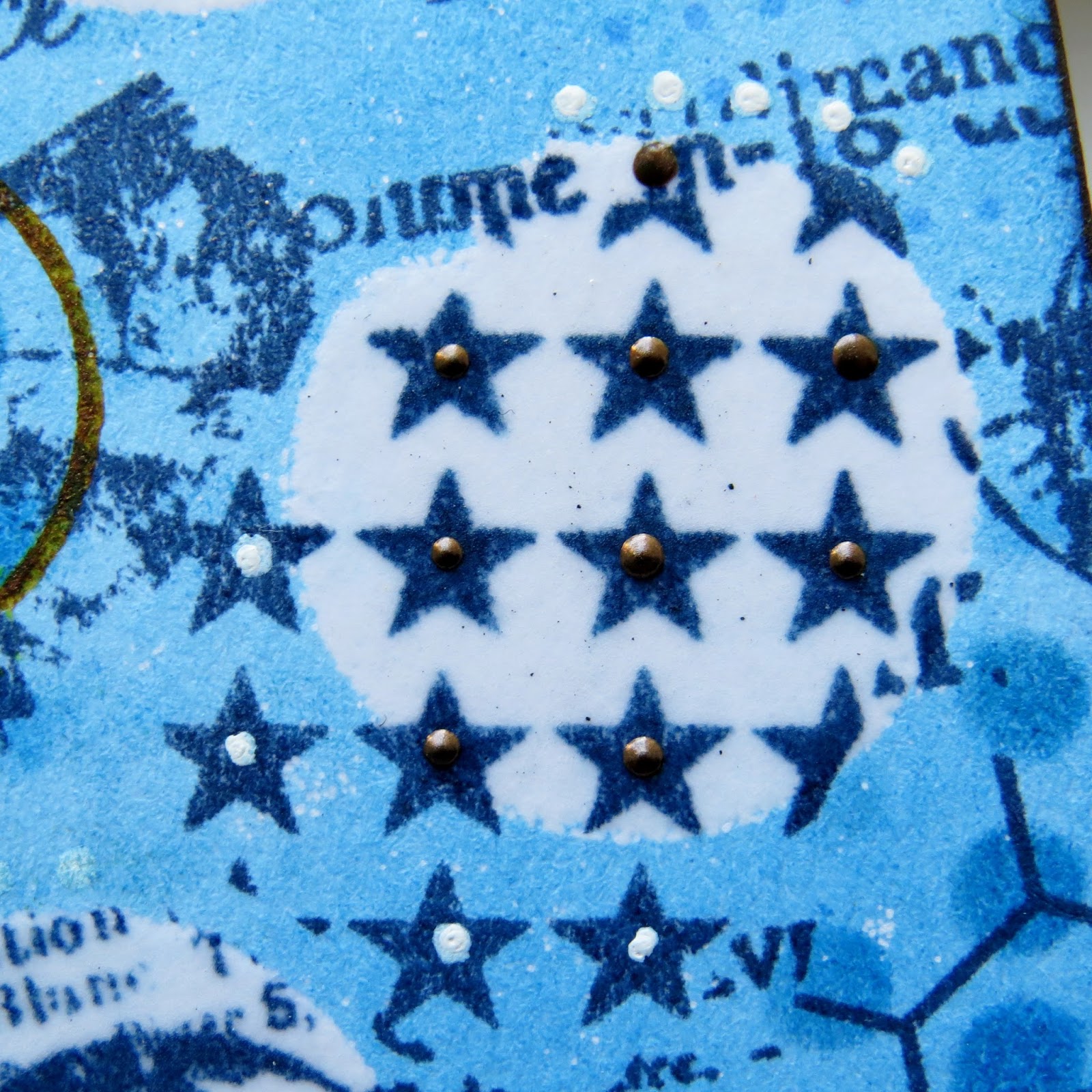
Some left over scraps of embossed card are used here - love the texture they give.

Drips and splatters are great fun but very scary!


Here's the list of items I used to create my pages:
DecoArt Traditions: Sapphire blue, Cobalt Blue Hue, Warm White, Aquamarine & Med Beige
DecoArt Media Fluid Acrylics: Metallic Gold, Quinacridone Gold, Shimmer Mister Turquoise & Primary Cyan Mister
DecoArt Mediums: White Gesso, Matte Medium, Crackle Glaze
Other Products: Black India Ink, Cobalt Archival Ink, Isopropyl Alcohol Spray
Other: Journal, Paintbrushes, Spatula, Stencil, Distressing Tool, Water Spray

Thanks so much for visiting today. You can still sign up for the Wanderlust course, just click the link. I think it's going to be well worth it. I now need to catch up on the second prompt and a class given by the fabulous Kate Crane!

Friday 22 January 2016

DecoArt: Winter Wonderland Challenge

Morning everyone. I'm here to share my Design Team project for DecoArt Media's Winter Wonderland Challenge. I'm sure you've seen the wonderful work made by other team members on blogs and social media if not, click the link above and you'll be able to see all the images and details.

http://decoart.com/mixedmediablog/article/162

The challenge is open until 29th January and you could win a wonderful prize packageworth over $120! Products similar to those above will be included and who wouldn't want that gorgeous little lot arriving on their door mat!

The theme 'Winter Wonderland' made me think of blues, purples, white, a little grey and perhaps a little Scandinavian style thrown in there too. I also kept thinking of snowflakes but didn't want to go back down the Christmas style route so I found something else to give just a feel of those beautiful little icy works of art! I usually cram as much as possible on my work but this time I've pared it back to let the few elements I have used, speak for themselves.

I have been hanging on to a little key cupboard just waiting for the right theme to come along and it seemed that this was the one! It was bought at least two years ago and sat there looking a little forlorn in its' unaltered state. At some point I painted it with gesso and sanded it down and it looked like this:

The cupboard is dismantled and painted with two coats of gesso plus sanding between the coats. After quite a few stages (!!) it then looked like this:

Here are the main steps and products I used to alter the little key cupboard:

Die cut shapes are applied to the cupboard with strong glue.

Home-made clay 'buttons' are applied on top of some of the die cuts. The cupboard is given another coat of gesso to seal all the embellishments.

Everything is painted with DecoArt Media Fluid Acrylics in a mix of cobalt turquoise hue and titanium white. The door knob, drawer knob and four feet (I glued on wooden beads to make these - sorry no picture!) have a little Texture Sand Paste mixed in with the paint to add a rough, aged appearance.

This image shows the effect the Texture Sand Paste has on the paint when used on the door knob.

Everything is then dry brushed with Prussian Blue Hue - guess which paint I've used a lot?!! The colour can barely be read! Don't like dry brushing? Get one of these paintbrushes from DecoArt - they make it so much easier! 

On the sides of the cupboard, some scraps of cheesecloth were applied under the die cuts to frame them and add an interesting texture. You can see the very delicate coat of dry brushed prussian blue hue in this image. 

All the die cuts and clay buttons were then coloured using varying amounts of the three colours above. Some were coats of paint and some dry brushing.

This is how the embellishments looked after the colour application. You don't have to be too fussy with this stage so if a little paint gets where it shouldn't, it will be covered later!

The next stage is to cover everything with a good coat of white Antiquing Cream and leave it to dry. You can then remove the cream where it isn't required using a baby wipe and this is the result you get - lovely shabby look which highlights all that wonderful texture. I always buff up the antiquing cream after with a soft cloth as it contains a wax and it gives a lovely soft sheen to the piece. You can also opt to leave this step out if it isn't appropriate. Remember that antiquing cream reacts with water so should be sealed with a sealant for long term use.

The door clearly shows how the cream can be removed almost entirely in some areas yet left in others. The edges of the cupboard are given a grungy feel with a little Archival ink applied with a sponge.

On the snowflake like ends of the die cut you can see some pewter coloured 'blobs'. These are tiny amounts of Liquid Pearls which have been applied - very time consuming but I like the effect! They add a three dimensional factor to the die cut which is better than just a flat finish.

Products as used above.

The door hinges are also painted then finished in the same way as the rest of the cupboard.

The inside didn't escape my paintbrush either! I even added some little home-made clay hearts so there was a surprise inside. I added a little dry brushed Quinacridone Gold around the hearts too.

The hooks were grunged up a little with some Archival Ink. . . . . . . 

. . . and the hinges didn't escape either!

Detail image to show those little hearts with their liquid pearl blobs!

I managed to find four matching wooden beads which got the same finish as the drawer and door knobs.

I wanted to decorate the top of the cupboard with the die cuts.

Detail shot.

I made the die cuts extend over the edges to give a more interesting look.

I left the drawer painted with Titan Buff only because I have found with wooden alterables that too much paint on the sides and edges of drawers often prevents them from closing or they get stuck!

Again, I made sure that one of the die cuts went over the edge of the drawer. The latch which closes the door is finished as before and a small amount of the liquid pearl paint is added to the nail which holds it in place - I like details!

Hope this has given you some ideas for all those blank wooden pieces you've bought which need some tender loving care, not to mention paint and mediums!

Thanks so much for your visit and I do hope you find time over the coming week to link up a project with us at DecoArt on the theme of Winter Wonderland.

Project Supply List

DecoArt Products: 
Media Fluid Acrylics: Titanium White, Cobalt Turquoise Hue, Prussian Blue Hue, Quinacridone Violet, Quinacridone Magenta, Quinacridone Gold and Metallic Gold.
Mediums & Finishes: Titanium White Antiquing Cream, Gesso, Texture Sand Paste, Decoupage Glue

Other Products: 
Ranger Archival Ink, Liquid Pearls dimensional paint, Fimo modelling clay, rubber stamp for imprinting the clay, silicone mould for clay hearts, scrap cheesecloth fabric, wooden beads, white card, plain wood mini key cupboard

Equipment: 
Bigshot die cutting machine, various paintbrushes, foam for ink application, sandpaper, screwdriver to dismantle cupboard, non stick craft mat, scissors etc!

Sunday 17 January 2016

Oh So Blue. . . . . . .

Hi everyone. I have vowed to blog more regularly - as time allows - and today sees the start of that goal.

I saw a challenge at Stamps & Stencils which is all about the colour blue and I really fancied having a go. I have a soft spot for this challenge blog as I was on the original DT line up so it would be lovely to continue my contact with them.

Here's what I made in fairly quick time. Quite unusual for me as I usually take ages to finish!


As blue as I could get the tag without using solid blue!


I started by stamping the background with a large collage style background stamp. Some focal areas were then stencilled with embossing ink and finished with clear embossing powder. After this the whole tag was coloured using distress ink in one shade. The areas which were embossed remain white and bring the eye to the stamping below.


This image shows one of the embossed circles. Liquid pearls were added to some stars and a white pen to others. In the right hand corner you can see some stencilling done with the same distress ink colour used for the background.

A piece of card is coloured using DecoArt Misters in two shades of blue plus white. To mix the colours, the wet paint is misted with water and left to dry. A piece is torn off to fit the tag.

The torn edges are finished with some acrylic glaze in an autumnal shade to give definition. Spots are made using a white pen.

Sections of a die cut are coloured with the same acrylic glaze and applied to the torn card section in the top corner. The small brown dot is some liquid peals in a chocolate shade.

This die cut piece is applied at the bottom of the tag to give balance.

The letters are die cut from scrap packaging for extra thickness. They are coloured with the same acrylic misters as before but heavier with the white shade and lots of spritzed water is added. I love how the bird's head is picked out in the clear embossed circle.

The acrylic glaze is used to stamp with a plastic lid to add depth to the background. More white pen and liquid pearls can be seen.

Some tiny spots are stamped in Archival ink.

A home-made clay button is painted with DecoArt Media Line acrylics in prussian blue. The raised areas on the clay are brushed lightly with the same acrylic glaze used previously.

Detail Image. 

The top of the tag is finished with some rusty wire twisted around a paintbrush.

Hope you like my tag which was fun to make with no real plan in my head at the start! 

I'd also like to enter my tag in the following challenges:

Simon Says Stamp Monday Blog: Stencil It - stencil used to add embossing ink in circular shape
Anything But Cute Mixed Media Blog: Ring Out The Old, Bring In The New - used ColourArte Silks   Acrylic Glaze and Ranger Liquid Pearls both Christmas gifts.