Monday, 1 July 2013

Captured Memories At Our Creative Corner. . . . . New Challenge Starts Today.

We had some beautiful entries for our last challenge which was a Recipe concocted by Buttons. Our new challenge goes live today and this time the talented Linda aka The Funkie Junkie is your host.

Linda is asking everyone to use the theme 'Memories' for the month of July. This gives lots of scope for the type of project you produce which could be a layout, card, wall piece, tag, 3D art, the list could go on and on!

There is one rule for the product you make: it must use a real photograph. Not sure of the other rules for the challenge at Our Creative Corner? Click here and you can find a short set of rules which we ask you to remember when you play with us.

Please remember to pop over and see the wonderful creations made by my Teamies. Halfway through the month, the second team will post yet more inspiration for you so don't forget to pop over then too!

For my piece this time, I have made a piece of wall art using a family photograph. I did cheat slightly because I only have photographs of the originals so I printed one off onto photographic paper.

I've used a picture of my paternal Grandmother when she was aged approx. 19. If you click here, you will see the childhood image I used of my Grandmother in a previous post. The photos I have are a wonderful record of my Grandmother's life from childhood, through to becoming a young woman, bride and mother to three children. A very special memory for our family.

I should warn you that there are a number of photographs because I've shown the making of my product in more detail this time. Grab a coffee and let's go:

The finished piece which could be hung on the wall or given a stand and stood with other family photos.

How did I achieve this end result? Let's start with the substrate used for the base:
I found this hanging in a charity shop and thought it might be useful at some point! Originally, it had a thick white cotton cord for hanging. I've removed the cord and kept it for another time. At a glance it looks like shabby wood but it is simply a thick, rigid piece of plastic - what more can I say?!
Two coats of gesso were applied to cover the existing design. Three colours of  DecoArt Americana acrylic were then randomly applied over the surface (not blended though) and dried.A fourth toning colour of DecoArt Americana was then applied covering the random shades from the first stage. When dry, the base was sanded to reveal some areas of the first layer of colour. 

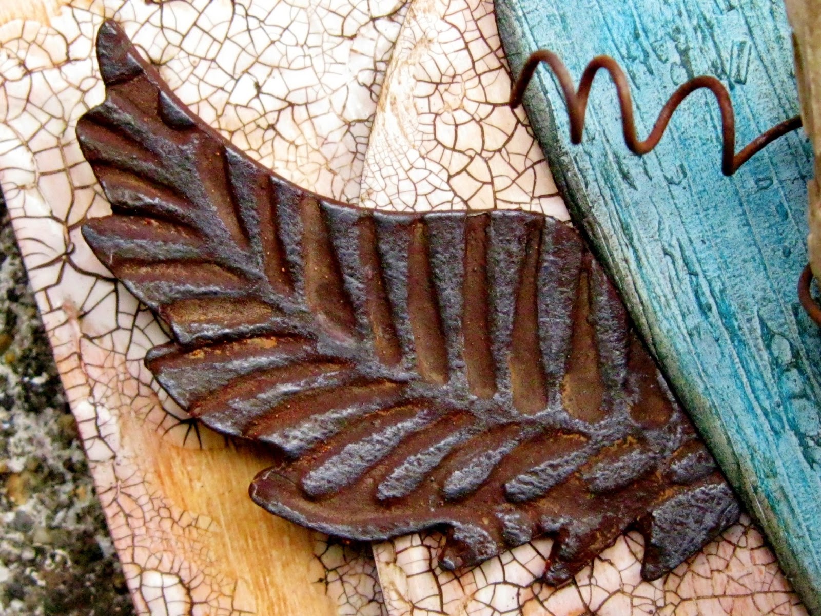
The base was then stamped with versamark using a background stamp - I made sure that the stamping was Not precise in order to give an aged worn look.  Gold and brown mica powder was then lightly brushed onto the stamped area and allowed to set. Finally, a coat of DecoArt Americana sealant spray was applied to protect the surface.

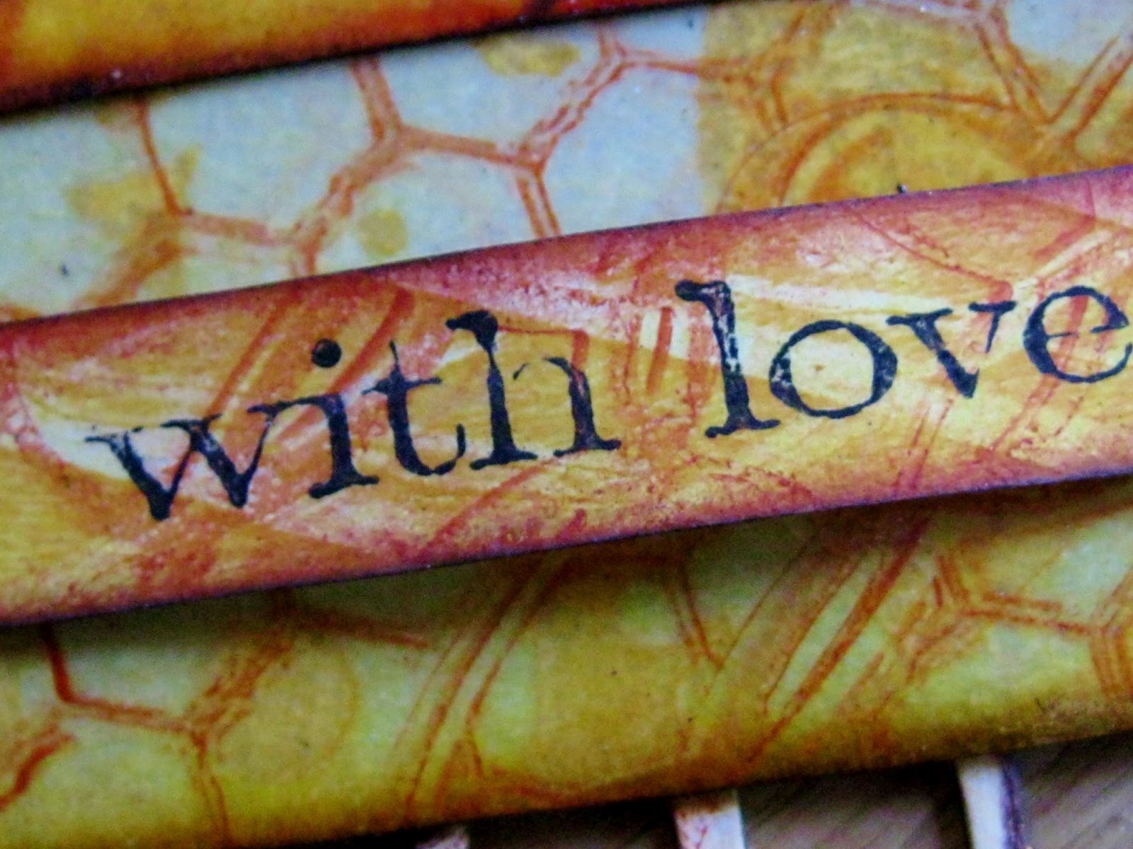
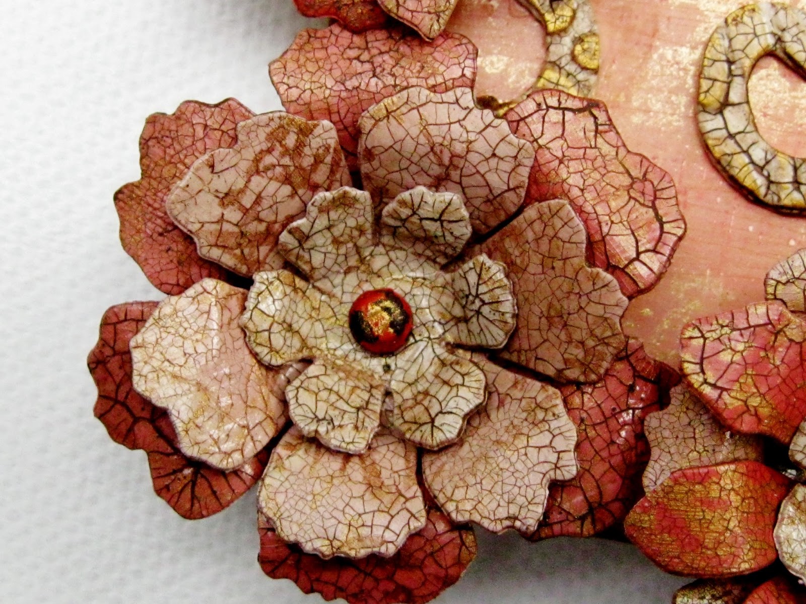
To make the flowers (follow images from left to right), I painted card with the same colours used on the base - I've only shown two here as the rest were already cut up!
Flower shapes were die cut. Each die cut was stamped with a script image and versamark. Gold mica powder was then applied.
DecoArt Two Step Crackle medium was then applied according to the instructions. Raw umber Traditions paint was applied to the crackle when dry and wiped back with a baby wipe leaving the colour only in the crevices.
The flowers were then assembled in various combinations of shape, size and colour.

In the centre of each flower, a 'distressed' brad was used to hold the layers together. The distressing was done with various DecoArt acrylics and a small swipe of their gold Metallic Lustre.

Images of the three remaining flowers are shown below:


The frame for the photograph was cut from Amazon packaging - so useful! Various layers were cut until I achieved the look I wanted.
The top layer of the frame was embossed and coated with gesso. This was followed by two layers of DecoArt Traditions acrylic. Some gold DecoArt Metallic Lustre was roughly applied to the raised areas followed by some sepia archival ink to age the frame.
Two flourishes were die cut from the same Amazon packaging as before. Each went through the same process as the frame to achieve the aged appearance,

The flourishes were used to help 'frame' the flowers.

I was quite pleased with how the background turned out, particularly the stamped image which shows up much better than I could have hoped. 

The final touch was to add coffee archival ink to the edges of the base just to complete the aged look.
If you got down to the bottom, thank you so much for sticking with me! I really enjoyed making this piece but when I showed it to my Husband he said  'it's far too girlie and peach coloured'. Can't win really can you??!!


Sunday, 23 June 2013

Get Messy With Anything But A Card Challenge # 22

For the next fortnight at Anything But A Card, we're asking you to Get Messy! Woohoo! I don't need any excuse to get the messy stuff out and have a good play. This time, strangely, I decided just to use paint and crackle medium which are probably my favourite two things at the moment. Only two ingredients but what a great mess I was still able to make.

My team mates are also showing you some inspiration today so please go and leave them a little comment or two. The second team will be up a week from now so it would be great if you could show them some support too.

As long as you stick to the theme of getting messy, you can make anything you like except a card. So, come on, you know you want to get even messier than usual! Let's see paints, modelling paste, crackle medium/paste, inks, pastels, crayons, gelli plates, stencils, masks, mica sprays and powders and all the other things I haven't mentioned!

I used lots of DecoArt Traditions paints and one of their crackle mediums to make my wall plaque for this challenge, along with a few Andy Skinner Timeworn Techniques of course!

I photographed the final piece against all kinds of backgrounds but nothing seemed to look right! I settled for this one on the lawn in the end even though it's not perfect. Why is it that close up shots are no trouble but taking a shot of something more than two feet away causes all kinds of problems? Think I need to check out the other button on the camera which I haven't tried yet!
The wonderful driftwood was found when we walked along Aldeburgh beach in Suffolk - no need to do anything to it because it's beautiful just as it is. The wonderful key is one of a bag full given to me by my sister Sandie which she rescued and I am so grateful to her for such a wonderful gift. I didn't even have to rust it myself either - how cool is that?!! The rusty wire wrapped around the key was bought ready rusted   and I just love it.
The heart was die cut then given an Andy Skinner treatment and ended up looking like weathered paint. All the layers of paint used on the heart were shades from the DecoArt Traditions range. Some archival ink was added to the edge of the heart to frame it.
The wings were die cut then embossed before being 'rusted' with a Timeworn technique and DecoArt Traditions paints.
Coiled rusty wire was placed either side of the heart too.
The 'crest' at the top of my plaque started life as a die cut and was then embossed and finally rusted in the same way as the wings. The little flowers were punched from card which was first coloured with water soluble crayons then crackled. The centres of all the flowers were made by painting clear gems with raw umber Americana paint (by DecoArt).

I think these punched flowers look like cracked china when viewed in close up. Problem is, I want to make them all the time . . . . . . . . 
For the base of the plaque, a piece of thick card was given a Timeworn treatment and made to look like aged ivory (I hope!!) followed by yet more crackle. Both were achieved using DecoArt Traditions paints and crackle medium as before.
Once dry, an oval was cut from the centre, a stamped and inked layer was placed under the aperture and the oval shape was raised from the background using foam pads.
I'm really pleased with how the embossed areas turned out. Before applying the crackle medium, they were dry brushed with warm white Traditions paint leaving the flat areas darker and more aged. 
You can see here how the oval with the heart stands proud from the background.
I would like to investigate the possibilities of using other colours for the peeled paint effect but these blue shades go so well with the colours used in the piece - it's hard to break the habit!

Thank you for visiting me - it really makes a difference that you do. Off you go now and get messy - it would be lovely to see lots of you enter a piece for this challenge at Anything But A Card!!

Friday, 21 June 2013

Craft Barn Alpha Challenge - Letter U

Hi everyone. Seems like such a long time since I was here. All sorts of things have been getting in the way of blogging and creating. Life is sometimes like that isn't it? So much going on and the thing you most love to do has to take a back seat. Hopefully, life has settled down a little now and normal activities can be resumed!

I couldn't miss the Alpha Challenge at the Craft Barn. We are asked to use the letter U and depict the definition in a visual manner. I have chosen to work in a secondhand dictionary but you can use other ways to display your work as long as you include the definition.

For my letter U, I have chosen the word 'URBAN' as I happened to have a stamp plate which fits the bill perfectly designed by Sam Poole.


The word and definition were masked off. Two shades of DecoArt Traditions paint were then used to roughly coat the pages. I made sure that the two colours weren't mixed but used side by side on a craft mat then blended straight on the page.

The definition after the masking tape was removed.
The sketchy stamping was achieved using archival ink.


The letters were die cut, painted with Fresco snowflake followed by stencilling with DecoArt Traditions paint. Archival ink was then randomly applied with cut and dry. Once attached to the page, each letter was  outlined with a black waterproof pen and some edges were shaded with a black pencil.

the footprints were stamped onto old book pages, cut out and glued into position. Carbon black DecoArt paint was applied using an Andy Skinner stencil onto both pages.

More stencil work was added using the same paint. A white pen was used to outline the stencil work.

An image reflecting the word definition was stamped onto old book paper, cut out and attached. Black pencil was used around the edges to add shading.

Script was stamped in the background with DecoArt Traditions paint. It gives a great effect using the paint for stamping. You can also see the shades created with the two colours of paint used in the background.

Not entered the Craft Barn Apha Challenge yet? You can join in any time, so why not have a go?

Thanks for everyone's patience and I'm sorry to have missed so many wonderful pieces of work. I will catch up with you all again but please bear with me! 

Sunday, 9 June 2013

Anything But A Card Challenge #21 - Masculine Or Something For Dear Ol' Dad. . . . . . . .

Hello everyone. It's time for a new challenge at Anything But A Card for the next fortnight. We are asking you to make a creation using a masculine theme or you can produce something for your Dad. Here in UK Father's Day takes place on Sunday 16th June, so the timing is perfect if you haven't yet come up with a little something for that special Dad. Just remember, we accept any kind of project as long as it's NOT a card.

Sadly, my Dad is no longer with us so I decided to make a holder for a gift card or cash present suitable for a boy/man. My holder takes the form of a tag with a little pocket which holds the card or cash gift.

I promised to bring out some more of my gelli plate pieces and I've used one of them for the background of my make - with additional stencilling, pencil work and other things!

The finished tag complete with gift pocket and stamped sentiment using DecoArt acrylic. The bottom edge of the tag was made more interesting by adding the waste card left over from die cutting the pocket.
The tag background, the pocket and the sentiment banner were all cut from one gelli plate print. The print was made using both Americana and Traditions acrylics by DecoArt and various masks. The rich colour around the edges was achieved using archival ink on some cut and dry foam. Some letters were stencilled here there using DecoArt's Americana paint.
Some chunky natural 'rope' was used to dress the top of the tag. Once in position, some rusty wire was added to keep the rope in position and to match in with the wire used elsewhere.
The pocket piece was cut to size and a Tim Holtz die was used to cut the top edge. The dark brown lines on the background were added with a brown pencil to highlight one of the masks used on the print.
I used two more of my little Fimo 'buttons' to anchor down the sentiment banner.
 A washer was given a slightly rusty look before being fixed over the tag hole. 
Stencilled modelling paste was applied in various areas of the tag. I used DecoArt modelling paste and when dry, some DecoArt Traditions acrylic was used to colour the design applied through the stencil. Two shades of Treasure Gold were smoothed roughly over the paste. The whole tag and the pocket piece were then given two coats of DecoArt Triple Thick spray.
Brown pencil was added to the gelli plate print to create depth and interest.
I love the effect of the Triple Thick on the background. In real life it adheres differently to the various areas of the tag. Over the stencilled letters it gives a lovely shine but where paint is thinner, it gives a more gentle sheen to the background. In this image, the treasure gold is easily seen and the Triple Thick gives the appearance of clear powder embossing - it's much quicker though!
The sentiment was stamped with carbon black Traditions acrylic paint and a Tim stamp.
Rusty wire was used on the tag pocket to add interest without covering up the gelli plate print.
Some sections of the gelli print are very subtle as in the image above. I just love how you can mix ink and paints to create a layered look. Now I really NEED some Inktense pencils for my work - I'm busy dropping huge hints!

I do hope you'll pop over to Anything But A Card and see what the rest of the team have put together for you. Check back halfway through the Challenge for some inspiration from our second team of designers too.

So, get those thinking caps on, make something which fits the theme and link up with us at  Anything But A Card. Can't wait to see what you come up with. . . . . . . . 


Friday, 7 June 2013

Craft Barn Alpha Challenge. . . . . . Letter F

The Craft Barn Alpha Challenge continues with the letter F. The twist this fortnight is that we can only choose words between FE and FR.

I decided to choose the word 'Fellow' because I recently aquired a PaperArtsy stamp which shows a rather snazzy fellow and I thought he fitted the bill perfectly.

You can join in the Alpha Challenge at any point - it's addictive believe me!

I also wanted to use a little piece from one of my first gelli plate prints which I made at an Andy Skinner class recently - more, much more on that in another post!

Please don't expect too much because the print I used was one of the first I pulled from the gelli plate, but from that moment I was addicted. I never realised these plates were so much fun until I finally gave in, did the class and bought the plate!

Here is my double page spread:

The left page was made with part of a gelli plate. The right page was made using stencils and stamping. Both archival inks and DecoArt Traditions and Americana paints were used.
The word definition was left without paint/ink as required by the challenge.
My 'fellow' was stamped onto white card with archival ink. Most of the background was coloured with distress marker and a waterbrush. Some random acrylic paint stencil work was added to the image to enable it to fit with the page background.
The right hand page was covered with a light wash of Fresco snowflake. Script stamping was done with DecoArt acrylics. Stencilling was added with both acrylics and archival ink.
The gelli plate print was achieved using an Andy Skinner stencil and three DecoArt acrylic colours (both Traditions and Americana). A piece of fancy yarn also helped to add another dimension to the print by placing it onto the paint loaded plate prior to pulling the print off.
The die cut letters were cut from some card covered with a piece of gelli plate print. Once applied, some shading was added around the letters with pencil. Black pen was also used to define the letters.
All the die cut letters had stencilling applied to help them appear as an integral part of the design. 

A little extra shading was added below the foot to act as a shadow effect.
Thanks for looking at my pages - expect more gelli plate work soon but remember - I'm a beginner!! 

A big hello to new followers too. I've been a bit of a lazy blogger lately but never fear, I will get to you eventually!