Monday, 28 September 2015

“Halloween HAUNTS: Zombies, Goblins, Witches… OH MY!”.

 I'm really excited to be sharing a piece for an upcoming challenge via DecoArt Inc. - details will go live from October 1st 2015 so keep an eye open on Face Book and other social media.

Amazing prizes to be won. Winners to be decided by Andy Skinner!
I don't 'celebrate' Halloween and I know it's still September but I love creating pieces for this time of year! I've altered a book box which I bought many moons ago and put to one side. All paints and mediums used are from the DecoArt Media range which can be viewed here. Here's what I've created to inspire your Halloween makes:

Lots of layers incorporating paints, mediums, embellishments, die cuts, stencils and even some altered paper flowers! 

This is the inside of the book box and the outside looked very similar before I covered it with gesso. 

The spine of the book is covered with some plasterboard tape to add texture and some stencilled modelling paste is being added. 

Found objects and other embellishments are added to the stencilled book box cover. The back is kept with just a stencilled image to keep it flat and avoid damage. 

Additional texture is added with this product which makes wonderful faux buttons/rivets. Die cuts can be seen in the left corner of this image. These are glued over the dry modelling paste and painted with gesso. 

Various mediums are used both before and after the application of colour to achieve the finished results. Click the image to see the product names more clearly.
At this point, I chose a number of colours from the DecoArt Media range of fluid acrylics and started adding layers until I was happy. This would have involved far too many individual photos so I thought I would share an image of the paints I used and comment on other products as necessary. If you have any questions about any part of this piece, please don't hesitate to email me.

The colours shown are used on the front and back of the book box to create the finished piece. Click the photo to see the product colours more clearly.

The back view. This surface had to be kept relatively flat and serviceable as it would often be placed down on various surfaces. Two stencils have been used. The skull is stencilled using paint followed by dry brushing, Crackle Glaze and antiquing. Modelling paste is used for the second stencil followed by layers of paint and dry brushing.

Detail shot of back view.
Die cuts are used to add details. Layers of paint, crackle glaze, antiquing and dry brushing alter the die cuts to suit.

Layers of paint clearly visible.

Detail shot to show paint effects around eyes.

Various embellishments are combined to create a central element of the design. Lots of layers of colour and dry brushing complete the piece. Also visible in the background is crackle paste which creates additional texture, along with small watch parts.

On a number of flat areas of the cover, skulls are stencilled with fluid acrylics then antiqued with crackle glaze and antiquing cream.

The main image is a large skull stencilled using modelling paste. Various layers of fluid acrylics are followed by dry brushing to make subtle alterations.

Detail image showing eye on the main skull image.

Altered mulberry paper flowers.

Detail shot showing layers of colour and dry brushing.

The edges of the book are painted with black gesso followed by dry brushing with gold metallic fluid acrylic.

Detail shot.
Detail shot showing crackle paste and those tiny watch parts.
I hope you've enjoyed seeing the details of my Halloween Book Box! Keep watching for more details from DecoArt about their Halloween HAUNTS challenge!!

Thanks so much for visiting and spending time looking at my post.

Thursday, 3 September 2015

Up, Up And Away With A Twist At Stamps & Stencils

Good morning. Today sees the start of a new challenge at Stamps & Stencils. Your host is the lovely Sharon and here's what she has set as her challenge:

For this challenge we would like to see something that goes Up Up and Away. It could be a plane, a bird, a feather or anything that can go up, but you must use /autumnal colours. So get out the copper, rust and burnt oranges. Be it paint, metal or embossing powders, don't forget to include some Stamps and Stencilling....

Lots of options I thought to myself then the mind went blank! So, to get some ideas flowing, I got out my stash of gelli plate print tags and chose one which had some relation to the theme set. Eventually, I ended up with this (yes, I know, another altered gelli print but I LOVE using them!):

The tree goes up, up but not away! The birds will fit the rest of the challenge and do the away bit so I thought this would work! Not the best photo I'm afraid.

The original gelli print tag. Two stencils are used: a doilly followed by a tree design. A mixture of DecoArt Media Fluid Acrylics and Traditions paint have been used on the print.

A suitable stencil.

Some crackle paste.


Some birds stencilled in the trees and further down the tag the words and a feather. 

When dry, the birds are painted with a mixture of the two DecoArt Fluid Acrylics shown.

The birds have been outlined with an inktense pencil - the start of many layers.

DecoArt Quinacridone Gold Fluid Acrylic is painted over the birds to antique them further and give an autumnal hue.

The letters receive the same treatment.

The top of the tag is finished with a left over rusted die cut from a previous project and some sari silk. The edge of the tag is finished with some copper embossing powder.

Detail shot. Various colours of inktense pencils are used to add autumnal shades to the original green paint on the print.

Inktense pencil is used to bring out some of the underlying print on the tree trunk. Black pen has been used to outline sections of the print.

Detail shot.

Embossed circles show areas with fresher colours of summer and even spring. The areas outside the circles shows the onset of autumn with browns, oranges, reds, yellows and copper tones.

Detail shot showing layers of colour.

Detail shot.

Detail shot.

From not having any ideas at all, I'm quite pleased with how this turned out. I love playing around with gelli plate prints - you never know what's going to happen really!

Please do go over to Stamps & Stencils and see what my wonderfully talented teamies have produced for your inspiration. Why not visit their blogs too and see more of their gorgeous work?

Over to you now - we'd love you to join us for this challenge!

Tuesday, 1 September 2015

Shades Of Autumn

Hi everyone. I'm back again this time with Our Creative Corner and it's my turn to host the September challenge. 

I just had to go with that old favourite 'Shades Of Autumn' and judging by the weather here in Suffolk this weekend, winter may be just around the corner!

You are challenged to use a picture inspiration and produce an autumnal style project using the wonderful colours in the image. For full details, click HERE and see what my teamies have come up with to inspire you too!


I love the colours of autumn. Those beautiful and dramatic reds, golds, yellows, browns, greens and all shades in between. 

Here's the project I came up with:

An altered Ikea mirror featuring fabric leaves and a stencilled background.

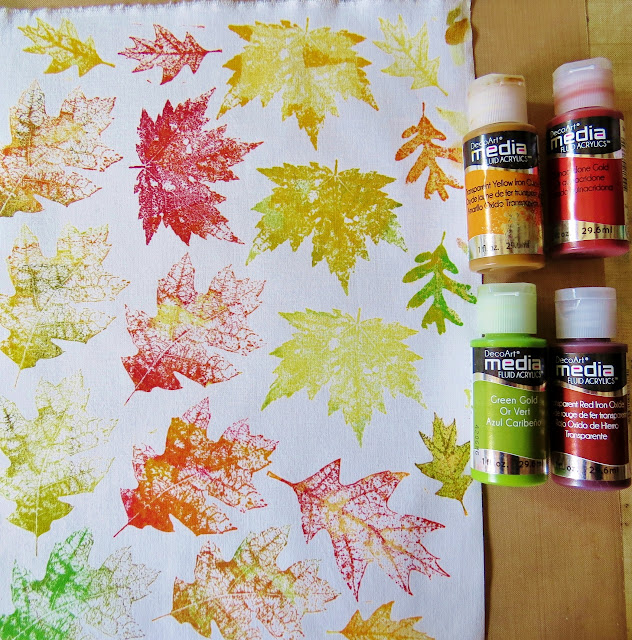
The leaves are created using Lesley Riley's TAP (Transfer Artist Paper). This is so easy to use: the leaf stamps are stamped onto the white side of the TAP using various Distress Inks. 

When dry, the TAP is placed stamped side down onto cotton fabric and ironed until the images are transferred onto the fabric. Each pack comes with full instructions. Using DecoArt Media Fluid Acrylics, each leaf is painted to eliminate the white background and enhance the stamped design.

I got so involved with this project that I didn't take any photos after the leaves were transferred and painted! So: each leaf was cut out and some fine wire is taped to the back to enable them to be shaped. They are attached to the mirror frame using a glue gun.

On the top part of the mirror, a large script stencil and some modelling paste creates texture before the frame is painted using DecoArt Media Fluid Acrylics in various colours. Some flat stencilling has also been added randomly as seen in the top left of this image.

On the lower half of the frame, a diamond stencil has been used with modelling paste. Once painted as before, the diamonds are given a coat of DecoArt Crackle Glaze followed by some Antiquing Cream to enhance those crackles.


There's lots more to see over at Our Creative Corner and you'll find details of our generous sponsor this month: Creative Embellishments who are offering one randomly generated winner a $25 voucher - wow!! All you need to do is enter a project to be in with a chance to win.


Thanks so much for having a look at this post. I hope you've been inspired to create your own autumnal project. The challenge closes on 28th September so you've got time to get those thinking caps on!